HTML Responsive Website Design

In this article, we will discuss HTML responsiveness. Having a responsive website design or layout means that the content is visible on all devices, making the website look elegant no matter what device is being used!

Adapting to different screen sizes and browsers is part of a responsive web design.


What is Html Responsive Web Design?

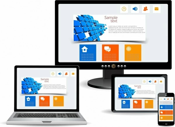
HTML and CSS are used in responsive web design to resize, hide, shrink, or enlarge websites to make them fit and visible for all devices (TV, Desktops, Tablets, and Mobile Phones):

You can see how responsive design looks for all devices in the image below:


Responsive Web Design


Setting The Viewport

If you want your website to be responsive, add the following <meta> tag to all your pages using HTML responsive:

Example

<!DOCTYPE html> <html><head><meta name="viewport" content="width=device-width, initial-scale=1.0"></head><body></body></html>

With the above example code, you can instruct web browsers how to control the dimensions and scaling of your page by setting the viewport of your web page.

In the below example, the viewport <meta> tag has been dragged from a web page, but the same web page has been added:

Meta tag without viewport:

Meta tag with viewport:

Note: You can click on the two links above if browsing on a phone or tablet to see the difference and check its responsiveness.


Responsive Images

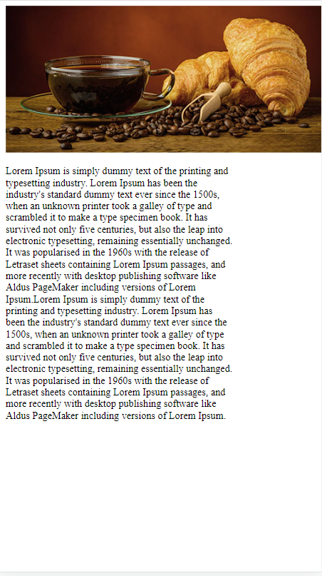
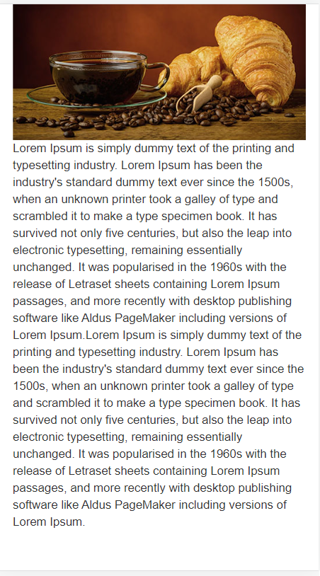
A responsive image is a picture that can be scaled to fit any size of the browser or screen size.

Image width Property

Setting 100% to the CSS width property will make the image below responsive and allow it to scale up and down as per screen sizes.

Example

<!DOCTYPE html> <html> <body><img src="https://mrexamples.com/wp-content/uploads/html_images/img_boy.jpg" style="width:100%;"></body> </html>

The picture in the example above can be scaled up to be larger than its original size. Most often, using max-width will be a more suitable solution.

Max-width Property

Max-width sets the maximum width of the image to 100%, which means it will always scale down to fit, but never increase higher than its original width:

Example

<!DOCTYPE html> <html> <body><img src="https://mrexamples.com/wp-content/uploads/2023/03/HTML-responsive-2-scaled.jpg" style="max-width:100%; height:auto;"></body> </html>

Here is the other example of using max-width property for responsive layout so you can learn more about it:

Example: 

<!DOCTYPE html> <html> <head><meta name="viewport" content="width=device-width, initial-scale=1.0"> </head><body> <h2>Responsive Image</h2> <p>"max-width:100%" This ensures that the image will not grow larger than its original size and is also responsive.</p> <p>To see the results, resize the browser window.</p> <img src="https://mrexamples.com/wp-content/uploads/2023/03/HTML-responsive-2-scaled.jpg%20" style="max-width:100%;height:auto;"> </body> </html>

Show Different Images Depending on Browser Width

The dynamic image size can be specified for each browser window dimension using the HTML <picture> element.

View the image below as it varies in width by resizing your browser window:

Flowers

Example

<!DOCTYPE html> <html> <body><picture> <source srcset="https://mrexamples.com/wp-content/uploads/2023/03/flower-scaled.jpg" media="(max-width:200px)"> <source srcset="https://mrexamples.com/wp-content/uploads/2023/03/flower-scaled.jpg" media="(max-width:400px)"> <source srcset="https://mrexamples.com/wp-content/uploads/2023/03/flower-scaled.jpg"> <img src="https://mrexamples.com/wp-content/uploads/2023/03/flower-scaled.jpg" alt="Flowers"> </source></source></source></picture></body> </html>

Responsive Text Size

HTML responsive text size can be set with a “vw” (viewport width) unit. It will ensure that the text size obeys the browser window size:

Hello World

Try resizing the browser window to catch how the below text size varies.

Example

<!DOCTYPE html> <html> <body><h1 style="font-size:10vw">Hello World</h1></body> </html>

Another example of font size responsive:

Example: 

<!DOCTYPE html> <html> <head><meta name="viewport" content="width=device-width, initial-scale=1.0"> </head><body> <h1 style="font-size:12vw;">The size is 12vw here.</h1> <p style="font-size:8vw;">The size is 8vw here.</p> <p style="font-size:6vw;">The size is 6vw here.</p> <p>Resize your window to view the difference .</p> </body> </html>

Reminder: The viewport calculates the size of the browser window. 1vw is equivalent to 1% of the viewport width. In this case, 1vw is equal to 0.5cm since the viewport is 50 cm wide.


Media Queries

Media queries are also commonly utilized in responsive web pages, in addition to resizing text and images.

Various styles can be expressed based on the browser size with media queries.

You can verify this by resizing the browser window so the three div elements below are portrayed horizontally on large screens and vertically on small screens:

Main Content

Right Content

Example: 

<!DOCTYPE html> <html><body><br><br><br><meta name="viewport" content="width=device-width, initial-scale=1.0"><br><style><br>* {<br> box-sizing: border-box;<br>}<br><br>.left {<br> background-color: #2196F3;<br> padding: 20px;<br> float: left;<br> width: 20%; /* The width is 20%, by default */<br>}<br><br>.main {<br> background-color: #f1f1f1;<br> padding: 20px;<br> float: left;<br> width: 60%; /* The width is 60%, by default */<br>}<br><br>.right {<br> background-color: #04AA6D;<br> padding: 20px;<br> float: left;<br> width: 20%; /* The width is 20%, by default */<br>}<br><br>/* Use a media query to add a break point at 800px: */<br>@media screen and (max-width: 800px) {<br> .left, .main, .right {<br> width: 100%; /* The width is 100%, when the viewport is 800px or smaller */<br> }<br>}<br></style><br><br><br><br><h2>Media Queries</h2><br><p>Resize the browser window.</p><br><br><p>Make sure you reach the breakpoint at 800px when resizing this frame.</p><br><br><div class="left"><br> <p>Left Menu</p><br></div><br><br><div class="main"><br> <p>Main Content</p><br></div><br><br><div class="right"><br> <p>Right Content</p><br></div><br><br><br><br> </body></html>
Note: Reading our upcoming RWD lesson, you can understand more about Media Queries and Responsive Web Design.

Responsive Web Page – Mr Examples

Mobile phones and large desktop screens should display well on responsive web pages.

Tip: Are you familiar with mrexamples services? Website hosting is available here. Create your website from scratch or use a template.


Bootstrap

Bootstrap is one of the most famous CSS frameworks. HTML responsive web pages are created with Bootstrap using HTML, CSS, and jQuery.

Bootstrap Example:

<!DOCTYPE html> <html lang="en"> <head> <title>Mr-Example Bootstrap </title> <meta charset="utf-8"> <meta name="viewport" content="width=device-width, initial-scale=1"> <link rel="stylesheet" href="https://maxcdn.bootstrapcdn.com/bootstrap/3.4.1/css/bootstrap.min.css"> <script src="https://ajax.googleapis.com/ajax/libs/jquery/3.5.1/jquery.min.js"></script> <script src="https://maxcdn.bootstrapcdn.com/bootstrap/3.4.1/js/bootstrap.min.js"></script> </head> <body><div class="container"> <div class="mrxsite"> <h1>Mr-example bootstrap testing heading</h1></div> <div class="row"> <div class="col-sm-4"> …</div> <div class="col-sm-4">… </div> <div class="col-sm-4"> … </div></div> </div></body> </html>

Another example of using bootstap in our code with buttons:

Example: 

<!DOCTYPE html> <html> <head> <title>Mr-Example Bootstrap </title> <meta charset="utf-8"> <meta name="viewport" content="width=device-width, initial-scale=1"> <link rel="stylesheet" href="https://maxcdn.bootstrapcdn.com/bootstrap/3.4.1/css/bootstrap.min.css"> <script src="https://ajax.googleapis.com/ajax/libs/jquery/3.5.1/jquery.min.js"></script> <script src="https://maxcdn.bootstrapcdn.com/bootstrap/3.4.1/js/bootstrap.min.js"></script> </head> <body> <button type="button" class="btn btn-primary">Primary</button> <button type="button" class="btn btn-secondary">Secondary</button> <button type="button" class="btn btn-success">Success</button> <button type="button" class="btn btn-danger">Danger</button> <button type="button" class="btn btn-warning">Warning</button> </body> </html>
Note: We will teach you better about Bootstrap in our upcoming Bootstrap lessons.

Advantages of HTML Responsive Website Design

The following are the advantages of HTML Responsive Website Design:

Improved User Experience: Responsive design ensures a seamless user experience across different devices, leading to increased engagement, longer site visits, and higher conversion rates.

Enhanced SEO: Responsive website design can improve your website’s search engine rankings by providing a better user experience.

Cost-effective: A responsive website design allows you to have a single website that adapts to different devices, reducing development and maintenance costs.

Simplified Maintenance: A responsive website design requires only one website to update, making maintenance and updates more efficient.

Future-proof: Responsive website design can adapt to new devices with varying screen sizes and resolutions, ensuring a consistent user experience.

Let us know regarding your opinion on this article by leaving your reaction below.
We value your feedback.
+1
0
+1
0
+1
0
+1
0
+1
0
+1
0
+1
0

Subscribe To Our Newsletter
Enter your email to receive a weekly round-up of our best posts. Learn more!
icon

Leave a Reply

Your email address will not be published. Required fields are marked *