What is Python Kivy Slider Widget?
The Python Kivy Slider Widget is a graphical user interface (GUI) element that allows you to incorporate a sliding mechanism for selecting values within a specific range. With this widget, your users can interactively choose a value by dragging a thumb along a track.
In this article, we will explore the Slider widget in Kivy and delve into its features and functionalities.
Understanding Kivy Slider Widget
With Kivy Slider Widget in Python, you have an interactive tool that allows you to input numerical values or adjust settings within a specified range. It includes a track that represents the range of values and a draggable thumb that you can slide along the track to select a specific value. The Slider widget is widely utilized for tasks like controlling volume, adjusting brightness, filtering data, and many other purposes.
In Kivy, you have the additional option of working with normalized values (ranging from 0 to 1) when dealing with the Slider widget. This means that instead of using the actual value ranges supported by the slider, you can work with normalized values to provide a standardized approach to your interactions with the Slider.
Fundamental Guidelines for Developing a Slider:
Step 1
import kivy
Step 2
import kivy App
Step 3
import gridlayout(not compulsory according to need)
Step 4
import Label(not compulsory according to need)
Step 5
import Slider
Step 6
import Numeric property
Step 7
set minimum version(optional)
Step 8
Extend the class
Step 9
Add and return a widget
Step 10
Run an instance of the class
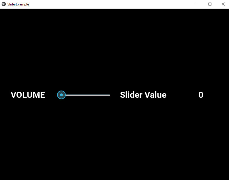
Kivy slider code for Execution
import kivy

kivy.require("1.9.1")

from kivy.app import App

from kivy.uix.gridlayout import GridLayout

from kivy.uix.slider import Slider

from kivy.uix.label import Label

from kivy.properties import NumericProperty

class WidgetContainer(GridLayout):

    def __init__(self, **kwargs):

        super(WidgetContainer, self).__init__(**kwargs)

        self.cols = 4

        self.volumeControl = Slider(min=0, max=100)

        self.add_widget(Label(text='VOLUME', font_size = 30, bold = 40))

        self.add_widget(self.volumeControl)

        self.add_widget(Label(text='Slider Value', font_size = 30, bold = 40))

        self.volumeValue = Label(text='0', font_size = 30, bold = 40)

        self.add_widget(self.volumeValue)

        self.volumeControl.bind(value=self.on_value)

    def on_value(self, instance, volume):

        self.volumeValue.text = "%d" % volume

class SliderExample(App):

    def build(self):

        widgetContainer = WidgetContainer()

        return widgetContainer

root = SliderExample()

root.run()
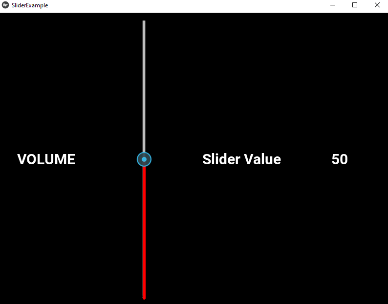
Output
To enhance the appearance and customize the visual aspects of the slider, you can incorporate the below code:
import kivy

kivy.require("1.9.1")

from kivy.app import App

from kivy.uix.gridlayout import GridLayout

from kivy.uix.slider import Slider

from kivy.uix.label import Label

from kivy.properties import NumericProperty

class WidgetContainer(GridLayout):

    def __init__(self, **kwargs):

        super(WidgetContainer, self).__init__(**kwargs)

        self.cols = 4

        self.volumeControl = Slider(min = 0, max = 100,

                                        orientation ='vertical',

                                        value_track = True,

                                        value_track_color = 'red')

        self.add_widget(Label(text='VOLUME', font_size = 30, bold = 40))

        self.add_widget(self.volumeControl)

        self.add_widget(Label(text='Slider Value', font_size = 30, bold = 40))

        self.volumeValue = Label(text='0', font_size = 30, bold = 40)

        self.add_widget(self.volumeValue)

        self.volumeControl.bind(value=self.on_value)

    def on_value(self, instance, volume):

        self.volumeValue.text = "%d" % volume

class SliderExample(App):

    def build(self):

        widgetContainer = WidgetContainer()

        return widgetContainer

root = SliderExample()

root.run()
Output
Example Explanation
In above code, we have created a Kivy app that showcases the usage of the Slider widget with some additional styling and coloring.
First, we import the required modules and set the Kivy version. Then, we define a class called WidgetContainer that inherits from the GridLayout widget. Inside this class, we override the constructor method to customize the layout.
Within the constructor, we set the number of columns for the GridLayout and create a Slider widget called volumeControl. We specify its minimum and maximum values, set the orientation to vertical, enable the value track, and change the color of the value track to red.
Next, we add Labels to display the text ‘VOLUME‘ and ‘Slider Value‘ alongside the Slider widget. We also create a Label called volumeValue to dynamically display the current value of the Slider.
To establish a connection between the Slider and the volumeValue Label, we bind the value property of the Slider to the on_value method. This method updates the volumeValue Label whenever the Slider value changes.
The SliderExample class inherits from the App class provided by Kivy. In the build method, we create an instance of the WidgetContainer class and return it as the root widget of the app.
Finally, we create an object of the SliderExample class and call the run method to start the app.
Kivy Slider Benefits
- The Kivy Slider provides an intuitive and user-friendly way for users to input numerical values or adjust settings within a specified range. It allows users to visually select a value by dragging a thumb along the track, making it easier to provide precise input.
- The Kivy Slider allows you to define a specific range of values that users can select from. This is useful for scenarios where you need to limit input within a certain range, such as volume controls, brightness settings, or data filtering.
- Kivy’s Slider widget offers flexibility in terms of customization. You can adjust various properties such as orientation (horizontal or vertical), track color, thumb appearance, and more. This allows you to tailor the Slider’s visual presentation to match the overall look and feel of your application.
- The Kivy Slider widget supports event handling mechanisms that allow you to respond to value changes. You can bind functions or methods to the Slider’s value property, enabling you to perform actions or update other components in real-time based on the Slider’s current value.
- Since the Kivy Slider provides a dynamic interface element, it is particularly useful for scenarios where values or settings need to be adjusted dynamically. For example, you can use a Slider to control real-time updates, live visualization, or interactive animations based on user input.
- The Kivy Slider widget seamlessly integrates with other Kivy layout widgets, allowing you to incorporate it into complex user interface designs. You can place the Slider within Gridlayouts, Boxlayouts, or other container widgets to create versatile and responsive layouts.
Conclusion
The Kivy Slider widget offers you several advantages when it comes to creating interactive and user-friendly interfaces. You can use its intuitive drag-and-select feature to input precise numerical values or adjust settings within a specified range. Additionally, you have the flexibility to customize its appearance and behavior, including orientation, track color, and thumb style, so that it seamlessly fits into the visual design of your application.
With the Slider’s event handling capabilities, you can easily respond to changes in the Slider’s value and update other components in real-time. This enhances the interactivity of your application and allows for dynamic adjustments, such as real-time updates, visualizations, or interactive animations.
By combining the Slider widget with other Kivy layout widgets, you can create layouts that are versatile and responsive, adapting to user input. Whether you’re working on volume controls, brightness settings, or data filtering mechanisms, the Slider widget offers a convenient and flexible solution to meet your needs.
