Scatter Plot In Python Machine Learning
A complete scatterplot guide with examples is presented on this page in Python ML. We are here to help you achieve your educational goals.
ScatterPlot – What is it?
In scatterplots (also known as scatter charts or scatter graphs), dots represent numerical values.
Data points are represented by dots on the horizontal and vertical axis.
In simple words – a scatter plot depicts the values of the data set as dots.
The scatter plot is used to observe relationships between variables.
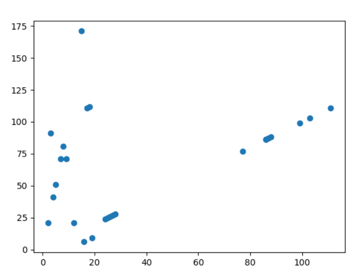
A scatter plot showing a sample of fictional trees’ diameters and heights is shown above.
Dots represent individual trees, and the horizontal positioning of each dot indicates the diameter (in centimeters) and vertical positioning indicates the height (in meters) of each tree.
Using the Matplotlib module, scatter plots can be drawn using two arrays of the same length, one for the values of the x-axis, and one for the values of the y-axis:
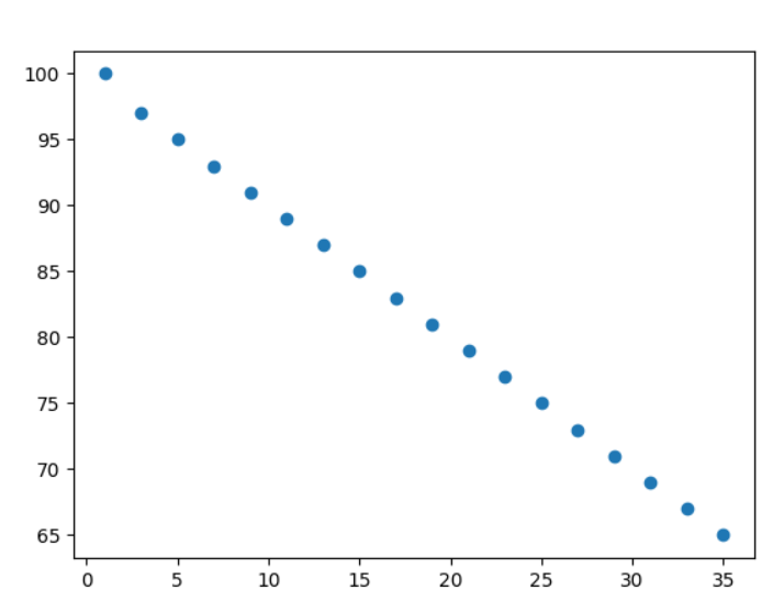
mrx = [1,3,5,7,9,11,13,15,17,19,21,23,25,27,29,31,33,35]
ample = [100,97,95,93,91,89,87,85,83,81,79,77,75,73,71,69,67,65]
Each firm’s age is represented by the mrx array.
Performance of each firm is represented by the ample array.
Example Image:
To draw a scatter plot diagram, use the scatter() method:
Example
Explanation of scatter plots example
Scatterplots have an x-axis that represents years, and a y-axis that indicates performance.
According to the above diagram, the top performing firm is one year old, while the poor performing firm is 35 years old.
Our data suggests that the younger the firm, the better the performance, but this could be a coincidence, considering only 18 firms were registered.
Random Data Distributions
Using scatterplots in machine learning, thousands or even millions of values can be represented in a data set.
It may be necessary to use randomly generated values when testing an algorithm since you may not have real-world data.
We can do that with NumPy, as we’ve learned in the previous chapter.
As an example, let’s create two arrays containing 999 random numbers from a normal distribution.
We will set the mean to 2.0 with a standard deviation of 1.0 for the first array.
In the second array, the mean will be 8.0, and the standard deviation will be 7.0:
Example Image:
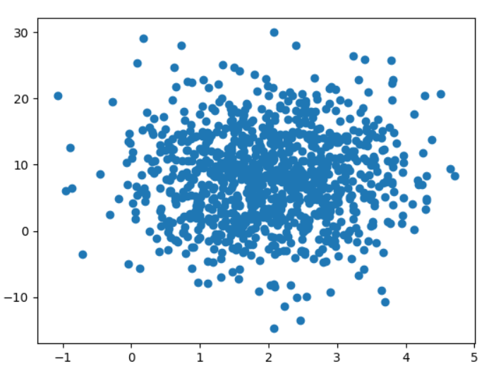
Here is a scatter plot with 999 points:
Example
Random Data Distributions Explained with Scatter Plots
The scatterplot shows that the dots are gathered around the values 2 and 8 on the x-axis and y-axis, respectively.
The y-axis spread is also wider than the x-axis spread.
Scatter plots: when to use them
Observing and illustrating relationships between two numeric variables is the primary use of scatterplots.
Scatter plots not only show individual values, but also patterns that can be seen when all the data are combined.
Adding a trend line to the plot shows the mathematically best fit to the data when using a scatter plot to visualize a predictive or correlational relationship between variables.