Matplotlib Bars
In this article, we’ll dive into the Matplotlib bars, including how to create and customize bar charts, as well as some tips for making your charts more effective.
Bar charts are a great way to display and compare data across categories, and Matplotlib bar chart function makes it easy to create customizable and visually appealing charts.
Creating Bars Chart
Through Pyplot’s bar() function, you can generate bar graphs:
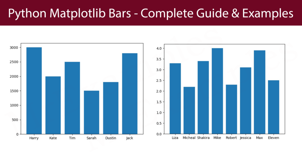
Generate a bar graph of employee data:
Example:
Display the student results with a bar graph:
Example:
As arrays, the first and second arguments describe the types and their data.
Example:
Show the statical data of football leagues with bar() function:
Example:
Matplotlib barh() – Horizontal Bars
You can implement the barh() function if you prefer to visualize the bars horizontally in place of vertically:
In the following employee data example insert six horizontal bars:
Example:
Utilize the barh() function to display the following graph:
Example:
Bar Color
To customize the color of Matplotlib bars, invoke bar() or barh() functions with the keyword argument color:
Assign the magenta color to the following bar graph:
Example:
First apply black color to all bars then set different edge colors on bars:
Example:
Color Names
You can also utlize 140 supported color names which defined in matplotlib Bars document.
Utilize the keyword argument color = ‘Maroon‘:
Example:
Implement ‘Linen’ color on all bars then apply different edge colors to the following bars:
Example:
Color Hex
Alternatively, you can also work with Hexadecimal color values:
Insert five bars with a hexadecimal color ‘#ffb399‘:
Example:
Utilize the linewidth argument along with the edgecolor argument:
Example:
Bar Width
According to Matplotlib bars, the bar() function accepts the keyword argument width to define the width:
In the below example utilize the width argument:
Example:
Assign a particular width to all bars and apply a different color to each bar:
Example:
By default, width is set to 0.8
Bar Height
According to Matplotlib bars, the bar() function accepts the keyword argument height to define the height:
Apply the width argument in the following example:
Example:
Provide a specific width to all bars and implement a distinct color to every bar:
Example:
By default, height is set to 0.8
Example Explanation
In above example we have used Matplotlib library to create a horizontal bar chart that displays the CGPA of eight students. The code does the following:
- It creates an array named student_name that contains the names of the students, and an array named student_cgpa that contains the CGPA of each student.
- It creates an array named c with eight different color values that will be used to color the bars of the horizontal bar chart.
- It uses the barh function of the pyplot module to create the horizontal bar chart. The function takes student_name, student_cgpa, height and color as parameters.
- The height parameter represents the height of the bars, and the color parameter is used to color the bars.
- Finally, the show function of the pyplot module is called to display the bar chart on the screen. The horizontal bar chart shows the CGPA of the eight students with bars of different colors for each student, where the length of the bar indicates the CGPA of the student.
Benefits
Matplotlib bars offer several advantages, which include:
- Matplotlib bars make it easy to visualize data in a simple and understandable format. Bar graphs are especially useful for displaying categorical data as they allow you to see patterns, trends, and comparisons among groups.
- Matplotlib bars are highly customizable. You can modify the colors, widths, and orientations of the bars as well as add labels, titles, and legends to the graph.
- Matplotlib bars are compatible with Python, which is a widely used programming language for data analysis and science. This makes it easy for programmers and data analysts to use the library to create high-quality visualizations.
- Matplotlib bars can be made interactive by using widgets and sliders, allowing users to modify the graph parameters and see the effects in real-time.
- Matplotlib provides a wide range of graph types, including stacked bar graphs, horizontal bar graphs, and grouped bar graphs, making it possible to display data in a variety of formats. This allows for greater flexibility in presenting data and catering to different types of audiences.
Conclusion
Matplotlib bars provide several advantages for data analysis and visualization. They offer a powerful means of presenting categorical data in a straightforward and comprehensible manner, and their flexibility allows for extensive customization to fit varying preferences and requirements. Furthermore, Matplotlib bars integrate well with Python, making them widely used among programmers and data analysts.
The availability of interactive features and a diverse array of graph types further enhances their usefulness, making Matplotlib bars an ideal tool for effectively communicating data insights.