Understanding Matplotlib Histograms
As you explore data analysis, you may come across Matplotlib histograms, which are plots that display the frequency distribution of your dataset. These bar plots use the x-axis to represent the range of values and the y-axis to represent the frequency or count of observations that fall within that range.
As a data analyst, you may find histograms to be a useful graphical representation of your data that displays the frequency distribution of a set of continuous or discrete variables.
They can help you explore the shape, spread, and central tendency of your dataset. Fortunately, you can use Matplotlib, a powerful Python library for data visualization, to create and customize histograms with numerous functions.
If you’re interested in learning more about the benefits and features of Matplotlib histograms, as well as seeing examples of how to use them, this article is for you.
Matplotlib Histogram
When using Matplotlib for data visualization, you can take advantage of the hist() function to create histograms. This function takes your dataset as input, calculates the frequency distribution by dividing it into bins, and generates a bar chart where the height of each bar represents the frequency of data points that fall within that bin.
While Matplotlib offers a range of histogram types, they all serve the same purpose: to illustrate frequency distributions. Specifically, histograms show how often certain values or ranges of values occur within your dataset.
With a histogram, you can easily visualize the number of data points falling within a certain period of time, without needing to interpret raw data values.
Example: If you provide information about the age of the number of patients, you likely get a histogram that looks like this:
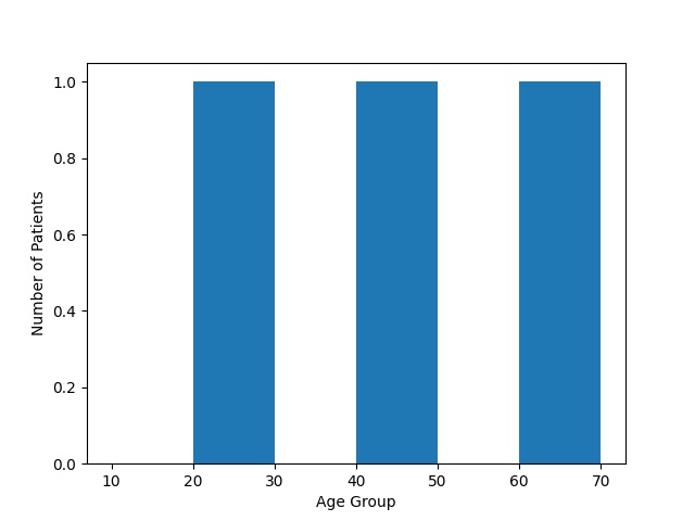
According to the histogram, the probable outcomes is:
- Some patient from 20 to 30 age group
- Some patient from 40 to 50 age group
- Some patient from 60 to 70 age group
Create A Histogram
To create Matplotlib histograms, you can use the hist() function in a way that generates the necessary plot. Specifically, you’ll need to provide the function with an array of numbers, which it will use to construct the histogram.
To make this process more efficient, you can use NumPy to construct an array of 400 values. By default, this array will focus on the number 90, with a standard deviation of 40.
As you continue learning about machine learning, you’ll gain more insight into normal data distribution, which can help you interpret the results of your histograms.
By leveraging NumPy, you can easily calculate the normal distribution of data, providing you with a more comprehensive understanding of your dataset.
Example:
In the following example apply the mean = 320 and standard deviation = 280:
Example:
In Matplotlib histograms, the hist() function takes the array and generates a histogram:
Display the basic histogram.
Example:
Utilize the numpy normal distribution function in below histogram.
Example:
Example Explanation
In the above example, we used Python and the Matplotlib library to generate a histogram plot of a dataset. Here’s a breakdown of each line of code we used:
- First, we imported the Matplotlib library using import matplotlib.pyplot as pt, giving it the shorter alias pt for convenience.
- Next, we imported the NumPy library using import numpy as npy, also giving it a shorter alias of npy.
- To create the dataset, we used NumPy’s random.normal() function, generating 50 random numbers drawn from a normal distribution with a mean of 320 and a standard deviation of 280. We assigned this dataset to the variable mrx.
- Using Matplotlib’s hist() function, we created a histogram plot of the data in mrx.
- Finally, we displayed the resulting histogram plot using pt.show().
Histograms are a helpful way to visually represent data distribution, displaying the count of observations in each interval or “bin” on the y-axis, and the range of data on the x-axis. The bars in the histogram represent the frequency of observations in each bin. In this example, we created a random dataset using NumPy, and generated a histogram plot to display its distribution using Matplotlib.
Matplotlib Histograms Benefits
- Histograms are a useful way to visually represent data distribution. Matplotlib histograms can create clear and informative plots that display the frequency of data points in various intervals or bins.
- Matplotlib histograms are highly customizable, with numerous options available to adjust plot appearance. Users can modify bin size, color, and other parameters to match their requirements.
- Matplotlib histograms work seamlessly with NumPy arrays, allowing users to work with large datasets and analyze complex data structures.
- Matplotlib histograms can accommodate a broad range of data types, including continuous and categorical data, making them a versatile tool for data analysis.
- Matplotlib histograms can be combined with other Matplotlib plots, such as line plots or scatter plots, to create more complex visualizations that reveal deeper insights into data.
- There are many examples and resources available online to help users learn how to use Matplotlib histograms effectively, making it easier to get started with this powerful tool.
Conclusion
Matplotlib histograms are a useful and powerful tool that can visually represent data distribution. They are customizable, work well with NumPy arrays, support various data types, and can be combined with other Matplotlib plots to create more complex visualizations. There are many examples and resources available online, which make Matplotlib histograms an accessible and flexible option for data analysis and visualization.