Matplotlib Pie Charts
Matplotlib Pie charts are an essential feature for visualizing categorical data. They are a great way to represent data in a clear and concise manner
This article aims to examine the merits and characteristics of using Matplotlib pie charts for data visualization, and also demonstrate their practical implementation through examples.
What is a Pie Chart?
A pie chart is a circular graph that is divided into slices to represent numerical proportions of data.
Each slice represents a percentage of the whole, and the size of each slice corresponds to its proportionate value.
Pie charts are commonly used to show categorical data, such as market share, survey results, and demographic data.
Create Pie Charts
If you want to create Matplotlib pie charts with Pyplot, you can implement the pie() function:
Display the basic pie chart:
Example:
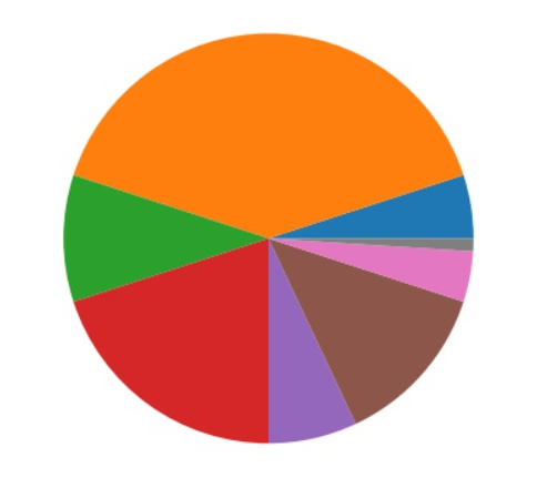
As you can see, Matplotlib pie charts display one wedge for each value in the array (which is [5, 40, 10, 20, 7, 13, 4, 1]).
Normally, plotting begins on the x-axis and proceeds anticlockwise:
The following formula computes the size of each gap by matching its value to all the other values.
Division of a number by its sum: x/sum(x)
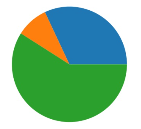
Make a pie chart which holds the array of three values:
Example:
Upon execution of above example, You will get below output:
Matplotlib Pie Charts Labels
Utilizing the label parameter, you can insert labels into the pie chart.
In Matplotlib pie charts, the label parameter should be an array with a single label per section:
Insert the different pie chart sections labels:
Example:
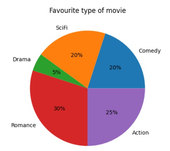
In the following example, show the world’s sports ratio:
Example:

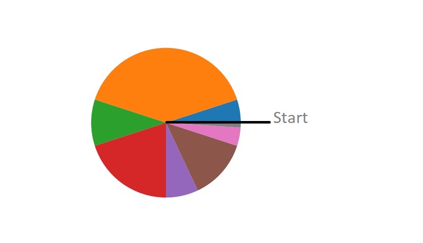
Start Angle
By providing a startangle parameter, you can modify the default start angle on the x-axis.
In degrees, the startangle parameter is configured with an angle of 0 as the default:
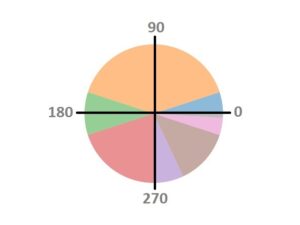
At 180 degrees, begin the first wedge as follows:
Example:

Begin the first section of the following pie chart at 45 degrees:
Example:

Explode
Would you like one of the wedges to stand out?
According to Matplotlib pie charts, you can do that through the explode parameter.
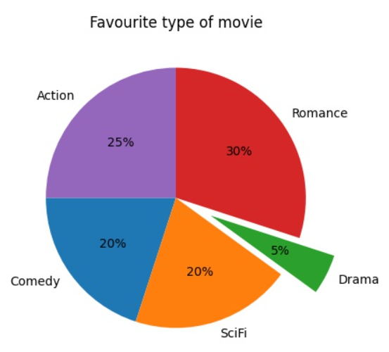
There should be a value for each wedge in the explode parameter, if the parameter is defined and not None.
The values indicate how a distance each segment is from the center:
In the pie chart, drag the “Drama” wedge 0.3 from the center:
Example:
From the center of the pie chart, drag the various sections with the explode argument:
Example:

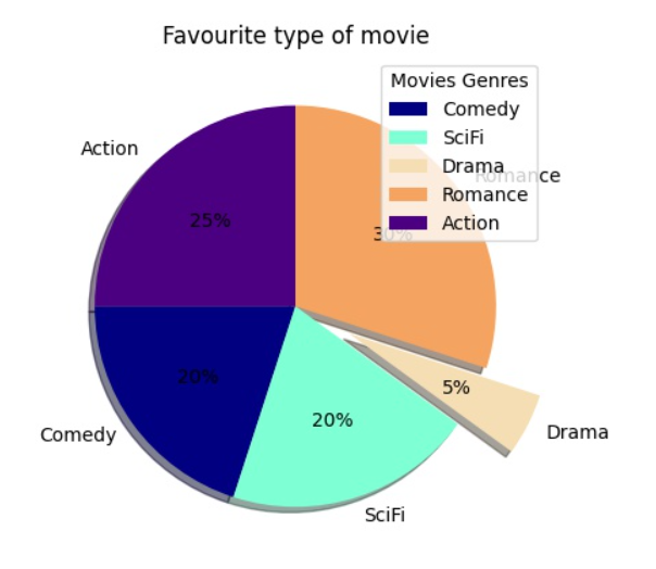
Shadow
Specify the shadows attribute to True to apply a shadow to the pie chart:

In the below example insert the shadow into the pie chart:
Example:
Utilize the shadow = True to apply shadow to the following pie chart:
Example:

Colors
Utilizing the colors parameter, you can customize the color of each segment.
Colors should be an array with single value for each segment, if provided:

For each segment of a pie chart assign a different color:
Example:
Utilizing a color attribute to insert a light colors into a pie chart:
Example:
There are three options available to select colors: hexadecimal color values, any of the 140 color names that are supported, or one of the provided shortcuts.
'r' – Red
'g' – Green
'b' – Blue
'c' – Cyan
'm' – Magenta
'y' – Yellow
'k' – Black
'w' – White
Legend()
By calling the legend() function, you can provide a description for each segment:

Apply the legend() function in the below example:
Example:
Insert a legend to the following sports pie chart:
Example:
Legend With Header
In Matplotlib pie charts, provide the title parameter to the legend function to include a header.
Implement the legend() function and insert the title argument:
Example:
Set the font weight to bold for the following pie chart legend title:
Example:
Example Explanation
The following points explain the above example that uses Matplotlib to create a pie chart visualization and add a legend to it:
- First we have import Matplotlib and NumPy libraries and renames them for convenience.
- A NumPy array called “percentage” is created that contains the percentages of different sports.
- A list called “mrx_labels” is created that contains the labels for each segment of the pie chart.
- A list called “mrx_explode” is created that contains the degree of separation of each segment of the pie chart.
- A list called “mrx_colors” is created that contains the colors to use for each segment of the pie chart.
- The title of the pie chart is set to “Most Popular Sports“.
- The pie chart is created using the pie() function of Matplotlib, where percentage parameter contains the values for each segment of the chart, the labels parameter contains the labels for each segment, and other parameters set various attributes of the chart.
- A legend is created for the pie chart using the legend() function of Matplotlib.
- The title of the legend is set to “Top 5 Sports” and made bold.
- The pie chart with the legend is displayed.
Benefits
Matplotlib Pie Charts offer several advantages, such as:
- They provide an efficient way to present data consisting of parts that make up a whole, illustrating proportions and percentages in a clear and understandable manner.
- Generating a pie chart using Matplotlib is relatively simple, requiring only a few lines of code.
- Matplotlib Pie Charts offer a high degree of customization, allowing you to modify the colors, labels, and other elements of the chart to match your needs.
- Pie charts are useful for comparing the proportions of different categories or segments of data, which can help identify trends or patterns.
- Pie charts are most effective when used to display small data sets with few categories. Including too many categories can cause the chart to become cluttered and difficult to understand.
Conclusion
Matplotlib Pie Charts are a popular choice for data visualization due to their numerous benefits. They provide an effective means of illustrating proportions and percentages in a comprehensible manner. Additionally, they are easily created with minimal code, highly customizable, suitable for comparing different data categories, and ideal for displaying small data sets with fewer categories. These advantages make Matplotlib Pie Charts an excellent tool for researchers and data analysts who want to present their findings in a visually appealing and informative way.