Quick Guide To Grid Auto Columns
The topic of discussion in this article is grid auto columns in Tailwind CSS. This class is used to set the size of columns in a grid that are not explicitly defined.
More precisely, the size of the columns of implicitly generated grid containers.
It is an alternative to the CSS grid-auto-columns property.
On the other hand, “grid template rows” class is used to explicitly define the columns of the grid by specifying their size.
Table Of Content-
Grid Auto columns Classes
| Classes | Overview |
| auto-cols-auto | This class sets up a grid so that the size of the columns is determined automatically based on the content of the cells. |
| auto-cols-min | Based on the content of the cells, the minimum size of columns in a grid is automatically determined. |
| auto-cols-max | The maximum column size in a grid is automatically determined by the content of the cells using this class. |
| auto-cols-fr | Using this utility class, we can set the column size of a grid automatically according to the remaining space, using a fraction unit (fr). |
Grid Auto column – auto-cols-auto
Syntax
<element class="auto-cols-auto">..</element>
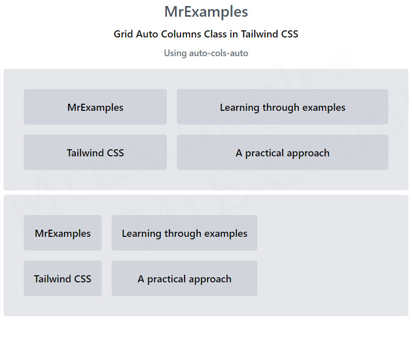
The below example is used to explore the auto-cols-auto utility class in Tailwind CSS:
Example:
<!DOCTYPE html>
<html>
<head>
<script src="https://cdn.tailwindcss.com"></script>
</head>
<body class="text-center">
<h1 class="text-gray-600 text-2xl font-semibold">
MrExamples
</h1>
<p class="font-medium my-2">Grid Auto Columns Class in Tailwind CSS</p>
<p class="font-medium my-2 text-sm text-gray-500">Using auto-cols-auto</p>
<div class="m-4 p-8 grid bg-gray-200 grid-rows-2
grid-flow-col gap-4 auto-cols-auto rounded font-medium">
<div class="p-4 bg-gray-300 rounded">
MrExamples
</div>
<div class="p-4 bg-gray-300 rounded">
Tailwind CSS
</div>
<div class="p-4 bg-gray-300 rounded">
Learning through examples
</div>
<div class="p-4 bg-gray-300 rounded">
A practical approach
</div>
</div>
</body>
</html>
Grid Auto column – auto-cols-min
Syntax
<element class="auto-cols-min">..</element>
The below example showcases the implementation of auto-cols-min class in Tailwind:
Example:
<!DOCTYPE html>
<html>
<head>
<script src="https://cdn.tailwindcss.com"></script>
</head>
<body class="text-center">
<h1 class="text-gray-600 text-2xl font-semibold">
MrExamples
</h1>
<p class="font-medium my-2">Grid Auto Columns Class in Tailwind CSS</p>
<p class="font-medium my-2 text-sm text-gray-500">Using auto-cols-min</p>
<div class="m-4 p-8 grid bg-gray-200 grid-rows-2
grid-flow-col gap-4 auto-cols-min rounded font-medium">
<div class="p-4 bg-gray-300 rounded">
MrExamples
</div>
<div class="p-4 bg-gray-300 rounded">
Tailwind CSS
</div>
<div class="p-4 bg-gray-300 rounded">
Learning through examples
</div>
<div class="p-4 bg-gray-300 rounded">
A practical approach
</div>
</div>
</body>
</html>
Grid Auto column – auto-cols-max
Syntax
<element class="auto-cols-max">..</element>
Here is a brief example covering the auto-cols-max class in Tailwind:
Example:
<!DOCTYPE html>
<html>
<head>
<script src="https://cdn.tailwindcss.com"></script>
</head>
<body class="text-center">
<h1 class="text-gray-600 text-2xl font-semibold">
MrExamples
</h1>
<p class="font-medium my-2">Grid Auto Columns Class in Tailwind CSS</p>
<p class="font-medium my-2 text-sm text-gray-500">Using auto-cols-max</p>
<div class="m-4 p-8 grid bg-gray-200 grid-rows-2
grid-flow-col gap-4 auto-cols-max rounded font-medium">
<div class="p-4 bg-gray-300 rounded">
MrExamples
</div>
<div class="p-4 bg-gray-300 rounded">
Tailwind CSS
</div>
<div class="p-4 bg-gray-300 rounded">
Learning through examples
</div>
<div class="p-4 bg-gray-300 rounded">
A practical approach
</div>
</div>
</body>
</html>
Tailwind – auto-cols-fr
Syntax
<element class="auto-cols-fr">..</element>
Here is a sample of how Tailwind CSS uses auto-cols-fr to display columns:
Example:
<!DOCTYPE html>
<html>
<head>
<script src="https://cdn.tailwindcss.com"></script>
</head>
<body class="text-center">
<h1 class="text-gray-600 text-2xl font-semibold">
MrExamples
</h1>
<p class="font-medium my-2">Grid Auto Columns Class in Tailwind CSS</p>
<p class="font-medium my-2 text-sm text-gray-500">Using auto-cols-fr</p>
<div class="m-4 p-8 grid bg-gray-200 grid-rows-2
grid-flow-col gap-4 auto-cols-fr rounded font-medium">
<div class="p-4 bg-gray-300 rounded">
MrExamples
</div>
<div class="p-4 bg-gray-300 rounded">
Tailwind CSS
</div>
<div class="p-4 bg-gray-300 rounded">
Learning through examples
</div>
<div class="p-4 bg-gray-300 rounded">
A practical approach
</div>
</div>
</body>
</html>
We value your feedback.
+1
+1
+1
+1
+1
+1
+1
