Tailwind Gap
As the title suggests, the focus of this article will be Tailwind gap class with examples.
Tailwind CSS provides the “gap” class, which is a utility class that helps add space between items in a grid or flexbox.
This class is frequently used with the “grid” or “flex” classes to build responsive layouts with consistent spacing between elements.
Tailwind gap class has separate classes for horizontal and vertical spacing.
Tailwind Gap classes
| Classes | Overview |
| gap-0 | This class removes any gaps between grid or flexbox items. |
| gap-x-0 | It sets the spacing between grid or flexbox items to 0 only in the horizontal direction. |
| gap-y-0 | It sets the spacing between grid or flexbox items to 0 only in the vertical direction. |
| gap-px | This class is used to set the spacing between grid or flexbox items to 1px. |
| gap-x-px | This class is used to set the horizontal spacing between grid or flexbox items to 1px. |
| gap-y-px | This class is used to set the vertical spacing between grid or flexbox items to 1px. |
| gap-0.5 | The spacing between grid or flexbox items to 0.125 rem or 2px. |
| gap-x-0.5 | The horizontal spacing between grid or flexbox items to 0.125 rem or 2px. |
| gap-y-0.5 | The vertical spacing between grid or flexbox items to 0.125 rem or 2px. |
| gap-1 | This class adds a gap of 0.25rem (4px) between grid or flexbox items. |
| gap-x-1 | This class adds a horizontal gap of 0.25rem (4px) between grid or flexbox items. |
| gap-y-1 | This class adds a vertical gap of 0.25rem (4px) between grid or flexbox items. |
| gap-1.5 | Used to set the spacing between grid or flexbox items to 0.375rem (6px). |
| gap-x-1.5 | Used to set the horizontal spacing between grid or flexbox items to 0.375rem (6px). |
| gap-y-1.5 | Used to set the vertical spacing between grid or flexbox items to 0.375rem (6px). |
| gap-2 | In this case, the gap between grid or flexbox items is set to a value of 0.5rem (8px). |
| gap-x-2 | In this case, the horizontal gap between grid or flexbox items is set to a value of 0.5rem (8px). |
| gap-y-2 | In this case, the vertical gap between grid or flexbox items is set to a value of 0.5rem (8px). |
| gap-2.5 | The purpose of this class is to set the spacing between grid or flexbox items to 0.625rem (10px). |
| gap-x-2.5 | The purpose of this class is to set the horizontal spacing between grid or flexbox items to 0.625rem (10px). |
| gap-y-2.5 | The purpose of this class is to set the vertical spacing between grid or flexbox items to 0.625rem (10px). |
| gap-3 | In this class, the gap between grid or flexbox items is set to 0.75rem (12px). |
| gap-x-3 | In this class, the horizontal gap between grid or flexbox items is set to 0.75rem (12px). |
| gap-y-3 | In this class, the vertical gap between grid or flexbox items is set to 0.75rem (12px). |
| gap-3.5 | This class makes sure that the spacing between grid or flexbox items is 0.875rem (14px). |
| gap-x-3.5 | This class makes sure that the horizontal spacing between grid or flexbox items is 0.875rem (14px). |
| gap-y-3.5 | This class makes sure that the vertical spacing between grid or flexbox items is 0.875rem (14px). |
| gap-4 | This class ensures that the gap between grid or flexbox items is 1rem (16px). |
| gap-x-4 | This class ensures that the horizontal gap between grid or flexbox items is 1rem (16px). |
| gap-y-4 | This class ensures that the vertical gap between grid or flexbox items is 1rem (16px). |
| gap-5 | This class defines the spacing between grid or flexbox items to 1.25rem (20px). |
| gap-x-5 | This class defines the horizontal spacing between grid or flexbox items to 1.25rem (20px). |
| gap-y-5 | This class defines the vertical spacing between grid or flexbox items to 1.25rem (20px). |
| gap-6 | The spacing between grid or flexbox items is defined as 1.5 rem (24px). |
| gap-x-6 | The horizontal spacing between grid or flexbox items is defined as 1.5 rem (24px). |
| gap-y-6 | The vertical spacing between grid or flexbox items is defined as 1.5 rem (24px). |
| gap-7 | The flexbox or grid spacing is defined as 1.75 rem (28px). |
| gap-x-7 | The flexbox or grid horizontal spacing is defined as 1.75 rem (28px). |
| gap-y-7 | The flexbox or grid vertical spacing is defined as 1.75 rem (28px). |
| gap-8 | Grid and flexbox items are separated by 2rem (32px) using this class. |
| gap-x-8 | Grid and flexbox items are horizontally separated by 2rem (32px) using this class. |
| gap-y-8 | Grid and flexbox items are vertically separated by 2rem (32px) using this class. |
| gap-9 | Used to set the spacing between grid or flexbox items to 2.25rem (36px). |
| gap-x-9 | Used to set the horizontal spacing between grid or flexbox items to 2.25rem (36px). |
| gap-y-9 | Used to set the vertical spacing between grid or flexbox items to 2.25rem (36px). |
| gap-10 | The aim of this class is to adjust the gap between grid or flexbox items to 2.5rem (40px). |
| gap-x-10 | The aim of this class is to adjust the horizontal gap between grid or flexbox items to 2.5rem (40px). |
| gap-y-10 | The aim of this class is to adjust the vertical gap between grid or flexbox items to 2.5rem (40px). |
| gap-11 | In this case, the spacing between grid or flexbox items is specified at 2.5rem (40px). |
| gap-x-11 | In this case, the horizontal spacing between grid or flexbox items is specified at 2.5rem (40px). |
| gap-y-11 | In this case, the vertical spacing between grid or flexbox items is specified at 2.5rem (40px). |
| gap-12 | This class is responsible for setting the spacing between grid or flexbox items to 3rem (48px). |
| gap-x-12 | This class is responsible for setting the horizontal spacing between grid or flexbox items to 3rem (48px). |
| gap-y-12 | This class is responsible for setting the vertical spacing between grid or flexbox items to 3rem (48px). |
| gap-14 | This class adds a gap of 3.5rem (56px) to grid or flexbox items. |
| gap-x-14 | This class adds a horizontal gap of 3.5rem (56px) to grid or flexbox items. |
| gap-y-14 | This class adds a vertical gap of 3.5rem (56px) to grid or flexbox items. |
| gap-16 | Used to set the spacing between grid or flexbox items to 4rem (64px). |
| gap-x-16 | Used to set the horizontal spacing between grid or flexbox items to 4rem (64px). |
| gap-y-16 | Used to set the vertical spacing between grid or flexbox items to 4rem (64px). |
| gap-20 | The spacing between grid or flexbox items 5rem or 80px. |
| gap-x-20 | The horizontal spacing between grid or flexbox items 5rem or 80px. |
| gap-y-20 | The vertical spacing between grid or flexbox items 5rem or 80px. |
| gap-24 | Using this class, the spacing between grid or flexbox items is set to 6rem (96px). |
| gap-x-24 | Using this class, the horizontal spacing between grid or flexbox items is set to 6rem (96px). |
| gap-y-24 | Using this class, the vertical spacing between grid or flexbox items is set to 6rem (96px). |
| gap-28 | This class is used to set the spacing between grid or flexbox items to 7rem or 112px. |
| gap-x-28 | This class is used to set the horizontal spacing between grid or flexbox items to 7rem or 112px. |
| gap-y-28 | This class is used to set the vertical spacing between grid or flexbox items to 7rem or 112px. |
| gap-32 | Grid and flexbox items are separated by 8rem (128px) using this class. |
| gap-x-32 | Grid and flexbox items are horizontally separated by 8rem (128px) using this class. |
| gap-y-32 | Grid and flexbox items are vertically separated by 8rem (128px) using this class. |
| gap-36 | The purpose of this class is to set the spacing between grid or flexbox items to 9rem (144px). |
| gap-x-36 | The purpose of this class is to set the horizontal spacing between grid or flexbox items to 9rem (144px). |
| gap-y-36 | The purpose of this class is to set the vertical spacing between grid or flexbox items to 9rem (144px). |
| gap-40 | A gap of 10rem (160px) is added between the grid and flexbox items. |
| gap-x-40 | A horizontal gap of 10rem (160px) is added between the grid and flexbox items. |
| gap-y-40 | A vertical gap of 10rem (160px) is added between the grid and flexbox items. |
| gap-44 | Using this class, the gap between grid or flexbox items is set to 11rem (176px). |
| gap-x-44 | Using this class, the horizontal gap between grid or flexbox items is set to 11rem (176px). |
| gap-y-44 | Using this class, the vertical gap between grid or flexbox items is set to 11rem (176px). |
| gap-48 | In grid or flexbox items, this class adds 12rem (192px) of spacing. |
| gap-x-48 | In grid or flexbox items, this class adds 12rem (192px) of horizontal spacing. |
| gap-y-48 | In grid or flexbox items, this class adds 12rem (192px) of vertical spacing. |
| gap-52 | This class is responsible for setting the spacing between grid or flexbox items to 13rem (208px). |
| gap-x-52 | This class is responsible for setting the horizontal spacing between grid or flexbox items to 13rem (208px). |
| gap-y-52 | This class is responsible for setting the vertical spacing between grid or flexbox items to 13rem (208px). |
| gap-56 | This class is used to set the spacing between grid or flex items to 14rem (224px). |
| gap-x-56 | This class is used to set the horizontal spacing between grid or flex items to 14rem (224px). |
| gap-y-56 | This class is used to set the vertical spacing between grid or flex items to 14rem (224px). |
| gap-60 | It sets the spacing between grid or flex items to 15rem (240px). |
| gap-x-60 | It sets the horizontal spacing between grid or flex items to 15rem (240px). |
| gap-y-60 | It sets the vertical spacing between grid or flex items to 15rem (240px). |
| gap-64 | The gap between the flex or grid items is defined as 16rem (256px). |
| gap-x-64 | The horizontal gap between the flex or grid items is defined as 16rem (256px). |
| gap-y-64 | The vertical gap between the flex or grid items is defined as 16rem (256px). |
| gap-72 | In this case, the spacing between the flexbox and grid items is defined as 18rem (288px). |
| gap-x-72 | In this case, the horizontal spacing between the flexbox and grid items is defined as 18rem (288px). |
| gap-y-72 | In this case, the vertical spacing between the flexbox and grid items is defined as 18rem (288px). |
| gap-80 | This class defines the separation between the items in a flexbox or grid container to 20rem (320px). |
| gap-x-80 | This class defines the horizontal separation between the items in a flexbox or grid container to 20rem (320px). |
| gap-y-80 | This class defines the vertical separation between the items in a flexbox or grid container to 20rem (320px). |
| gap-96 | The goal of this class is to separate the grid or flexbox items by 24rem (384px). |
| gap-x-96 | The goal of this class is to horizontally separate the grid or flexbox items by 24rem (384px). |
| gap-y-96 | The goal of this class is to vertically separate the grid or flexbox items by 24rem (384px). |
| gap-number | This is used to apply spacing both horizontally and vertically according to the number used. |
Syntax
<element class="gap-number"> </element>
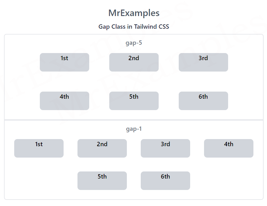
This example illustrates the usage of gap-5 and gap-1 classes in Tailwind:
Example:
<!DOCTYPE html>
<html>
<head>
<script src="https://cdn.tailwindcss.com"></script>
</head>
<body class="text-center">
<h1 class="text-gray-600 text-2xl font-semibold">
MrExamples
</h1>
<p class="font-medium my-2 text-slate-800">Gap Class in Tailwind CSS</p>
<div class="font-medium p-2 border-2 rounded-t-md">
<h1 class="text-gray-500">gap-5</h1>
<div class="flex justify-center gap-5 flex-wrap">
<div class="bg-gray-300 rounded-lg m-4 w-32 h-12">1st</div>
<div class="bg-gray-300 rounded-lg m-4 w-32 h-12">2nd</div>
<div class="bg-gray-300 rounded-lg m-4 w-32 h-12">3rd</div>
<div class="bg-gray-300 rounded-lg m-4 w-32 h-12">4th</div>
<div class="bg-gray-300 rounded-lg m-4 w-32 h-12">5th</div>
<div class="bg-gray-300 rounded-lg m-4 w-32 h-12">6th</div>
</div>
</div>
<div class="font-medium p-2 border-2 rounded-b-md">
<h1 class="text-gray-500">gap-1</h1>
<div class="flex justify-center gap-1 flex-wrap">
<div class="bg-gray-300 rounded-lg m-4 w-32 h-12">1st</div>
<div class="bg-gray-300 rounded-lg m-4 w-32 h-12">2nd</div>
<div class="bg-gray-300 rounded-lg m-4 w-32 h-12">3rd</div>
<div class="bg-gray-300 rounded-lg m-4 w-32 h-12">4th</div>
<div class="bg-gray-300 rounded-lg m-4 w-32 h-12">5th</div>
<div class="bg-gray-300 rounded-lg m-4 w-32 h-12">6th</div>
</div>
</div>
</body>
</html>
Tailwind gap-x-number
Using this class the spacing would only be applied horizontally.
Syntax
<element class="gap-x-number"> </element>
The example below provides an implementation of the gap-x-5 and gap-x-1 classes in Tailwind:
Example:
<!DOCTYPE html>
<html>
<head>
<script src="https://cdn.tailwindcss.com"></script>
</head>
<body class="text-center">
<h1 class="text-gray-600 text-2xl font-semibold">
MrExamples
</h1>
<p class="font-medium my-2 text-slate-800">Gap Class in Tailwind CSS</p>
<div class="font-medium p-2 border-2 rounded-t-md">
<h1 class="text-gray-500">gap-x-5</h1>
<div class="flex justify-center gap-x-5 flex-wrap">
<div class="bg-gray-300 rounded-lg m-4 w-32 h-12">1st</div>
<div class="bg-gray-300 rounded-lg m-4 w-32 h-12">2nd</div>
<div class="bg-gray-300 rounded-lg m-4 w-32 h-12">3rd</div>
<div class="bg-gray-300 rounded-lg m-4 w-32 h-12">4th</div>
<div class="bg-gray-300 rounded-lg m-4 w-32 h-12">5th</div>
<div class="bg-gray-300 rounded-lg m-4 w-32 h-12">6th</div>
</div>
</div>
<div class="font-medium p-2 border-2 rounded-b-md">
<h1 class="text-gray-500">gap-x-1</h1>
<div class="flex justify-center gap-x-1 flex-wrap">
<div class="bg-gray-300 rounded-lg m-4 w-32 h-12">1st</div>
<div class="bg-gray-300 rounded-lg m-4 w-32 h-12">2nd</div>
<div class="bg-gray-300 rounded-lg m-4 w-32 h-12">3rd</div>
<div class="bg-gray-300 rounded-lg m-4 w-32 h-12">4th</div>
<div class="bg-gray-300 rounded-lg m-4 w-32 h-12">5th</div>
<div class="bg-gray-300 rounded-lg m-4 w-32 h-12">6th</div>
</div>
</div>
</body>
</html>
Tailwind gap-y-number
Using this utility the spacing would only be applied vertically.
Syntax
<element class="gap-y-number"> </element>
Here’s an example that demonstrates the operation of gap-y-5 and gap-y-1 classes in Tailwind:
Example:
<!DOCTYPE html>
<html>
<head>
<script src="https://cdn.tailwindcss.com"></script>
</head>
<body class="text-center">
<h1 class="text-gray-600 text-2xl font-semibold">
MrExamples
</h1>
<p class="font-medium my-2 text-slate-800">Gap Class in Tailwind CSS</p>
<div class="font-medium p-2 border-2 rounded-t-md">
<h1 class="text-gray-500">gap-y-5</h1>
<div class="flex justify-center gap-y-5 flex-wrap">
<div class="bg-gray-300 rounded-lg m-4 w-32 h-12">1st</div>
<div class="bg-gray-300 rounded-lg m-4 w-32 h-12">2nd</div>
<div class="bg-gray-300 rounded-lg m-4 w-32 h-12">3rd</div>
<div class="bg-gray-300 rounded-lg m-4 w-32 h-12">4th</div>
<div class="bg-gray-300 rounded-lg m-4 w-32 h-12">5th</div>
<div class="bg-gray-300 rounded-lg m-4 w-32 h-12">6th</div>
</div>
</div>
<div class="font-medium p-2 border-2 rounded-b-md">
<h1 class="text-gray-500">gap-y-1</h1>
<div class="flex justify-center gap-y-1 flex-wrap">
<div class="bg-gray-300 rounded-lg m-4 w-32 h-12">1st</div>
<div class="bg-gray-300 rounded-lg m-4 w-32 h-12">2nd</div>
<div class="bg-gray-300 rounded-lg m-4 w-32 h-12">3rd</div>
<div class="bg-gray-300 rounded-lg m-4 w-32 h-12">4th</div>
<div class="bg-gray-300 rounded-lg m-4 w-32 h-12">5th</div>
<div class="bg-gray-300 rounded-lg m-4 w-32 h-12">6th</div>
</div>
</div>
</body>
</html>
We value your feedback.
+1
+1
+1
+1
+1
+1
+1
