Grid Template Rows In Tailwind CSS
In this article, we will examine grid template rows property in Tailwind CSS, including its syntax, classes, and practical examples.
The grid-rows utility class in Tailwind CSS is used to set the number of rows for a CSS grid.
The number of rows is set by the number defined in the class. By default, the grid-row class will create a fixed number of rows, which means that if you have more items than rows, the excess items will overflow.
Syntax
The syntax of the grid template rows property is as follows:
<element class="grid grid-rows-number"> </element>
Grid Template Rows Classes
| Classes |
Overview |
| grid-rows-1 |
This class defines the number of rows in a grid container as 1. |
| grid-rows-2 |
Grid containers using this class consist of two rows. |
| grid-rows-3 |
A grid container with three rows is defined using this class. |
| grid-rows-4 |
Using this class, you can create grid containers with four rows. |
| grid-rows-5 |
The grid containers using this class are composed of five rows. |
| grid-rows-6 |
A grid container using this class will be able to contain six rows. |
| grid-rows-none |
As the name suggests, this class is used to remove the explicit definition of grid rows from an element. As a result, it takes up the whole container’s height. |
Note: This property can only be used on grid containers; therefore, it can only be used alongside the grid class.
This utility will not work without the grid class.
Let’s explore the working of grid-rows-2 and grid-rows-3 classes in Tailwind using an example:
<!DOCTYPE html>
<html><head>
<script src="https://cdn.tailwindcss.com"></script>
</head>
<body class="text-center">
<h1 class="text-gray-600 text-2xl font-semibold">
MrExamples
</h1>
<p class="font-medium my-2">Using grid-rows class in Tailwind CSS</p>
<p class="font-medium my-4 text-gray-500 text-sm">Using grid-rows-2</p>
<div class="grid grid-rows-2 grid-flow-col gap-2 font-medium">
<div class="bg-gray-300 w-30 h-10">1st</div>
<div class="bg-gray-300 w-30 h-10">2nd</div>
<div class="bg-gray-300 w-30 h-10">3rd</div>
<div class="bg-gray-300 w-30 h-10">4th</div>
<div class="bg-gray-300 w-30 h-10">5th</div>
<div class="bg-gray-300 w-30 h-10">6th</div>
<div class="bg-gray-300 w-30 h-10">7th</div>
<div class="bg-gray-300 w-30 h-10">8th</div>
</div>
<p class="font-medium mt-8 mb-4 text-gray-500 text-sm">Using grid-rows-3</p>
<div class="grid grid-rows-3 grid-flow-col gap-2 font-medium">
<div class="bg-gray-300 w-30 h-10">1st</div>
<div class="bg-gray-300 w-30 h-10">2nd</div>
<div class="bg-gray-300 w-30 h-10">3rd</div>
<div class="bg-gray-300 w-30 h-10">4th</div>
<div class="bg-gray-300 w-30 h-10">5th</div>
<div class="bg-gray-300 w-30 h-10">6th</div>
<div class="bg-gray-300 w-30 h-10">7th</div>
<div class="bg-gray-300 w-30 h-10">8th</div>
</div>
</body>
</html>
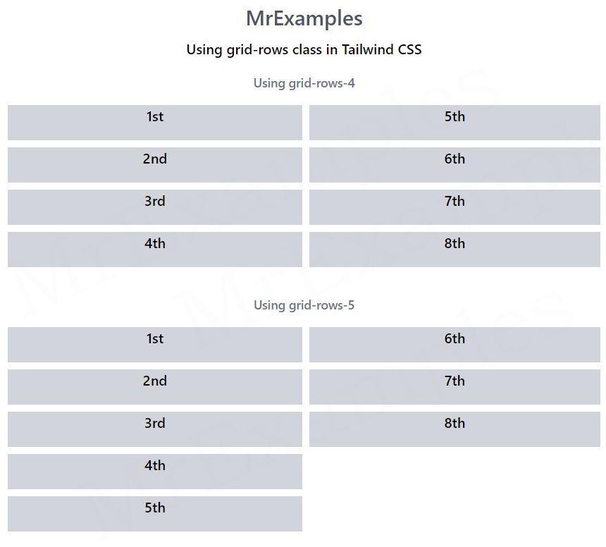
The following example portrays the application of grid-rows-4 and grid-rows-5 classes in Tailwind:
<!DOCTYPE html>
<html><head>
<script src="https://cdn.tailwindcss.com"></script>
</head>
<body class="text-center">
<h1 class="text-gray-600 text-2xl font-semibold">
MrExamples
</h1>
<p class="font-medium my-2">Using grid-rows class in Tailwind CSS</p>
<p class="font-medium my-4 text-gray-500 text-sm">Using grid-rows-4</p>
<div class="grid grid-rows-4 grid-flow-col gap-2 font-medium">
<div class="bg-gray-300 w-30 h-10">1st</div>
<div class="bg-gray-300 w-30 h-10">2nd</div>
<div class="bg-gray-300 w-30 h-10">3rd</div>
<div class="bg-gray-300 w-30 h-10">4th</div>
<div class="bg-gray-300 w-30 h-10">5th</div>
<div class="bg-gray-300 w-30 h-10">6th</div>
<div class="bg-gray-300 w-30 h-10">7th</div>
<div class="bg-gray-300 w-30 h-10">8th</div>
</div>
<p class="font-medium mt-8 mb-4 text-gray-500 text-sm">Using grid-rows-5</p>
<div class="grid grid-rows-5 grid-flow-col gap-2 font-medium">
<div class="bg-gray-300 w-30 h-10">1st</div>
<div class="bg-gray-300 w-30 h-10">2nd</div>
<div class="bg-gray-300 w-30 h-10">3rd</div>
<div class="bg-gray-300 w-30 h-10">4th</div>
<div class="bg-gray-300 w-30 h-10">5th</div>
<div class="bg-gray-300 w-30 h-10">6th</div>
<div class="bg-gray-300 w-30 h-10">7th</div>
<div class="bg-gray-300 w-30 h-10">8th</div>
</div>
</body>
</html>
Conclusion
The grid template rows property in Tailwind CSS provides a powerful tool for creating responsive and customizable grid layouts.
With its intuitive syntax and range of utility classes, you can create complex grid layouts quickly and easily.
By using Tailwind’s grid template rows property, you can streamline your workflow and create beautiful, responsive user interfaces with minimal CSS code.
