Justify Content In Tailwind CSS
In this article, we’ll examine Tailwind Justify Content with examples, how it works, and how it can be used to create professional-looking designs.
In traditional CSS, justify-content is a property used to align items along the main axis in a flex or grid container.
This property is applied to the flex container or grid container, not the individual flex items or grid cells.
In Tailwind, there are utility classes for justify-content that make it easy to align items in a grid or flex container.
Tailwind justify content property can be applied to any container element using the justify- prefix followed by a value.
Tailwind Justify Content Classes
| Classes |
Overview |
| justify-start |
This class aligns flex items to the start of the container. |
| justify-end |
Flex items are aligned to the container’s end using this class. |
| justify-center |
A container’s flex items are centered along its main axis by this class. |
| justify-between |
The flex items are distributed evenly along the main axis, with the first item at the start and the last item at the end. |
| justify-around |
Flex items are distributed evenly along the main axis, but equal space is left around each item. |
| justify-evenly |
Using this class, flex items are distributed evenly along the main axis, with equal spacing between them. |
Tailwind Justify Start
The justify-start is a class in Tailwind that sets the horizontal alignment of flex container items to the start of the container.
Syntax
<element class="justify-start">...</element>
Below is a sample code demonstrating the justify-start class in Tailwind:
<!DOCTYPE html>
<html>
<head>
<script src="https://cdn.tailwindcss.com"></script>
</head>
<body class="text-center">
<h1 class="text-gray-600 text-2xl font-semibold">
MrExamples
</h1>
<p class="font-medium text-slate-800 my-3">Justify Content in Tailwind</p>
<p class="font-medium text-gray-500 text-sm my-3">Using justify-start class</p>
<div class="flex justify-start flex-row font-medium">
<div class="bg-rose-600 w-24 h-12">1st</div>
<div class="bg-rose-500 w-24 h-12">2nd</div>
<div class="bg-rose-400 w-24 h-12">3rd</div>
</div>
</body>
</html>
Tailwind Justify End
The justify-end class in Tailwind is a utility class that aligns the contents of a flex container horizontally to the end of the container.
Syntax
<element class="justify-end">...</element>
The following example provides a demo of justify-end class in Tailwind:
<!DOCTYPE html>
<html>
<head>
<script src="https://cdn.tailwindcss.com"></script>
</head>
<body class="text-center">
<h1 class="text-gray-600 text-2xl font-semibold">
MrExamples
</h1>
<p class="font-medium text-slate-800 my-3">Justify Content in Tailwind</p>
<p class="font-medium text-gray-500 text-sm my-3">Using justify-end class</p>
<div class="flex justify-end flex-row font-medium">
<div class="bg-rose-600 w-24 h-12">1st</div>
<div class="bg-rose-500 w-24 h-12">2nd</div>
<div class="bg-rose-400 w-24 h-12">3rd</div>
</div>
</body>
</html><html>
<head>
<script src="https://cdn.tailwindcss.com"></script>
</head>
<body class="text-center">
<h1 class="text-gray-600 text-2xl font-semibold">
MrExamples
</h1>
<p class="font-medium text-slate-800 my-3">Justify Content in Tailwind</p>
<p class="font-medium text-gray-500 text-sm my-3">Using justify-end class</p>
<div class="flex justify-end flex-row font-medium">
<div class="bg-rose-600 w-24 h-12">1st</div>
<div class="bg-rose-500 w-24 h-12">2nd</div>
<div class="bg-rose-400 w-24 h-12">3rd</div>
</div>
</body>
</html>
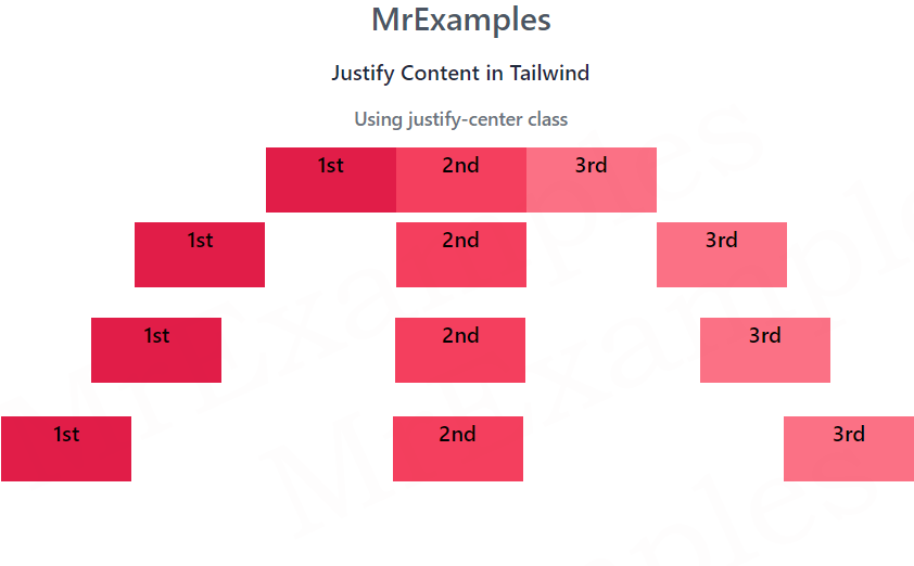
Tailwind Justify-center
This utility class centers the items inside the flex or grid container along the main axis.
Syntax
<element class="justify-center">...</element>
The following example utilizes the justify-center class in Tailwind:
<!DOCTYPE html>
<html>
<head>
<script src="https://cdn.tailwindcss.com"></script>
</head>
<body class="text-center">
<h1 class="text-gray-600 text-2xl font-semibold">
MrExamples
</h1>
<p class="font-medium text-slate-800 my-3">Justify Content in Tailwind</p>
<p class="font-medium text-gray-500 text-sm my-3">Using justify-center class</p>
<div class="flex justify-center flex-row font-medium">
<div class="bg-rose-600 w-24 h-12">1st</div>
<div class="bg-rose-500 w-24 h-12">2nd</div>
<div class="bg-rose-400 w-24 h-12">3rd</div>
</div>
</body>
</html>
Tailwind Justify-between
The Tailwind utility class justify-between evenly distributes the items of a flex container’s content with equal spacing between them horizontally.
The first item is positioned at the start of the container, and the last item is positioned at the end of the container.
Syntax
<element class="justify-between">...</element>
For this example, we will focus on the implementation of justify-between class in Tailwind:
<!DOCTYPE html>
<html>
<head>
<script src="https://cdn.tailwindcss.com"></script>
</head>
<body class="text-center">
<h1 class="text-gray-600 text-2xl font-semibold">
MrExamples
</h1>
<p class="font-medium text-slate-800 my-3">Justify Content in Tailwind</p>
<p class="font-medium text-gray-500 text-sm my-3">Using justify-between class</p>
<div class="flex justify-between flex-row font-medium">
<div class="bg-rose-600 w-24 h-12">1st</div>
<div class="bg-rose-500 w-24 h-12">2nd</div>
<div class="bg-rose-400 w-24 h-12">3rd</div>
</div>
</body>
</html>
Tailwind Justify-around
The Tailwind utility class justify-around aligns the horizontal placement of a flex container’s items in such a way that they are equally distributed with uniform spacing around them.
This implies that there is equal spacing both before the first item and after the last item, while the remaining items are evenly spaced between them.
Syntax
<element class="justify-around">...</element>
The following example demonstrates the use of justify-around class in Tailwind:
<!DOCTYPE html>
<html>
<head>
<script src="https://cdn.tailwindcss.com"></script>
</head>
<body class="text-center">
<h1 class="text-gray-600 text-2xl font-semibold">
MrExamples
</h1>
<p class="font-medium text-slate-800 my-3">Justify Content in Tailwind</p>
<p class="font-medium text-gray-500 text-sm my-3">Using justify-around class</p>
<div class="flex justify-around flex-row font-medium">
<div class="bg-rose-600 w-24 h-12">1st</div>
<div class="bg-rose-500 w-24 h-12">2nd</div>
<div class="bg-rose-400 w-24 h-12">3rd</div>
</div>
</body>
</html>
Tailwind Justify-evenly
The justify-evenly class in Tailwind distributes the flex container’s contents evenly with equal spacing between items, resulting in a balanced distribution.
Unlike justify-around, it creates equal spacing between adjacent items rather than extra space around the container’s edges.
Syntax
<element class=”justify-evenly”>…</element>
Let’s explore the justify-evenly class in Tailwind through a practical example:
<!DOCTYPE html>
<html>
<head>
<script src="https://cdn.tailwindcss.com"></script>
</head>
<body class="text-center">
<h1 class="text-gray-600 text-2xl font-semibold">
MrExamples
</h1>
<p class="font-medium text-slate-800 my-3">Justify Content in Tailwind</p>
<p class="font-medium text-gray-500 text-sm my-3">Using justify-evenly class</p>
<div class="flex justify-evenly flex-row font-medium">
<div class="bg-rose-600 w-24 h-12">1st</div>
<div class="bg-rose-500 w-24 h-12">2nd</div>
<div class="bg-rose-400 w-24 h-12">3rd</div>
</div>
</body>
</html>
