Backdrop Filter In Tailwind CSS

A brief overview of Tailwind Backdrop Filter use cases with examples will be provided in this article.

In Tailwind CSS, the Backdrop Filter class is used to apply filter effects to the background behind elements.

Tailwind Backdrop Filter


Tailwind Backdrop Filter

With the Tailwind CSS backdrop filter, you can enable the backdrop of any filter that uses it.

It works similarly to a filter class, but in the reverse direction.

As we have seen in the filter class, every element that needs an effect like blur, contrast, brightness, etc, needs to first be filtered before the effect can be applied. In a similar manner, backdrop-blur or backdrop-contrast must be used with backdrop-filter to disable the effect.

Syntax

<element class="backdrop-filter | backdrop-filter-none">..</element>

Tailwind Backdrop Filter Classes

  1. backdrop-filter – The backdrop filter is enabled using this class.
  2. backdrop-filter-none – Filters are removed using this class.

Different filter effects include:

1 – backdrop-blur: This class is used to apply a backdrop blur filter to an element.
2 – backdrop-brightness: This class is used to set the backdrop brightness of an element.
3 – backdrop-contrast: This class is used to set the backdrop contrast filter of an element.
4 – backdrop-hue-rotate: This class is used to apply a hue-rotate filter to an element. As a result, the hue of an element and its contents is rotated
5 – backdrop-saturate: This class is used to apply a saturation filter to an image which super-saturates or desaturates an input image.
6 – backdrop-sepia: This class is used to apply a sepia filter to an image which makes it more warm.
7 – backdrop-grayscale: This class is used to set the grayscale of an image.
8 – backdrop-invert: This class is used for inverting colours in images
9 – backdrop-opacity: This class is used to make the samples in the input image transparent.

Remember: These filters would only work alongside backdrop-filter class.

Example: 

<!DOCTYPE html> <html> <head> <script src="https://cdn.tailwindcss.com"></script> </head> <body class="text-center mx-4 "> <h1 class="text-gray-600 text-2xl font-semibold"> MrExamples </h1> <p class="font-semibold my-2">Backdrop Filter Class in Tailwind CSS</p> <div class=" mx-16 mt-18 h-36 relative"> <div class="absolute w-full py-18"> <img class="rounded-lg object-cover" src="https://miro.medium.com/max/644/1*d7Xs5RnaqcQtKzbNrAOAYA.png" alt="image"> </div> <div class="relative h-32 flex overflow-x-auto space-x-4 text-white"> <div class="flex-shrink-0 border-2 border-gray-500 backdrop-filter backdrop-invert w-1/5 text-black"> backdrop-invert </div> <div class="flex-shrink-0 border-2 border-gray-500 backdrop-filter backdrop-grayscale w-1/5"> backdrop-grayscale </div> <div class="flex-shrink-0 border-2 border-gray-500 backdrop-filter backdrop-blur w-1/5"> backdrop-blur </div> <div class="flex-shrink-0 border-2 border-gray-500 backdrop-filter-none w-1/5"> backdrop-filter-none </div> </div> </div> </body> </html>

Example: 

<!DOCTYPE html> <html> <head> <script src="https://cdn.tailwindcss.com"></script> </head> <body class="text-center mx-4 "> <h1 class="text-gray-600 text-2xl font-semibold"> MrExamples </h1> <p class="font-semibold my-2">Backdrop Filter Class in Tailwind CSS</p> <div class=" mx-16 mt-18 h-36 relative"> <div class="absolute w-full py-18"> <img class="rounded-lg object-cover" src="https://miro.medium.com/max/644/1*d7Xs5RnaqcQtKzbNrAOAYA.png" alt="image"> </div> <div class="relative h-32 flex overflow-x-auto space-x-4 text-white"> <div class="flex-shrink-0 border-2 border-gray-500 backdrop-filter backdrop-hue-rotate-180 w-1/5"> backdrop-hue-rotate </div> <div class="flex-shrink-0 border-2 border-gray-500 backdrop-filter backdrop-brightness-200 w-1/5"> backdrop-brightness </div> <div class="flex-shrink-0 border-2 border-gray-500 backdrop-filter backdrop-sepia w-1/5"> backdrop-sepia </div> </div> </div> </body> </html>

Example: 

<!DOCTYPE html> <html> <head> <script src="https://cdn.tailwindcss.com"></script> </head> <body class="text-center mx-4 "> <h1 class="text-gray-600 text-2xl font-semibold"> MrExamples </h1> <p class="font-semibold my-2">Backdrop Filter Class in Tailwind CSS</p> <div class=" mx-16 mt-18 h-36 relative"> <div class="absolute w-full py-18"> <img class="rounded-lg object-cover" src="https://miro.medium.com/max/644/1*d7Xs5RnaqcQtKzbNrAOAYA.png" alt="image"> </div> <div class="relative h-32 flex overflow-x-auto space-x-4 text-white"> <div class="flex-shrink-0 border-2 border-gray-500 backdrop-filter backdrop-saturate-150 w-1/5"> backdrop-saturate </div> <div class="flex-shrink-0 border-2 border-gray-500 backdrop-filter backdrop-opacity-50 w-1/5"> backdrop-opacity </div> <div class="flex-shrink-0 border-2 border-gray-500 backdrop-filter backdrop-contrast-50 w-1/5"> backdrop-contrast </div> </div> </div> </body> </html>

Example Explanation

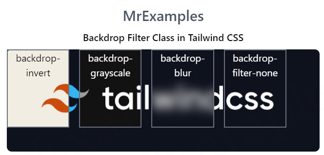
Above example includes a header that contains the title “MrExamples” and a paragraph that describes the Tailwind Backdrop Filter Class.

The body section contains a single div element that includes an image and three additional div elements.

The div elements have a border, a size of one-fifth of the parent container, and different backdrop filter classes.

The first div element has the “backdrop-saturate-150” class, which increases the saturation of the backdrop.

The second div element has the “backdrop-opacity-50” class, which sets the opacity of the backdrop.

The third div element has the “backdrop-contrast-50” class, which adjusts the contrast of the backdrop.

Above examples demonstrates how to apply different Tailwind backdrop filter effects.

We value your feedback.
+1
0
+1
0
+1
0
+1
0
+1
0
+1
0
+1
0

Subscribe To Our Newsletter
Enter your email to receive a weekly round-up of our best posts. Learn more!
icon

Leave a Reply

Your email address will not be published. Required fields are marked *