Quick Guide To Grid Template Columns In Tailwind CSS
Grid template columns are a key part of the Tailwind CSS grid system, providing a way to define the columns of a grid and control their width and placement.
The topic of discussion in this article is grid template columns utility class in Tailwind CSS with examples.

Grid Template Columns
This is a utility class that allows you to define the size and number of columns in a grid container.
Grid Template Columns class works by specifying one or more values that will be applied to the columns of the grid.
With Grid Template Columns, you can create a grid layout that is flexible and responsive to different screen sizes and device types.
Grid Template Columns Classes
Grid template columns are defined using a series of pre-defined classes that control the width and placement of columns.
These classes allows you to apply size and position of columns quickly and easily, without having to write custom CSS.
The classes are based on a 12-column grid system mentioned in below table:
| Classes | Overview |
| grid-cols-1 | This class sets the grid container to have only one column. |
| grid-cols-2 | Using this class, two columns will be displayed in the grid container. |
| grid-cols-3 | Using this class, the grid container will have three columns. |
| grid-cols-4 | There are four columns in the grid container when this class is applied. |
| grid-cols-5 | A grid container with five columns is created by this class. |
| grid-cols-6 | Grid containers are set to have six columns by this class. |
| grid-cols-7 | This class sets grid containers to have seven columns. |
| grid-cols-8 | This class specifies eight columns for grid containers. |
| grid-cols-9 | A grid container with this class has nine columns. |
| grid-cols-10 | As a result of this class, grid containers have ten columns. |
| grid-cols-11 | This class sets a grid container to have eleven columns. |
| grid-cols-12 | Using this class, grid containers will have twelve columns. |
| grid-cols-none | It is used to remove the grid-template-columns property from an element, effectively making it a single column grid. Useful when we want to create a grid that is not based on columns, but rather on rows or some other dimension. |
Note: This property can only be used on grid containers; therefore, it can only be used alongside the grid class. This utility will not work without the grid class.
Syntax
<element class="grid grid-cols-number"> </element>
The following example showcases the implementation of the grid-cols-3 and grid-cols-4 classes in Tailwind:
<!DOCTYPE html>
<html><head>
<script src="https://cdn.tailwindcss.com"></script>
</head>
<body class="text-center">
<h1 class="text-gray-600 text-2xl font-semibold">
MrExamples
</h1>
<p class="font-medium my-2">Using grid-cols class in Tailwind CSS</p>
<p class="font-medium my-4 text-gray-500 text-sm">Using grid-cols-4</p>
<div class="grid grid-cols-4 gap-1 justify-evenly font-medium">
<div class="bg-gray-300 w-32 h-10">1st</div>
<div class="bg-gray-300 w-32 h-10">2nd</div>
<div class="bg-gray-300 w-32 h-10">3rd</div>
<div class="bg-gray-300 w-32 h-10">4th</div>
<div class="bg-gray-300 w-32 h-10">5th</div>
<div class="bg-gray-300 w-32 h-10">6th</div>
</div>
<p class="font-medium mt-8 mb-4 text-gray-500 text-sm">Using grid-cols-3</p>
<div class="grid grid-cols-3 gap-1 justify-evenly font-medium">
<div class="bg-gray-300 w-32 h-10">1st</div>
<div class="bg-gray-300 w-32 h-10">2nd</div>
<div class="bg-gray-300 w-32 h-10">3rd</div>
<div class="bg-gray-300 w-32 h-10">4th</div>
<div class="bg-gray-300 w-32 h-10">5th</div>
<div class="bg-gray-300 w-32 h-10">6th</div>
</div>
</body>
</html>
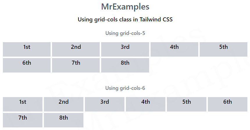
The following example illustrates how grid-cols-5 and grid-cols-6 classes are used in Tailwind:
<!DOCTYPE html>
<html><head>
<script src="https://cdn.tailwindcss.com"></script>
</head>
<body class="text-center">
<h1 class="text-gray-600 text-2xl font-semibold">
MrExamples
</h1>
<p class="font-medium my-2">Using grid-cols class in Tailwind CSS</p>
<p class="font-medium my-4 text-gray-500 text-sm">Using grid-cols-5</p>
<div class="grid grid-cols-5 gap-1 justify-evenly font-medium">
<div class="bg-gray-300 w-30 h-10">1st</div>
<div class="bg-gray-300 w-30 h-10">2nd</div>
<div class="bg-gray-300 w-30 h-10">3rd</div>
<div class="bg-gray-300 w-30 h-10">4th</div>
<div class="bg-gray-300 w-30 h-10">5th</div>
<div class="bg-gray-300 w-30 h-10">6th</div>
<div class="bg-gray-300 w-30 h-10">7th</div>
<div class="bg-gray-300 w-30 h-10">8th</div>
</div>
<p class="font-medium mt-8 mb-4 text-gray-500 text-sm">Using grid-cols-6</p>
<div class="grid grid-cols-6 gap-1 justify-evenly font-medium">
<div class="bg-gray-300 w-30 h-10">1st</div>
<div class="bg-gray-300 w-30 h-10">2nd</div>
<div class="bg-gray-300 w-30 h-10">3rd</div>
<div class="bg-gray-300 w-30 h-10">4th</div>
<div class="bg-gray-300 w-30 h-10">5th</div>
<div class="bg-gray-300 w-30 h-10">6th</div>
<div class="bg-gray-300 w-30 h-10">7th</div>
<div class="bg-gray-300 w-30 h-10">8th</div>
</div>
</body>
</html>