The Ultimate Guide To Tailwind Max Width
In this article, we will examine Tailwind max width property in detail. We’ll explain what it is, how it works, and demonstrate how it can be used to create responsive layouts.
What is Max Width?
Max-width is a CSS property that limits the maximum width of an element.
It is commonly used to ensure that an element does not exceed a certain width, even when the viewport is large.
Max-width is essential for creating responsive web designs that adjust to different screen sizes, making them accessible to users across various devices.
Tailwind Max Width
Tailwind max width class is used to set the maximum width of an HTML element.
It limits the width of an element so that it does not exceed the specified value.
This class is useful when you want to restrict the width of an element but still want it to be responsive and adjust to the viewport or parent container.
For instance:
If an element’s actual width exceeds the specified value, it will be truncated or scaled down to fit the specified maximum width.
Tailwind Max Width Classes
Tailwind CSS provides a wide range of classes to work with max-width.
These classes make it easy to apply max-width to different elements quickly.
Here are some of the Tailwind max width classes:
| Classes | Overview |
| max-w-0 | This class sets the maximum width of an element to 0 pixels. |
| max-w-none | The maximum width value is not specified in this case. |
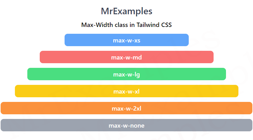
| max-w-xs | A maximum width value of 20rem or 320px is added to an element. |
| max-w-sm | The maximum width of an element is defined as 24rem or 384px. |
| max-w-md | The maximum width is specified as 28rem or 448px. |
| max-w-lg | Used to add a maximum width value as 32rem or 512px. |
| max-w-xl | Applies a maximum width of 36rem or 576px to an element. |
| max-w-2xl | This class is used to apply a maximum width value of 42rem or 672px. |
| max-w-3xl | This class sets the maximum width of an element to 48rem or 768px. |
| max-w-4xl | The maximum width of an element is defined as 56rem or 896px. |
| max-w-5xl | A maximum width value of 64rem or 1024px is added to an element. |
| max-w-6xl | The maximum width is specified as 72rem or 1152px. |
| max-w-7xl | Applies a maximum width of 80rem or 1280px to an element. |
| max-w-full | This class is used to apply a maximum width value of 100%. |
| max-w-min | The maximum width is specified to a value which occupies minimum content. |
| max-w-max | The maximum width is defined to a value which occupies maximum content. |
| max-w-fit | A maximum width value is set such that it fits the element’s content. |
| max-w-prose | A maximum width value of an element is set to 65ch. |
| max-w-screen-sm | The maximum width of an element is set to 640px. |
| max-w-screen-md | This class is used to apply a maximum width of 768px to an element. |
| max-w-screen-lg | This class is used to add a maximum width of 1024px to an element. |
| max-w-screen-xl | Applies a maximum width of 1280px to an element. |
| max-w-screen-2xl | This class defines the maximum width of an element as 1536px. |
Using these classes, we can easily apply max-width to any HTML element.
For example, if we want to limit the maximum width of an image to small size.
Syntax
<element class="max-w-0">...</element>
With this example, you can see how the maximum width class is used in Tailwind using some utility classes:
Example:
Example:
Conclusion
Tailwind Max width is an essential CSS property that helps in creating responsive web designs.
Tailwind CSS provides an extensive set of classes to work with max-width, making it easy to apply it to different elements quickly.
