Quick Guide To Grid Auto Rows In Tailwind
In this article, we will examine the Grid Auto Rows feature in Tailwind CSS. This utility is used to set the height of implicit rows in a grid container.
Grid Auto Rows allows you to set the size of rows in a grid that have not been explicitly defined.
By default, the size of such rows is determined by the content they contain. However, the Grid Auto Rows feature allows you to specify a fixed height for such rows or mix fixed and auto heights.
When the number of grid items exceeds the number of rows specified by the grid-template-rows property, the grid-auto-rows class applies one or more values to the implicit rows.
Grid Auto Rows Classes
| Classes | Overview |
| auto-rows-auto | This is used for setting the height of implicit rows in a grid container to “auto”. The “auto-rows-auto” class can automatically adjust the height of additional rows when the number of grid items exceeds the grid-template-rows property. |
| auto-rows-min | The auto-rows-min class will set the minimum height of the implicit rows to the specified value, and if the content in the row requires more height, the row will expand to fit the content. The size is specified according to the smallest item in the container. |
| auto-rows-max | In this class, a single value is specified that will be applied to implicit rows that appear when grid items exceed grid-template-rows. The maximum height of each row will be set according to the largest item in the container. |
| auto-rows-fr | The auto-rows-fr class in Tailwind CSS is used to set the height of implicit rows in a grid container as a fraction of the free space in the grid container’s row axis. There is a range [min, max] of sizes greater than or equal to min and less than or equal to max. |
Grid Auto Rows Auto
This can be useful when you have varying amounts of content in each row and want the rows to adjust accordingly.
Setting the row size to auto means that the row height will adjust based on the content inside it.
Syntax
<element class="auto-rows-auto">..</element>
In this example our focus is on implementing auto-rows-auto class in Tailwind:
Example:
Grid Auto Rows Min
Setting a minimum height for rows can be useful when you want to ensure that rows have a certain amount of space even if the content inside them is minimal.
For instance, you may want to create a grid with cards of varying heights, but you want to ensure that the smallest cards have a minimum height.
Syntax
<element class="auto-rows-min">..</element>
This example demonstrates the working of auto-rows-min class in Tailwind:
Example:
Grid Auto Rows Max
Setting a maximum height for rows can be useful when you want to ensure that rows do not become too tall and create excessive white space.
For instance, you may want to create a grid with cards of varying heights, but you want to ensure that the tallest cards do not take up too much space.
Syntax
<element class="auto-rows-max">..</element>
The following example highlights the use case of auto-rows-max class in Tailwind:
Example:
To prevent this, you can set the overflow-hidden class on the grid container.
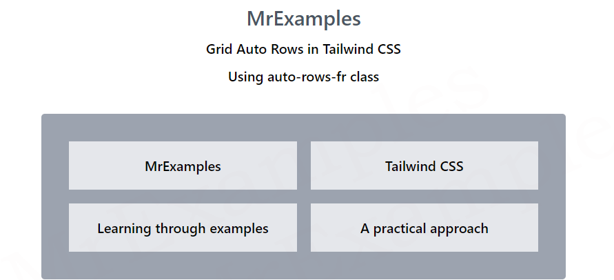
Grid Auto Rows Fr
you can use the grid-auto-rows-fr class to set the size of rows as a fraction of the available grid space.
Setting row sizes using fractions can be useful when you want to create a grid where the rows have a flexible size that adjusts based on the available space.
Syntax
<element class="auto-rows-fr">..</element>
You can also mix different row sizes using fractions and other units.
For example, you can set one row to 2fr and another to 100px to create a grid with flexible and fixed row sizes.
Additionally, you can combine the grid-auto-rows-fr class with other classes to create more complex grid layouts.
This particular examples focuses on the auto-rows-fr class in Tailwind:
