Tailwind Flex Direction
In this article, we’ll take a closer look at Tailwind flex direction property and how it works in Tailwind CSS.
With the flex-direction property, we can control the direction in which the flex items are displayed.
The flex-direction property is used to set the direction of the flex container’s main axis.
The main axis is the axis along which the flex items are laid out.
Syntax
<element class="flex flex-'direction'"> Contents....</element>
Tailwind Flex Direction Classes
Tailwind CSS supports a range of flex direction values that can be applied to flex containers to control the layout of their child elements.
Below is a list of some of the most commonly used flex direction class values in Tailwind CSS:
| Classes | Overview |
| flex-row | This value is used to set the direction of the flex container to be horizontal, with items arranged in a row from left to right. |
| flex-row-reverse | This value is used to set the direction of the flex container to be horizontal, with items arranged in a row from right to left. |
| flex-col | This value is used to set the direction of the flex container to be vertical, with items arranged in a column from top to bottom. |
| flex-col-reverse | This value is used to set the direction of the flex container to be vertical, with items arranged in a column from bottom to top. |
Now that we have explored the different types of flex direction class values supported by Tailwind CSS, let’s take a look at some examples of how they can be used practically.
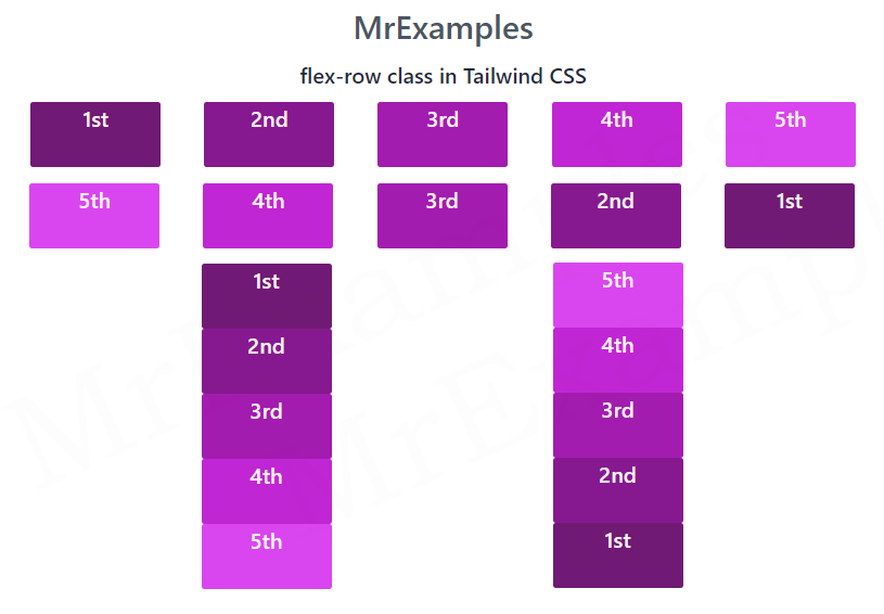
Tailwind Flex Direction Row
The flex-row class in Tailwind CSS is used to create a Flexbox layout that is oriented in a row.
This means that the elements inside the container will be arranged in a row, starting from the left and going towards the right.
Syntax
<element class="flex flex-row"> </element>
In this example, we’ll explore how to use the flex-row class in Tailwind CSS to create a row-oriented Flexbox layout:
Example:
Tailwind Flex Direction Reverse
The flex-row-reverse class in Tailwind CSS is a useful class for creating a Flexbox layout with elements arranged in a row from right to left.
This effectively reverses the order in which the items are laid out.
In other words, the last item becomes the first item, and the first item becomes the last item.
Syntax
<element class="flex flex-row-reverse"> </element>
In this code snippet, we showcase how the flex-row-reverse class is utilized in Tailwind:
Example:
Tailwind Flex Direction Col
The flex-col class in Tailwind CSS is a class used to create a column-oriented Flexbox layout.
This results in the elements inside the container being arranged in a column from top to bottom.
Syntax
<element class="flex flex-col"> </element>
This example provides an overview of the flex-col class in Tailwind CSS:
Example:
Tailwind Flex Col Reverse
Tailwind flex-col-reverse class is a useful class that allows you to create a column-oriented Flexbox layout with elements arranged in reverse order, from bottom to top.
This reverses the order in which the items are laid out in the column, with the last item becoming the first item, and the first item becoming the last item.
Syntax
<element class="flex flex-col-reverse"> </element>
For this example, we will examine the flex-col-reverse class in Tailwind:
Example:
