Tailwind Hue Rotate: Comprehensive Guide

In this article, we’ll examine what Hue Rotate is and how to use it in Tailwind CSS with examples, to add dynamic and engaging color effects to your UI.

Hue Rotate In Tailwind CSS

What is Hue Rotate?

In traditional CSS, the hue rotate property is used to apply a hue rotation to an element. Hue rotation is a color manipulation effect that involves rotating the hue value of an element on the color wheel.

This can result in a shift in color that can add depth and visual interest to an interface. With the hue-rotate() function in CSS, you can apply hue rotation to elements on a webpage, making it possible to create a wide range of color effects.


Hue Rotate In Tailwind CSS

Tailwind CSS makes it easy to apply hue rotation to elements on a webpage using the hue rotate().

The hue rotate class can be used to apply a CSS hue rotate filter to an element.

It accepts a value in degrees, which specifies the amount of hue rotation to apply.

A positive value rotates the hue clockwise, while a negative value rotates it counterclockwise.

Colors of an element can be shifted along the color spectrum using the hue rotate filter.
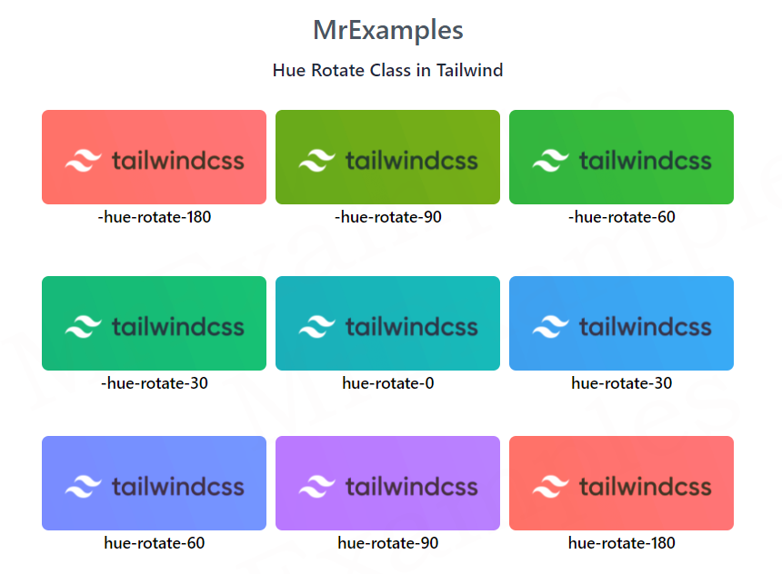

Hue Rotate Classes

ClassesOverview
-hue-rotate-180With this class, the hue of the element’s colors will be shifted 180 degrees anticlockwise.
-hue-rotate-90This class will shift the hue of an element’s colors 90 degrees anticlockwise.
-hue-rotate-60As a result of this class, the hue of the element’s colors will be rotated anticlockwise 60 degrees.
-hue-rotate-30By using this class, the hue of the element’s colors will be moved 30 degrees anticlockwise.
-hue-rotate-15The hue of the element’s colors will be shifted 15 degrees anticlockwise by this class.
hue-rotate-0This class applies a hue-rotate filter to an element, with a rotation angle of 0 degrees. In other words, it doesn’t shift the hue of the element’s colors.
hue-rotate-15The hue of the element’s colors will be shifted 15 degrees clockwise along the color spectrum.
hue-rotate-30Along the color spectrum, the hue of the element’s colors will be shifted 30 degrees clockwise.
hue-rotate-60There will be a 60 degree shift in the hue of the element’s colors.
hue-rotate-90On the color spectrum, the hue of the color of the element will be shifted 90 degrees clockwise.
hue-rotate-180A color’s hue will be shifted 180 degrees clockwise by using this class.

Syntax

<element class="hue-rotate-{angle}">..</element>

Here’s an example that showcases -hue-rotate-180, -hue-rotate-90 and -hue-rotate-60 classes in action:

Example: 

<!DOCTYPE html> <html> <head> <script src="https://cdn.tailwindcss.com"></script> </head><body class="text-center mx-4 space-y-2"> <h1 class="text-gray-600 text-2xl font-semibold"> MrExamples </h1> <p class="font-medium my-2 text-slate-800">Hue Rotate Class in Tailwind</p> <div class="grid grid-flow-col gap-2 text-center p-4 font-medium text-sm"> <div> <img class="rounded-md -hue-rotate-180" src="https://mrexamples.com/wp-content/uploads/2023/02/tailwind1.webp" alt="image"> <p>-hue-rotate-180</p> </div> <div> <img class="rounded-md -hue-rotate-90" src="https://mrexamples.com/wp-content/uploads/2023/02/tailwind1.webp" alt="image"> <p>-hue-rotate-90</p> </div> <div> <img class="rounded-md -hue-rotate-60" src="https://mrexamples.com/wp-content/uploads/2023/02/tailwind1.webp" alt="image"> <p>-hue-rotate-60</p> </div> </div> </body> </html>
This example demonstrates the effects of using the -hue-rotate-30, hue-rotate-0, and hue-rotate-30 classes in Tailwind:

Example: 

<!DOCTYPE html> <html> <head> <script src="https://cdn.tailwindcss.com"></script> </head><body class="text-center mx-4 space-y-2"> <h1 class="text-gray-600 text-2xl font-semibold"> MrExamples </h1> <p class="font-medium my-2 text-slate-800">Hue Rotate Class in Tailwind</p> <div class="grid grid-flow-col gap-2 text-center p-4 font-medium text-sm"> <div> <img class="rounded-md -hue-rotate-30" src="https://mrexamples.com/wp-content/uploads/2023/02/tailwind1.webp" alt="image"> <p>-hue-rotate-30</p> </div> <div> <img class="rounded-md hue-rotate-0" src="https://mrexamples.com/wp-content/uploads/2023/02/tailwind1.webp" alt="image"> <p>hue-rotate-0</p> </div> <div> <img class="rounded-md hue-rotate-30" src="https://mrexamples.com/wp-content/uploads/2023/02/tailwind1.webp" alt="image"> <p>hue-rotate-30</p> </div> </div> </body> </html>
Below example illustrates the use of the hue-rotate-60, hue-rotate-90, and hue-rotate-180 classes in Tailwind:

Example: 

<!DOCTYPE html> <html> <head> <script src="https://cdn.tailwindcss.com"></script> </head><body class="text-center mx-4 space-y-2"> <h1 class="text-gray-600 text-2xl font-semibold"> MrExamples </h1> <p class="font-medium my-2 text-slate-800">Hue Rotate Class in Tailwind</p> <div class="grid grid-flow-col gap-2 text-center p-4 font-medium text-sm"> <div> <img class="rounded-md hue-rotate-60" src="https://mrexamples.com/wp-content/uploads/2023/02/tailwind1.webp" alt="image"> <p>hue-rotate-60</p> </div> <div> <img class="rounded-md hue-rotate-90" src="https://mrexamples.com/wp-content/uploads/2023/02/tailwind1.webp" alt="image"> <p>hue-rotate-90</p> </div> <div> <img class="rounded-md hue-rotate-180" src="https://mrexamples.com/wp-content/uploads/2023/02/tailwind1.webp" alt="image"> <p>hue-rotate-180</p> </div> </div> </body> </html>

Conclusion

Hue rotation is a powerful color manipulation effect that can add depth and visual interest to your user interfaces.

By using hue-rotate() class and other color manipulation effects in Tailwind CSS, you can create engaging and visually appealing interfaces that capture your viewer attention and improve the overall user experience.

We value your feedback.
+1
0
+1
0
+1
0
+1
0
+1
0
+1
0
+1
0

Subscribe To Our Newsletter
Enter your email to receive a weekly round-up of our best posts. Learn more!
icon

Leave a Reply

Your email address will not be published. Required fields are marked *