Background Size In Tailwind CSS
In this article, we’ll take a closer look at Tailwind background size with examples and explore how it can be used to create attractive and responsive web pages.
Tailwind CSS is a popular CSS framework that offers a wide range of pre-defined classes to help you quickly and easily create responsive and visually appealing web designs.
One of the many features of Tailwind is its background sizing options, which can be used to adjust the size of the background image in a variety of ways.
Tailwind Background Size
Using Tailwind Background Size class, you can adjust the size of the background image and the way it should be displayed within the element.
The Tailwind CSS class accepts multiple values.
Each property is covered by a class.
The CSS background-size property is an alternative.
Tailwind Background Size classes
Tailwind offers a number of classes that can be used to adjust the size of background images, including:
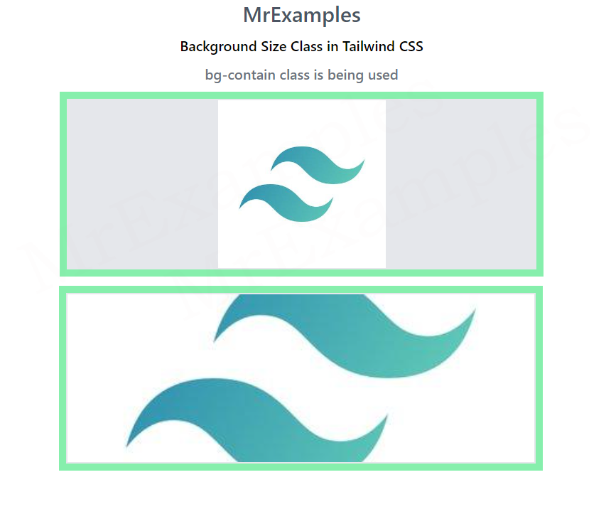
- bg-contain : This class sets the size of the background image to ensure that the image is fully contained within the element it’s applied to, without being stretched or distorted.
- bg-cover : This class sets the size of the background image to cover the entire element it’s applied to, without leaving any blank space. This can result in parts of the image being cropped if the aspect ratio of the image and the element don’t match.
- bg-auto : This class sets the background image size to its natural size, without any resizing or stretching.
Tailwind Background Size bg-contain
Using background size classes in Tailwind is easy. Simply apply the appropriate class to the element you want to add the background image to, and then specify the URL of the image in the background-image property.
Syntax
<element class="bg-contain"></element>
For example, to add a background image that is fully contained within an element, you would use the following code:
<div class="bg-contain" style="background-image: url('image.jpg');"></div>The example below presents a comprehensive illustration of bg-contain:
Example:
Tailwind Background Size bg-cover
Using bg-cover class, the background image is resized to cover the entire container element while maintaining its aspect ratio.
Syntax
<element class="bg-cover"></element>
To add a background image that covers the entire element, you would use the following code:
<div class="bg-cover" style="background-image: url('image.jpg')"></div>Let’s take a look at an example of bg-cover which makes it easy to grasp the concept:
Example:
Tailwind Background Size bg-auto
In Tailwind CSS, bg-auto is a background size utility class that sets the background image size to its original size, which is commonly known as “auto”.
Using bg-auto, you can apply this property to any element with a background image by simply adding the bg-auto class to it.
Syntax
<element class="bg-auto"></element>
An example utilizing the bg-auto class is demonstrated below for better understanding:
Example:
Example Explanation
The element has a background image set using the background-image CSS property.
The bg-center class is used to center the background image horizontally and vertically.
The element has a width of full and a height of 48, with a green background color set using the bg-green-300 class.
The mx-16 class adds horizontal margin to the element, while the space-y-4 class adds vertical spacing between child elements.
The p-2 class adds padding to the element, and the justify-between class aligns the child elements to be distributed evenly along the main axis.
Above example is using Tailwind CSS bg-center class to style an element with a background image, setting its size to its original dimensions and centering it horizontally and vertically within the element.
Conclusion
Tailwind background size classes make it easy to adjust the size of background images in your web designs. By choosing the appropriate class and combining it with other Tailwind utility classes, you can create responsive and visually appealing designs with very little effort.
Whether you want to fully contain an image, cover the entire element, or adjust the image size to a specific percentage of the element’s width or height, Tailwind has the classes you need to achieve your design goals.
