Tailwind Transition Timing Function
In this article, we will focus on Tailwind transition timing functions and how you can use them to create stunning visual effects on your web pages.
What is a Transition Timing Function?
Before diving into the Tailwind Transition Timing Function, it’s important to understand what a Transition Timing Function is.
In CSS, a Transition Timing Function is used to determine the speed at which a transition occurs, and how the transition progresses over time. It is defined using the transition-timing-function property.
There are several predefined timing functions available in CSS, including ease, ease-in, ease-out, and linear. Each timing function defines a different curve that determines the progression of the transition.
Tailwind Transition Timing Function
Tailwind Transition timing functions control how a property changes over time during a transition.
Tailwind CSS allows you to create beautiful and responsive designs that work seamlessly across different devices and screen sizes by incorporating transition timing functions into your HTML elements.
It provides several Transition Timing Functions that you can use to create smooth animations.
These functions are built-in and can be accessed using Tailwind’s transition-timing-function property.
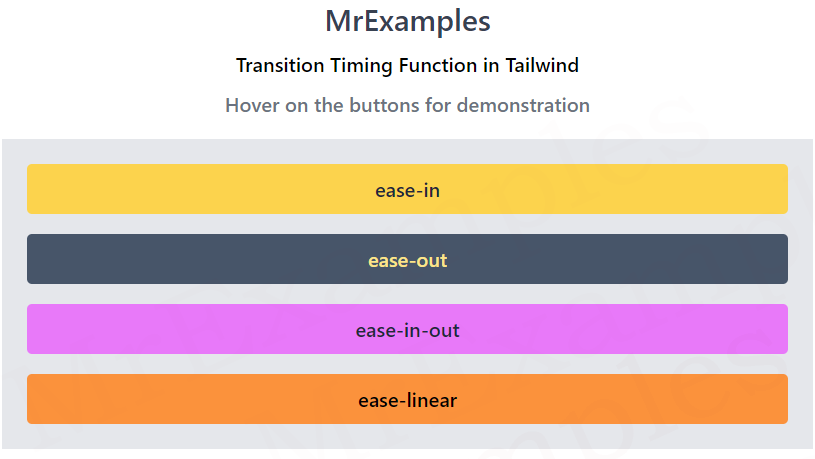
Tailwind Transition Timing Function Classes
Below you will find an explanation of Tailwind’s transition timing function classes:
| Classes | Overview |
| ease-linear | This class applies a constant rate of change throughout the animation, resulting in a linear animation effect. |
| ease-in | This class is used to apply a slow start to the animation, with the rate of change gradually increasing towards the end. |
| ease-out | As the animation progresses, the rate of change gradually decreases using this class. |
| ease-in-out | With a slow start and a slow end, the rate of change gradually increases before decreasing towards the middle of the animation. |
Syntax
<element class="ease-in-out">...</element>
To add a transition to an element, you simply use the transition class, followed by the name of the property you want to animate, and the duration of the animation in milliseconds.
You can then add a timing function by using the “ease-” prefix, followed by the name of the timing function.
The following example demonstrates the transition timing function classes in Tailwind:
