Quick Guide To Tailwind Stroke
In this article, we’ll learn how to use Tailwind stroke to add style and flair to your web designs.
Tailwind stroke color is the color of the outline or border of a shape or object.
Separating elements is a fundamental aspect of graphic design.
With Tailwind Stroke, you can set the stroke color of an SVG element using the stroke-{color} class.
Tailwind Stroke Classes
In order to define the stroke color, the following classes are used:
| Classes | Overview |
| stroke-none | In this case, the stroke from an SVG is removed.. |
| stroke-inherit | The SVG will inherit the parent element color for its stroke.. |
| stroke-current | This class is used to set the SVG stroke color to its current text color. |
| stroke-transparent | The stroke color property of an SVG element is set to transparent using this class. |
| stroke-black | As a result, the resulting SVG stroke color is black. |
| stroke-white | Using this class, the SVG stroke color is set to white. |
| stroke-slate-50 | The purpose of this class is to assign a shade of grayish blue color to an SVG stroke. |
| stroke-gray-50 | This class is utilized to assign a shade of gray color to an SVG stroke. |
| stroke-zinc-50 | The resulting SVG stroke uses the color as a shade of grayish green. |
| stroke-neutral-50 | The resulting SVG stroke is a shade of grayish neutral in color. |
| stroke-stone-50 | As a result of this class, the SVG stroke is a shade of grayish brown in color. |
| stroke-red-50 | The color of SVG stroke using this class is a shade of red. |
| stroke-orange-50 | A shade of orange color is used for the SVG stroke. |
| stroke-amber-50 | The SVG stroke color is set to a shade of amber using this class. |
| stroke-yellow-50 | This class is utilized to apply a shade of yellow color to SVG stroke. |
| stroke-lime-50 | The purpose of this class is to set the color of an SVG stroke to a shade of lime. |
| stroke-green-50 | The stroke color property of an SVG is set to a shade of green using this class. |
| stroke-emerald-50 | It sets the SVG stroke color to a shade of light green. |
| stroke-teal-50 | In this case, the SVG strokes are blueish-green in color. |
| stroke-cyan-50 | This class is used to set the SVG stroke color to a shade of cyan. |
| stroke-sky-50 | It sets the SVG stroke color to a shade of blue. |
| stroke-blue-50 | A shade of blue color is used to display the SVG stroke. |
| stroke-indigo-50 | The resulting SVG’s stroke color is set to a shade of indigo. |
| stroke-violet-50 | SVG strokes are represented using a shade of violet. |
| stroke-purple-50 | This class is utilized to set the SVG stroke color to a shade of purple. |
| stroke-fuchsia-50 | A shade of pinkish-purple color is used to display the SVG stroke. |
| stroke-pink-50 | A shade of pink color is used for the representation of an SVG stroke. |
| stroke-rose-50 | The purpose of this class is to set the color of an SVG stroke to a shade of rose. |
Note: The color’s values denote the intensity of color and can be adjusted from 50-900, with 50 being the lightest while 900 being the darkest. The color values are 50,100 to 900 with increments of 100.
Syntax
<svg class="stroke-pink-300">...</svg>
Let’s look at an example that implements some Tailwind stroke color classes:
Example:
<!DOCTYPE html>
<html><head>
<script src="https://cdn.tailwindcss.com"></script>
</head>
<body class="m-3 text-center">
<h1 class="text-gray-700 text-2xl font-semibold">
MrExamples
</h1>
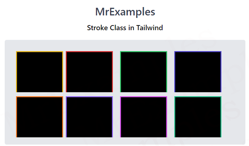
<p class="my-2 font-medium">Stroke Class in Tailwind</p>
<div class="bg-gray-500 grid grid-flow-col w-fit p-4 mx-auto mt-4 rounded">
<svg height="100px" width="500px" xmlns="http://www.mrexamples.com/2000/svg" version="1.1">
<rect class="stroke-yellow-500 stroke-2" x="10" y="10" width="80" height="80"></rect>
<rect class="stroke-red-600 stroke-2" x="120" y="10" width="80" height="80"></rect>
<rect class="stroke-green-500 stroke-2" x="240" y="10" width="80" height="80"></rect>
<rect class="stroke-indigo-700 stroke-2" x="360" y="10" width="80" height="80"></rect>
</svg>
</div>
</body>
</html>
Example Explanation
In above example the body content includes a header, a paragraph, and div’s of four rectangles, each with a colored stroke.
- The body tag contains two classes, m-3 and text-center, which define margins and text alignment for the entire body content.
- The header tag defines a title with a class text-gray-700 text-2xl font-semibold which sets the color, font size, and weight of the title text.
- The paragraph tag below the header defines a short description of the content and uses a class my-2 font-medium which sets margin and font weight.
- Four rectangles below the paragraph is contained in a div element with a class bg-gray-500 grid grid-flow-col w-fit p-4 mx-auto mt-4 rounded. This class applies various styles to the div element including a gray background, a grid layout, and a rounded border.
- The set of four rectangles are created using an SVG element with a height of 100px and a width of 500px. The SVG element contains four rectangle elements with different stroke colors, defined by the tailwind stroke-yellow-500, stroke-red-600, stroke-green-500, and stroke-indigo-700. The stroke-2 class defines the thickness of the border for each rectangle.
The following example demonstrates tailwind stroke color classes for your understanding:
Example:
<!DOCTYPE html>
<html><head>
<script src="https://cdn.tailwindcss.com"></script>
</head>
<body class="m-3 text-center">
<h1 class="text-gray-700 text-2xl font-semibold">
MrExamples
</h1>
<p class="my-2 font-medium">Stroke Class in Tailwind</p>
<div class="bg-gray-500 grid grid-flow-col w-fit p-4 mx-auto mt-4 rounded">
<svg height="100px" width="500px" xmlns="http://www.mrexamples.com/2000/svg" version="1.1">
<rect class="stroke-orange-500 stroke-2" x="10" y="10" width="80" height="80"></rect>
<rect class="stroke-violet-500 stroke-2" x="120" y="10" width="80" height="80"></rect>
<rect class="stroke-fuchsia-500 stroke-2" x="240" y="10" width="80" height="80"></rect>
<rect class="stroke-emerald-500 stroke-2" x="360" y="10" width="80" height="80"></rect>
</svg>
</div>
</body>
</html>
We value your feedback.
+1
+1
+1
+1
+1
+1
+1
