Tailwind Place Self
In this article, we’ll take a closer look at Tailwind Place Self and explore how it can help you streamline your CSS workflow and build more efficient web designs.
This class allows you to align a single grid or flex item along both the horizontal and vertical axes.
This utility overrides the align-self and justify-self properties of the grid container.
This property can be used to override the alignment specified by the place-items property for a specific grid item.
Tailwind Place Self Classes
Tailwind Place Self provides a large collection of pre-built classes that can be used to style HTML elements.
| Classes |
Overview |
| place-self-auto |
This is the default value, keeping the alignment of the grid or flex item as specified by the place-items property. |
| place-self-start |
The grid or flex item will be aligned to the start of the cell both horizontally and vertically. |
| place-self-end |
Using this class, the grid or flex item will appear at the end of the cell both horizontally and vertically. |
| place-self-center |
By using this class, the grid or flex item is aligned to the center of both the horizontal and vertical axes of the cell. |
| place-self-stretch |
In both horizontal and vertical directions, the grid or flex item is stretched to fill the entire cell. |
Tailwind Place Self Auto
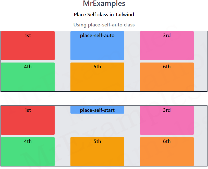
The place-self-auto class resets the alignment of a grid or flex item to the default alignment set by the parent container’s place-items property.
This means that the item will inherit the container’s alignment values for both the horizontal and vertical axes.
Syntax
<element class="place-self-auto">...</element>
The following example sheds some light on the usage of place-self-auto class in Tailwind:
<!DOCTYPE html>
<html><head>
<script src="https://cdn.tailwindcss.com"></script>
</head>
<body class="m-3 text-center">
<h1 class="text-gray-700 text-2xl font-semibold">
MrExamples
</h1>
<p class="my-2 font-semibold">Place Self class in Tailwind</p>
<p class="text-gray-500 font-medium my-2">Using place-self-auto class</p>
<div class=" h-48 w-full grid grid-cols-3 gap-2
place-items-stretch
bg-gray-200 border-solid border-2
border-gray-900 font-medium">
<div class="bg-red-500 w-4/5 rounded-sm">1st</div>
<div class="bg-blue-400 w-4/5 place-self-auto rounded-sm">place-self-auto</div>
<div class="bg-pink-400 w-4/5 rounded-sm">3rd</div>
<div class="bg-green-400 w-4/5 rounded-sm">4th</div>
<div class="bg-amber-500 w-4/5 rounded-sm">5th</div>
<div class="bg-orange-400 w-4/5 rounded-sm">6th</div>
</div>
</body>
</html>
Tailwind Place Self Start
The place-self-start class in CSS Grid is used to align an individual grid item to the start of the grid container along both the horizontal and vertical axes.
This means that the item will be positioned towards the top left corner of the container.
Syntax
<element class="place-self-start">...</element>
Below example demonstrates the place-self-start class in Tailwind:
<!DOCTYPE html>
<html><head>
<script src="https://cdn.tailwindcss.com"></script>
</head>
<body class="m-3 text-center">
<h1 class="text-gray-700 text-2xl font-semibold">
MrExamples
</h1>
<p class="my-2 font-semibold">Place Self class in Tailwind</p>
<p class="text-gray-500 font-medium my-2">Using place-self-start class</p>
<div class=" h-48 w-full grid grid-cols-3 gap-2
place-items-stretch
bg-gray-200 border-solid border-2
border-gray-900 font-medium">
<div class="bg-red-500 w-4/5 rounded-sm">1st</div>
<div class="bg-blue-400 w-4/5 place-self-start rounded-sm">place-self-start</div>
<div class="bg-pink-400 w-4/5 rounded-sm">3rd</div>
<div class="bg-green-400 w-4/5 rounded-sm">4th</div>
<div class="bg-amber-500 w-4/5 rounded-sm">5th</div>
<div class="bg-orange-400 w-4/5 rounded-sm">6th</div>
</div>
</body>
</html>
Tailwind Place Self End
This class aligns an individual grid or flex item to the end of the container along both the horizontal and vertical axes.
This means that the item will be positioned towards the bottom right corner of the container.
Syntax
<element class="place-self-end">...</element>
Let’s take a look at an example of the place-self-end class in Tailwind:
<!DOCTYPE html>
<html><head>
<script src="https://cdn.tailwindcss.com"></script>
</head>
<body class="m-3 text-center">
<h1 class="text-gray-700 text-2xl font-semibold">
MrExamples
</h1>
<p class="my-2 font-semibold">Place Self class in Tailwind</p>
<p class="text-gray-500 font-medium my-2">Using place-self-end class</p>
<div class=" h-48 w-full grid grid-cols-3 gap-2
place-items-stretch
bg-gray-200 border-solid border-2
border-gray-900 font-medium">
<div class="bg-red-500 w-4/5 rounded-sm">1st</div>
<div class="bg-blue-400 w-4/5 place-self-end rounded-sm">place-self-end</div>
<div class="bg-pink-400 w-4/5 rounded-sm">3rd</div>
<div class="bg-green-400 w-4/5 rounded-sm">4th</div>
<div class="bg-amber-500 w-4/5 rounded-sm">5th</div>
<div class="bg-orange-400 w-4/5 rounded-sm">6th</div>
</div>
</body>
</html>
Tailwind Place Self Center
Using this class, each grid or flex item is aligned to the center of its cell on both the horizontal and vertical axes.
The item will be centered both horizontally and vertically within the cell.
Syntax
<element class="place-self-center">...</element>
This example focuses on the implementation of the place-self-center class in Tailwind:
<!DOCTYPE html>
<html><head>
<script src="https://cdn.tailwindcss.com"></script>
</head>
<body class="m-3 text-center">
<h1 class="text-gray-700 text-2xl font-semibold">
MrExamples
</h1>
<p class="my-2 font-semibold">Place Self class in Tailwind</p>
<p class="text-gray-500 font-medium my-2">Using place-self-center class</p>
<div class=" h-48 w-full grid grid-cols-3 gap-2
place-items-stretch
bg-gray-200 border-solid border-2
border-gray-900 font-medium">
<div class="bg-red-500 w-4/5 rounded-sm">1st</div>
<div class="bg-blue-400 w-4/5 place-self-center rounded-sm">place-self-center</div>
<div class="bg-pink-400 w-4/5 rounded-sm">3rd</div>
<div class="bg-green-400 w-4/5 rounded-sm">4th</div>
<div class="bg-amber-500 w-4/5 rounded-sm">5th</div>
<div class="bg-orange-400 w-4/5 rounded-sm">6th</div>
</div>
</body>
</html>
Tailwind Place Self Stretch
Grid or flex items can be stretched along both horizontal and vertical axes using this class.
It means that the item will be expanded to take up all of the available space in the cell, regardless of its original size.
Syntax
<element class="place-self-stretch">...</element>
Let’s take a look at a demonstration of the place-self-stretch class in Tailwind:
<!DOCTYPE html>
<html><head>
<script src="https://cdn.tailwindcss.com"></script>
</head>
<body class="m-3 text-center">
<h1 class="text-gray-700 text-2xl font-semibold">
MrExamples
</h1>
<p class="my-2 font-semibold">Place Self class in Tailwind</p>
<p class="text-gray-500 font-medium my-2">Using place-self-stretch class</p>
<div class=" h-48 w-full grid grid-cols-3 gap-2
place-items-stretch
bg-gray-200 border-solid border-2
border-gray-900 font-medium">
<div class="bg-red-500 w-4/5 rounded-sm">1st</div>
<div class="bg-blue-400 w-4/5 place-self-stretch rounded-sm">place-self-stretch</div>
<div class="bg-pink-400 w-4/5 rounded-sm">3rd</div>
<div class="bg-green-400 w-4/5 rounded-sm">4th</div>
<div class="bg-amber-500 w-4/5 rounded-sm">5th</div>
<div class="bg-orange-400 w-4/5 rounded-sm">6th</div>
</div>
</body>
</html>
