Tailwind Border Color: Explained and Demonstrated
In this article, we’ll take a closer look at Tailwind border color classes with examples and how they can be used in your web development projects.
Tailwind CSS is a popular CSS framework that offers a range of classes to quickly style your HTML elements.
One of the key features of Tailwind CSS is its comprehensive set of border color classes.
Tailwind Border Color
Tailwind border color of an element can be set using the border color class.
In Tailwind CSS, this class accepts multiple values, with each value represented by a class. Alternatively, in normal CSS, the border-color property is used.
Syntax
<element class="border-{color}"></element>
Tailwind Border Color classes
The border color of an element can be specified using the “border-{color}” class in Tailwind CSS.
This class accepts a range of values that can be used to define the color of the border.
Here are some of the most commonly used border color classes in Tailwind CSS:
- border-transparent : This class sets the border color to transparent. This is useful when you want to hide the border of an element.
- border-current : This class sets the border color to the same color as the text or background color of the element. This is useful when you want to create an outline around the element that blends in with the content.
- border-white : This class sets the border color to white. This is useful when you want to create a border that stands out against a dark background.
- border-black : This class sets the border color to black. This is useful when you want to create a border that stands out against a light background.
- border-{color}-50 : This class sets the border color to a shade of the specified color. The number “50” can be replaced with any number from 100 to 900 to get a different shade of the color. For example, “border-blue-100” will give you a lighter shade of blue than “border-blue-900”.
- border-blue-50 : This class will result in a blue border.
- border-red-50 : This class sets the border color to red. This is useful when you want to create a border that stands out against a light background.
- border-indigo-50 : This class sets the border color to indigo. This is useful when you want to create a border that stands out against a light background.
- border-yellow-50 : This class sets the border color to yellow. This is useful when you want to create a border that stands out against a dark background.
- border-green-50 : This class sets the border color to green. This is useful when you want to create a border that stands out against a dark background.
- border-purple-50 : This class sets the border color to purple. This is useful when you want to create a border that stands out against a light background.
- border-pink-50 : This class will result in a pink border.
To use a Tailwind border color class, simply add it to the HTML element that you want to style.
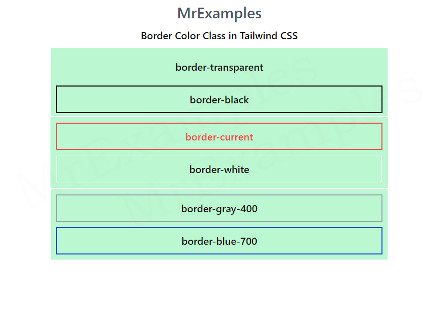
The following example portrays the use of bg-transparent and bg-black classes:
Example:
You can also combine multiple border classes to create more complex border styles.
The border-current and border-white classes are demonstrated in the example below.
Example:
The focus of this example is on utilizing the border-gray-400 and border-blue-700 class.
Example:
In this example border-red-500 and border-indigo-700 classes are utilized:
Example:
Let’s implement border-purple-500 and border-yellow-400 classes in Tailwind for a better understanding:
Example:
This example makes use of border-green-600 and border-pink-500 classes for illustration:
Example:
Conclusion
Tailwind border color classes provide a convenient way to add borders to HTML elements with a wide range of colors and styles.
By using these classes, you can quickly create a variety of border styles without having to write custom CSS.
Whether you want to create a subtle outline or a bold border, Tailwind CSS has a class to help you achieve the look you want.
