Tailwind Border Opacity: A Comprehensive Guide

In this article, we will discuss in detail Tailwind border opacity class with examples and learn how to use it effectively in your developments.

Tailwind CSS is a popular and efficient framework for building modern websites.

One of the great features of Tailwind is its flexibility in customizing the style of an element using pre-defined classes.

The border opacity class is one such feature that allows you to control the opacity of an element’s border.

Tailwind Border Opacity


Tailwind Border Opacity

Tailwind border opacity class provides a way to control the transparency of an element’s border without affecting its content.

The border opacity class accepts a range of values from 0 to 100, with intermediate values corresponding to partially transparent values.

When the value is set to 0, the border is fully transparent, while when the value is set to 100, the border is fully opaque.

Syntax

<element class="border-opacity-{amount}">....</element>

In above syntax, replace {amount} with the value from the border-opacity class that you want to use.

For example, to set an element’s border opacity to 50, you would add the following class to the element:

<div class="border border-red-500 border-opacity-50">....</div>

Tailwind Border Opacity classes

The border-opacity class provides an alternative to the CSS opacity property, allowing you to set the transparency of an element’s border using Tailwind’s intuitive class names.

Let’s take a look at the available border opacity classes in Tailwind CSS:

  • border-opacity-0
  • border-opacity-5
  • border-opacity-10
  • border-opacity-20
  • border-opacity-25
  • border-opacity-30
  • border-opacity-40
  • border-opacity-50
  • border-opacity-60
  • border-opacity-70
  • border-opacity-75
  • border-opacity-80
  • border-opacity-90
  • border-opacity-95
  • border-opacity-100

These values indicate how transparent an element’s border is.

You can use these classes to achieve various effects, from subtle to dramatic.

For example, you can use border-opacity-0 to create a borderless element, or use intermediate values to create a border that’s partially transparent.

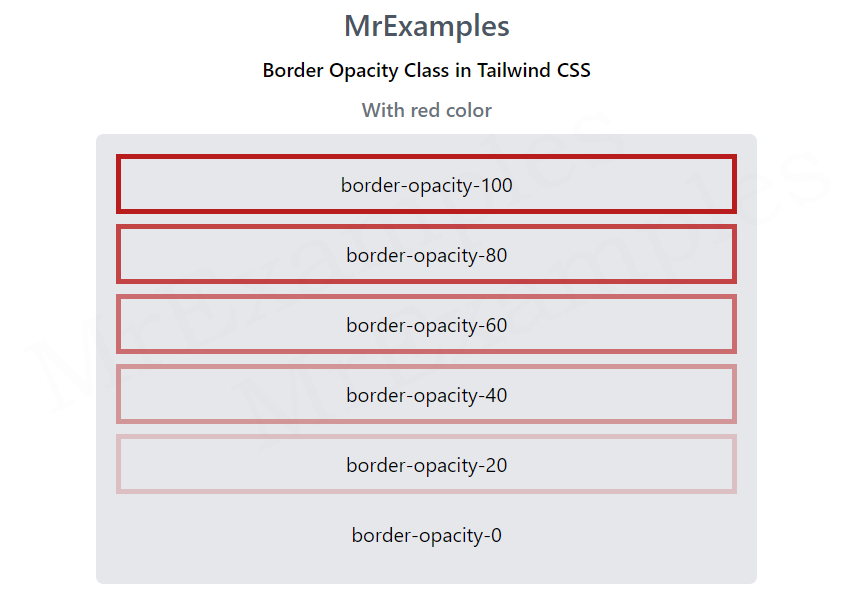
Some of the available classes have been applied to a red border in this example:

Example: 

<!DOCTYPE html> <html><head> <script src="https://cdn.tailwindcss.com"></script> </head> <body class="text-center mx-4 space-y-2"> <h1 class="text-gray-600 text-2xl font-semibold"> MrExamples </h1> <p class="font-semibold my-2">Border Opacity Class in Tailwind CSS</p> <p class="font-medium text-gray-500 my-2">With red color</p> <div class="mx-14 bg-gray-200 grid grid-rows-6 grid-flow-col gap-2 text-center p-4 rounded-md"> <p class="border-red-700 border-4 border-opacity-100 p-2"> border-opacity-100 </p> <p class="border-red-700 border-4 border-opacity-80 p-2"> border-opacity-80 </p> <p class="border-red-700 border-4 border-opacity-60 p-2"> border-opacity-60 </p> <p class="border-red-700 border-4 border-opacity-40 p-2"> border-opacity-40 </p> <p class="border-red-700 border-4 border-opacity-20 p-2"> border-opacity-20 </p> <p class="border-red-700 border-4 border-opacity-0 p-2"> border-opacity-0 </p> </div> </body> </html>

This example showcases the application of some of the available classes on a green border:

Example: 

<!DOCTYPE html> <html><head> <script src="https://cdn.tailwindcss.com"></script> </head> <body class="text-center mx-4 space-y-2"> <h1 class="text-gray-600 text-2xl font-semibold"> MrExamples </h1> <p class="font-semibold my-2">Border Opacity Class in Tailwind CSS</p> <p class="font-medium text-gray-500 my-2">With green color</p> <div class="mx-14 bg-gray-200 grid grid-rows-6 grid-flow-col gap-2 text-center p-4 rounded-md"> <p class="border-green-700 border-4 border-opacity-100 p-2"> border-opacity-100 </p> <p class="border-green-700 border-4 border-opacity-80 p-2"> border-opacity-80 </p> <p class="border-green-700 border-4 border-opacity-60 p-2"> border-opacity-60 </p> <p class="border-green-700 border-4 border-opacity-40 p-2"> border-opacity-40 </p> <p class="border-green-700 border-4 border-opacity-20 p-2"> border-opacity-20 </p> <p class="border-green-700 border-4 border-opacity-0 p-2"> border-opacity-0 </p> </div> </body> </html>

This example demonstrates the usage of some available classes on a blue border:

Example: 

<!DOCTYPE html> <html><head> <script src="https://cdn.tailwindcss.com"></script> </head> <body class="text-center mx-4 space-y-2"> <h1 class="text-gray-600 text-2xl font-semibold"> MrExamples </h1> <p class="font-semibold my-2">Border Opacity Class in Tailwind CSS</p> <p class="font-medium text-gray-500 my-2">With blue color</p> <div class="mx-14 bg-gray-200 grid grid-rows-6 grid-flow-col gap-2 text-center p-4 rounded-md"> <p class="border-blue-700 border-4 border-opacity-100 p-2"> border-opacity-100 </p> <p class="border-blue-700 border-4 border-opacity-80 p-2"> border-opacity-80 </p> <p class="border-blue-700 border-4 border-opacity-60 p-2"> border-opacity-60 </p> <p class="border-blue-700 border-4 border-opacity-40 p-2"> border-opacity-40 </p> <p class="border-blue-700 border-4 border-opacity-20 p-2"> border-opacity-20 </p> <p class="border-blue-700 border-4 border-opacity-0 p-2"> border-opacity-0 </p> </div> </body> </html>

In conclusion, tailwind border opacity class is an essential class that enables you to control the transparency of an element’s border with ease.

By utilizing this class, you can create stunning designs and ensure that your web pages look amazing across different devices and screen sizes.

We value your feedback.
+1
0
+1
0
+1
0
+1
0
+1
0
+1
0
+1
0

Subscribe To Our Newsletter
Enter your email to receive a weekly round-up of our best posts. Learn more!
icon

Leave a Reply

Your email address will not be published. Required fields are marked *