Align Content In Tailwind CSS

In this article, we will explore the align content utility class in Tailwind CSS, which is specifically designed to help you align multiple rows of content within a container.

We’ll take a look at the different values you can use with the align content property and show you some examples of how to apply them to your own projects. With the help of this utility class, you can quickly and easily align your content in a way that suits your needs and enhances the user experience.

let’s dive in and learn how to use the align-content utility class in Tailwind CSS.

In Tailwind CSS, this class accepts many values – It’s an alternative to the CSS Align Content property.

The flex-wrap property can be modified with this class. In this case, it aligns flex lines. Within a flexible container, it specifies the alignment of lines.

When flex-wrap: wrap is applied, flex lines are aligned within a flexbox. This property can only be used if multiple lines of flexbox items exist.


Align Content Classes

Here are the possible values for the align content property:

  1. start – Aligns content to the top of the container.
  2. center – Aligns content to the center of the container.
  3. end – Aligns content to the bottom of the container.
  4. between – Distributes the rows of content evenly with space between them.
  5. around – Distributes the rows of content evenly with space around them.
  6. evenly – Distributes the rows of content evenly with equal space between them.

First, you must create a flex container with multiple rows of flex items before you can use the align-content class.

In below example, we have three rows of items in a flex container:

Example: 

<!DOCTYPE html PUBLIC "-//W3C//DTD HTML 4.0 Transitional//EN" "http://www.w3.org/TR/REC-html40/loose.dtd"> <html><body><div class="flex flex-wrap h-64 align-content-evenly"> <div class="w-1/3 h-24 bg-red-500"></div> <div class="w-1/3 h-24 bg-green-500"></div> <div class="w-1/3 h-24 bg-blue-500"></div> <div class="w-1/3 h-24 bg-yellow-500"></div> <div class="w-1/3 h-24 bg-purple-500"></div> <div class="w-1/3 h-24 bg-pink-500"></div> </div></body></html>

In above example, the align-content-evenly class is added to the parent div, which evenly distributes the rows of content with equal space between them.


Content-Start

The content-start class allows you to align the content to the top of the container. This is useful when you want to create a layout where the first row of content is at the top of the container, and any additional rows of content are displayed below it.

Syntax:

<element class="content-start">...</element>

Example: 
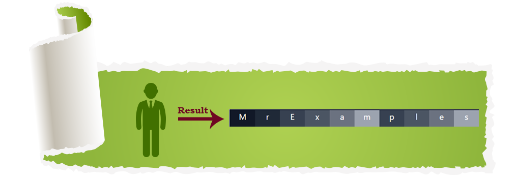
<!DOCTYPE html> <html><head> <script src="https://cdn.tailwindcss.com"></script> </head> <body class="text-center"> <h1 class="text-gray-700 text-2xl font-semibold"> Mr Examples </h1> <b>Align Content class in Tailwind CSS</b> <div id="main" class="ml-20 h-32 w-full flex flex-wrap content-start bg-green-200 border-solid border-2 border-gray-900 text-white"> <div class="bg-gray-900 w-12 h-8">M</div> <div class="bg-gray-800 w-12 h-8">r</div> <div class="bg-gray-700 w-12 h-8">E</div> <div class="bg-gray-600 w-12 h-8">x</div> <div class="bg-gray-500 w-12 h-8">a</div> <div class="bg-gray-400 w-12 h-8">m</div> <div class="bg-gray-700 w-12 h-8">p</div> <div class="bg-gray-600 w-12 h-8">l</div> <div class="bg-gray-500 w-12 h-8">e</div> <div class="bg-gray-400 w-12 h-8">s</div> </div> </body> </html>

Align Content examples


Content-Center

Lines are placed on the center of flex containers using this class.

Syntax:

<element class="content-center">...</element>

Example: 

<!DOCTYPE html> <html><head> <script src="https://cdn.tailwindcss.com"></script> </head> <body class="text-center"> <h1 class="text-gray-700 text-2xl font-semibold"> Mr Examples </h1> <b>Align Content class in Tailwind CSS</b> <div id="main" class="ml-20 h-32 w-full flex flex-wrap content-center bg-green-200 border-solid border-2 border-gray-900 text-white"> <div class="bg-gray-900 w-12 h-8">M</div> <div class="bg-gray-800 w-12 h-8">r</div> <div class="bg-gray-700 w-12 h-8">E</div> <div class="bg-gray-600 w-12 h-8">x</div> <div class="bg-gray-500 w-12 h-8">a</div> <div class="bg-gray-400 w-12 h-8">m</div> <div class="bg-gray-700 w-12 h-8">p</div> <div class="bg-gray-600 w-12 h-8">l</div> <div class="bg-gray-500 w-12 h-8">e</div> <div class="bg-gray-400 w-12 h-8">s</div> </div> </body> </html>

Content-End

Content-End class specifies how lines are positioned at the end of a flex container.

Syntax:

<element class="content-end">...</element>

Example: 

<!DOCTYPE html> <html><head> <script src="https://cdn.tailwindcss.com"></script> </head> <body class="text-center"> <h1 class="text-gray-700 text-2xl font-semibold"> Mr Examples </h1> <b>Align Content class in Tailwind CSS</b> <div id="main" class="ml-20 h-32 w-full flex flex-wrap content-end bg-green-200 border-solid border-2 border-gray-900 text-white"> <div class="bg-gray-900 w-12 h-8">M</div> <div class="bg-gray-800 w-12 h-8">r</div> <div class="bg-gray-700 w-12 h-8">E</div> <div class="bg-gray-600 w-12 h-8">x</div> <div class="bg-gray-500 w-12 h-8">a</div> <div class="bg-gray-400 w-12 h-8">m</div> <div class="bg-gray-700 w-12 h-8">p</div> <div class="bg-gray-600 w-12 h-8">l</div> <div class="bg-gray-500 w-12 h-8">e</div> <div class="bg-gray-400 w-12 h-8">s</div> </div> </body> </html>

Content-Between

The content-between value of the align-content property in Tailwind CSS allows you to distribute the rows of content evenly with space between them. This is particularly useful when you want to create a layout where there is equal spacing between each row of content.

Syntax:

<element class="content-between">...</element>

Example: 

<!DOCTYPE html> <html><head> <script src="https://cdn.tailwindcss.com"></script> </head> <body class="text-center"> <h1 class="text-gray-700 text-2xl font-semibold"> Mr Examples </h1> <b>Align Content class in Tailwind CSS</b> <div id="main" class="ml-20 h-32 w-full flex flex-wrap content-between bg-green-200 border-solid border-2 border-gray-900 text-white"> <div class="bg-gray-900 w-12 h-8">M</div> <div class="bg-gray-800 w-12 h-8">r</div> <div class="bg-gray-700 w-12 h-8">E</div> <div class="bg-gray-600 w-12 h-8">x</div> <div class="bg-gray-500 w-12 h-8">a</div> <div class="bg-gray-400 w-12 h-8">m</div> <div class="bg-gray-700 w-12 h-8">p</div> <div class="bg-gray-600 w-12 h-8">l</div> <div class="bg-gray-500 w-12 h-8">e</div> <div class="bg-gray-400 w-12 h-8">s</div> </div> </body> </html>

Content-Around

You can distribute rows of content evenly with space around them by setting the content-around class.

Syntax:

<element class="content-around">...</element>

you can create equal spacing between rows of content and add visual breathing room between them:

Example: 

<!DOCTYPE html> <html><head> <script src="https://cdn.tailwindcss.com"></script> </head> <body class="text-center"> <h1 class="text-gray-700 text-2xl font-semibold"> Mr Examples </h1> <b>Align Content class in Tailwind CSS</b> <div id="main" class="ml-20 h-32 w-full flex flex-wrap content-around bg-green-200 border-solid border-2 border-gray-900 text-white"> <div class="bg-gray-900 w-12 h-8">M</div> <div class="bg-gray-800 w-12 h-8">r</div> <div class="bg-gray-700 w-12 h-8">E</div> <div class="bg-gray-600 w-12 h-8">x</div> <div class="bg-gray-500 w-12 h-8">a</div> <div class="bg-gray-400 w-12 h-8">m</div> <div class="bg-gray-700 w-12 h-8">p</div> <div class="bg-gray-600 w-12 h-8">l</div> <div class="bg-gray-500 w-12 h-8">e</div> <div class="bg-gray-400 w-12 h-8">s</div> </div> </body> </html>


Content-Evenly

You can use the content-evenly class to distribute rows of content evenly, including at the top and bottom of the container.

You can use this method when displaying multiple rows of content with equal emphasis to create a visually balanced layout.

Syntax:

<element class="content-evenly">...</element>

You must add the align-content-evenly class to the parent element that contains your rows of content in order to use content-evenly:

Example: 

<!DOCTYPE html> <html><head> <script src="https://cdn.tailwindcss.com"></script> </head> <body class="text-center"> <h1 class="text-gray-700 text-2xl font-semibold"> Mr Examples </h1> <b>Align Content class in Tailwind CSS</b> <div id="main" class="ml-20 h-32 w-full flex flex-wrap content-evenly bg-green-200 border-solid border-2 border-gray-900 text-white"> <div class="bg-gray-900 w-12 h-8">M</div> <div class="bg-gray-800 w-12 h-8">r</div> <div class="bg-gray-700 w-12 h-8">E</div> <div class="bg-gray-600 w-12 h-8">x</div> <div class="bg-gray-500 w-12 h-8">a</div> <div class="bg-gray-400 w-12 h-8">m</div> <div class="bg-gray-700 w-12 h-8">p</div> <div class="bg-gray-600 w-12 h-8">l</div> <div class="bg-gray-500 w-12 h-8">e</div> <div class="bg-gray-400 w-12 h-8">s</div> </div> </body> </html>
We value your feedback.
+1
0
+1
0
+1
0
+1
0
+1
0
+1
0
+1
0

Subscribe To Our Newsletter
Enter your email to receive a weekly round-up of our best posts. Learn more!
icon

Leave a Reply

Your email address will not be published. Required fields are marked *