Tailwind Divide Width
The purpose of this article is to provide an overview of Tailwind Divide Width, how to use it, and how it can help you create visually pleasing web pages.
Tailwind CSS provides an easy way to set the divider or border width between elements using the divide-width class.
This class can be used in place of the traditional CSS border-top-width and border-bottom-width properties.
By default, dividers have a width of 1px, but with Tailwind divide width, you can set the width of dividers or borders between elements with a single line of code.
The class accepts a wide range of values that cover all of the relevant properties, including the width, style, and color of the divider or border.
Syntax
You can add a divider with a specific width by adding the “divide-width” class followed by a width value.
<element class="divide-x-{number}">...</element>
If you want to add a divider with a width of 2px, use the syntax below:
<element class="divide-width-2"></element>
This will insert a divider with a width of 2px into the element.
Tailwind Divide Width Classes
| Classes |
Overview |
| divide-x |
A horizontal divide can be set using this class. |
| divide-x-reverse |
This particular class defines the horizontal reverse divide. |
| divide-y |
For setting the vertical divide, this class is used. |
| divide-y-reverse |
This class is specifically designed to create vertical dividers in reverse order. |
Note: The divide-y-{number} and divide-x-{number} classes can be customized to have values from 0 to 8, with increments of 2.
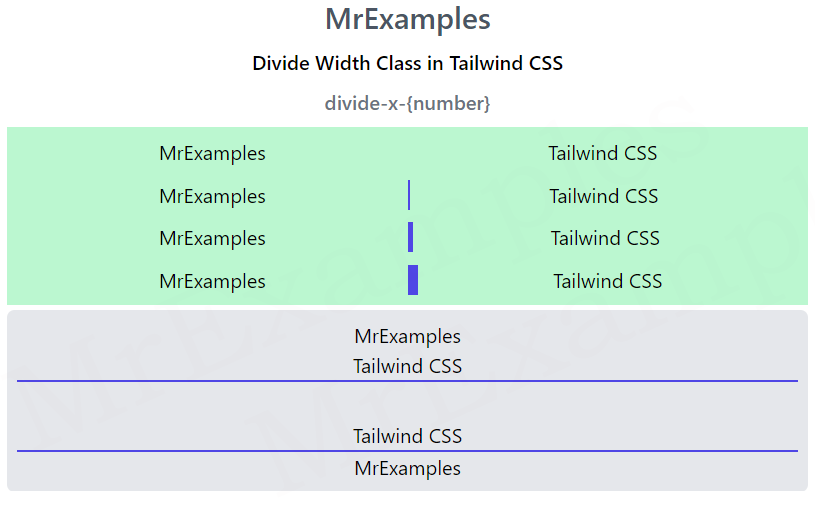
Tailwind divide-x-{number}
The purpose of this class is to add borders between horizontal child elements.
Syntax
<element class="divide-x-{number}">....</element>
<!DOCTYPE html>
<html>
<head>
<script src="https://cdn.tailwindcss.com"></script>
</head>
<body class="text-center">
<h1 class="text-gray-600 text-2xl font-semibold">
MrExamples
</h1>
<p class="font-semibold my-2">Divide Width Class in Tailwind CSS</p>
<p class="font-medium text-gray-500 my-2">divide-x-{number}</p>
<div class="mx-4 bg-green-200 p-2">
<div class="grid grid-cols-2 divide-x-0
divide-indigo-600">
<div>MrExamples</div>
<div>Tailwind CSS</div>
</div>
<div style="height:10px"></div>
<div class="grid grid-cols-2 divide-x-2
divide-indigo-600">
<div>MrExamples</div>
<div>Tailwind CSS</div>
</div>
<div style="height:10px"></div>
<div class="grid grid-cols-2 divide-x-4
divide-indigo-600">
<div>MrExamples</div>
<div>Tailwind CSS</div>
</div>
<div style="height:10px"></div>
<div class="grid grid-cols-2 divide-x-8
divide-indigo-600">
<div>MrExamples</div>
<div>Tailwind CSS</div>
</div>
</div>
</body>
</html>
Tailwind divide-y-{number}
This class serves the purpose of adding borders between vertical child elements.
Syntax
<element class="divide-y-{number}">....</element>
<!DOCTYPE html>
<html>
<head>
<script src="https://cdn.tailwindcss.com"></script>
</head>
<body class="text-center">
<h1 class="text-gray-600 text-2xl font-semibold">
MrExamples
</h1>
<p class="font-semibold my-2">Divide Width Class in Tailwind CSS</p>
<p class="font-medium text-gray-500 my-2">divide-y-{number}</p>
<div class="mx-4 bg-green-200 p-2">
<div class="grid grid-rows-2 divide-y-0
divide-indigo-600">
<div>MrExamples</div>
<div>Tailwind CSS</div>
</div>
<div style="height:10px"></div>
<div class="grid grid-rows-2 divide-y-2
divide-indigo-600">
<div>MrExamples</div>
<div>Tailwind CSS</div>
</div>
<div style="height:10px"></div>
<div class="grid grid-rows-2 divide-y-4
divide-indigo-600">
<div>MrExamples</div>
<div>Tailwind CSS</div>
</div>
<div style="height:10px"></div>
<div class="grid grid-rows-2 divide-y-8
divide-indigo-600">
<div>MrExamples</div>
<div>Tailwind CSS</div>
</div>
</div>
</body>
</html>
Tailwind divide-y-reverse
This class reverses the vertical border between child elements.
Syntax
<element class="divide-y-reverse">....</element>
The following example illustrates how to use the divide-y-reverse class in Tailwind.
The flex-col-reverse is used so that the divider is placed between the elements:
<!DOCTYPE html>
<html>
<head>
<script src="https://cdn.tailwindcss.com"></script>
</head>
<body class="text-center">
<h1 class="text-gray-600 text-2xl font-semibold">
MrExamples
</h1>
<p class="font-semibold my-2">Divide Width Class in Tailwind CSS</p>
<p class="font-medium text-gray-500 my-2">divide-y-reverse</p>
<div class="mx-4 bg-gray-200 p-2 rounded-md">
<div class="flex flex-col divide-y-2
divide-y-reverse divide-indigo-600">
<div>MrExamples</div>
<div>Tailwind CSS</div>
</div>
<div style="height:30px"></div>
<div class="flex flex-col-reverse divide-y-2
divide-y-reverse divide-indigo-600">
<div>MrExamples</div>
<div>Tailwind CSS</div>
</div>
</div>
</body>
</html>
Tailwind divide-x-reverse
This class reverses the horizontal border between the child elements.
Syntax
<element class="divide-x-reverse">....</element>
Here is an example of divide-x-reverse class in action:
<!DOCTYPE html>
<html>
<head>
<script src="https://cdn.tailwindcss.com"></script>
</head>
<body class="text-center">
<h1 class="text-gray-600 text-2xl font-semibold">
MrExamples
</h1>
<p class="font-semibold my-2">Divide Width Class in Tailwind CSS</p>
<p class="font-medium text-gray-500 my-2">divide-y-reverse</p>
<div class="mx-4 bg-gray-200 p-2 rounded-md">
<div class="flex flex-row justify-center divide-x-2
divide-x-reverse divide-indigo-600">
<div>MrExamples</div>
<div>Tailwind CSS</div>
</div>
<div style="height:30px"></div>
<div class="flex flex-row-reverse justify-center divide-x-2
divide-x-reverse divide-indigo-600">
<div>MrExamples</div>
<div>Tailwind CSS</div>
</div>
</div>
</body>
</html>
