Tailwind Background Position: A Brief Overview
This article provides a brief overview of Tailwind Background Position class with examples, an alternative to the CSS background-position property.
With this class, you can position a background image for an element.
The default placement of a background image on an element is in the top-left corner.

Syntax
To use Tailwind Background Position class, use the following syntax:
<element class="bg-{side}"></element>
Tailwind Background Position Classes
Tailwind CSS provides a set of classes to position a background image on an element.
These classes accept more than one value, allowing you to position the background image anywhere you like.
Here are the available Tailwind background position classes:
- bg-left-top : This class positions the background on the top-left.
- bg-top : The background is positioned at the top of the page with this class.
- bg-right-top : With this class, the background appears at the top-right of the page.
- bg-left : The background is positioned on the left of the page with this class.
- bg-center : This class positions the background at the center of the page.
- bg-right : With this class, the background appears on the right.
- bg-left-bottom : This class positions the background on the bottom-left of the page.
- bg-bottom : With this class, the background appears at the bottom of the page.
- bg-right-bottom : The background is positioned at the bottom-right of the page with this class.
The following example demonstrates the use of bg-left-top class:
<!DOCTYPE html>
<html>
<head>
<script src="https://cdn.tailwindcss.com"></script>
</head><body class="text-center">
<h1 class="text-gray-600 text-2xl font-semibold">
MrExamples
</h1>
<p class="font-semibold my-2">Tailwind CSS bg-left-top class</p>
<div class="bg-gray-300 mx-16 flex justify-center items-center p-2">
<div title="bg-left-top" class="bg-no-repeat bg-left-top bg-transparent w-28 h-28 border-4 my-4" style="background-image:url(
https://mrexamples.com/wp-content/uploads/2023/02/tailwind2.jpg);background-size:50%">
</div>
</div>
</body>
</html>
A nice demonstration of bg-top class is presented in the example below:
<!DOCTYPE html>
<html>
<head>
<script src="https://cdn.tailwindcss.com"></script>
</head><body class="text-center">
<h1 class="text-gray-600 text-2xl font-semibold">
MrExamples
</h1>
<p class="font-semibold my-2">Tailwind CSS bg-top class</p>
<div class="bg-gray-300 mx-16 flex justify-center items-center p-2">
<div title="bg-top" class="bg-no-repeat bg-top bg-transparent w-28 h-28 border-4 my-4" style="background-image:url(
https://mrexamples.com/wp-content/uploads/2023/02/tailwind2.jpg);background-size:50%">
</div>
</div>
</body>
</html>
The following example showcases the implementation of the bg-right-top class:
<!DOCTYPE html>
<html>
<head>
<script src="https://cdn.tailwindcss.com"></script>
</head><body class="text-center">
<h1 class="text-gray-600 text-2xl font-semibold">
MrExamples
</h1>
<p class="font-semibold my-2">Tailwind CSS bg-right-top class</p>
<div class="bg-gray-300 mx-16 flex justify-center items-center p-2">
<div title="bg-right-top" class="bg-no-repeat bg-right-top bg-transparent w-28 h-28 border-4 my-4" style="background-image:url(
https://mrexamples.com/wp-content/uploads/2023/02/tailwind2.jpg);background-size:50%">
</div>
</div>
</body>
</html>
Following example exhibits the use of bg-left class:
<!DOCTYPE html>
<html>
<head>
<script src="https://cdn.tailwindcss.com"></script>
</head><body class="text-center">
<h1 class="text-gray-600 text-2xl font-semibold">
MrExamples
</h1>
<p class="font-semibold my-2">Tailwind CSS bg-left class</p>
<div class="bg-gray-300 mx-16 flex justify-center items-center p-2">
<div title="bg-left" class="bg-no-repeat bg-left bg-transparent w-28 h-28 border-4 my-4" style="background-image:url(
https://mrexamples.com/wp-content/uploads/2023/02/tailwind2.jpg);background-size:50%">
</div>
</div>
</body>
</html>
The following example briefly demonstrates the application of bg-center:
<!DOCTYPE html>
<html>
<head>
<script src="https://cdn.tailwindcss.com"></script>
</head><body class="text-center">
<h1 class="text-gray-600 text-2xl font-semibold">
MrExamples
</h1>
<p class="font-semibold my-2">Tailwind CSS bg-center class</p>
<div class="bg-gray-300 mx-16 flex justify-center items-center p-2">
<div title="bg-center" class="bg-no-repeat bg-center bg-transparent w-28 h-28 border-4 my-4" style="background-image:url(
https://mrexamples.com/wp-content/uploads/2023/02/tailwind2.jpg);background-size:50%">
</div>
</div>
</body>
</html>
A simple example of how the bg-right class can be used is shown in the following example:
<!DOCTYPE html>
<html>
<head>
<script src="https://cdn.tailwindcss.com"></script>
</head><body class="text-center">
<h1 class="text-gray-600 text-2xl font-semibold">
MrExamples
</h1>
<p class="font-semibold my-2">Tailwind CSS bg-right class</p>
<div class="bg-gray-300 mx-16 flex justify-center items-center p-2">
<div title="bg-right" class="bg-no-repeat bg-right bg-transparent w-28 h-28 border-4 my-4" style="background-image:url(
https://mrexamples.com/wp-content/uploads/2023/02/tailwind2.jpg);background-size:50%">
</div>
</div>
</body>
</html>
Following example presents the practical use of bg-left-bottom class:
<!DOCTYPE html>
<html>
<head>
<script src="https://cdn.tailwindcss.com"></script>
</head><body class="text-center">
<h1 class="text-gray-600 text-2xl font-semibold">
MrExamples
</h1>
<p class="font-semibold my-2">Tailwind CSS bg-left-bottom class</p>
<div class="bg-gray-300 mx-16 flex justify-center items-center p-2">
<div title="bg-left-bottom" class="bg-no-repeat bg-left-bottom bg-transparent w-28 h-28 border-4 my-4" style="background-image:url(
https://mrexamples.com/wp-content/uploads/2023/02/tailwind2.jpg);background-size:50%">
</div>
</div>
</body>
</html>
The example below makes it easy to visualize the application of bg-bottom class:
<!DOCTYPE html>
<html>
<head>
<script src="https://cdn.tailwindcss.com"></script>
</head><body class="text-center">
<h1 class="text-gray-600 text-2xl font-semibold">
MrExamples
</h1>
<p class="font-semibold my-2">Tailwind CSS bg-bottom class</p>
<div class="bg-gray-300 mx-16 flex justify-center items-center p-2">
<div title="bg-bottom" class="bg-no-repeat bg-bottom bg-transparent w-28 h-28 border-4 my-4" style="background-image:url(
https://mrexamples.com/wp-content/uploads/2023/02/tailwind2.jpg);background-size:50%">
</div>
</div>
</body>
</html>
Here is an example that depicts the exploitation of bg-right-bottom class:
<!DOCTYPE html>
<html>
<head>
<script src="https://cdn.tailwindcss.com"></script>
</head><body class="text-center">
<h1 class="text-gray-600 text-2xl font-semibold">
MrExamples
</h1>
<p class="font-semibold my-2">Tailwind CSS bg-right-bottom class</p>
<div class="bg-gray-300 mx-16 flex justify-center items-center p-2">
<div title="bg-right-bottom" class="bg-no-repeat bg-right-bottom bg-transparent w-28 h-28 border-4 my-4" style="background-image:url(
https://mrexamples.com/wp-content/uploads/2023/02/tailwind2.jpg);background-size:50%">
</div>
</div>
</body>
</html>
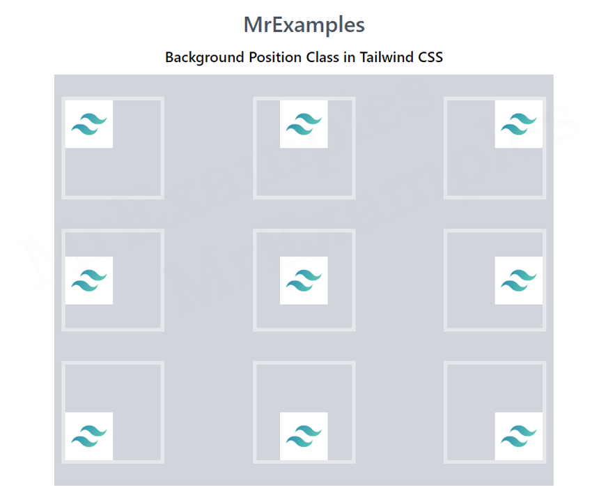
Now let’s take a closer look using an example which combines all classes used above:
<!DOCTYPE html PUBLIC "-//W3C//DTD HTML 4.0 Transitional//EN" "http://www.w3.org/TR/REC-html40/loose.dtd">
<html>
<head>
<script src="https://cdn.tailwindcss.com"></script>
</head><body class="text-center">
<h1 class="text-gray-600 text-2xl font-semibold">
MrExamples
</h1>
<p class="font-semibold my-2">Background Position Class in Tailwind CSS</p>
<div class="bg-gray-300
mx-16
space-y-4
p-2
justify-between
grid grid-rows-3
grid-flow-col">
<div title="bg-left-top" class="bg-no-repeat bg-left-top
bg-transparent w-28 h-28
border-4 my-4" style="background-image:url(
https://mrexamples.com/wp-content/uploads/2023/02/tailwind2.jpg);background-size:50%">
</div>
<div title="bg-left" class="bg-no-repeat bg-left
bg-transparent w-28 h-28
border-4 my-4" style="background-image:url(
https://mrexamples.com/wp-content/uploads/2023/02/tailwind2.jpg);background-size:50%">
</div>
<div title="bg-left-bottom" class="bg-no-repeat bg-left-bottom
bg-transparent w-28 h-28
border-4 my-4" style="background-image:url(
https://mrexamples.com/wp-content/uploads/2023/02/tailwind2.jpg);background-size:50%">
</div>
<div title="bg-top" class="bg-no-repeat bg-top
bg-transparent w-28 h-28
border-4 my-4" style="background-image:url(
https://mrexamples.com/wp-content/uploads/2023/02/tailwind2.jpg);background-size:50%">
</div>
<div title="bg-center" class="bg-no-repeat bg-center
bg-transparent w-28 h-28
border-4 my-4" style="background-image:url(
https://mrexamples.com/wp-content/uploads/2023/02/tailwind2.jpg);background-size:50%">
</div>
<div title="bg-bottom" class="bg-no-repeat bg-bottom
bg-transparent w-28 h-28
border-4 my-4" style="background-image:url(
https://mrexamples.com/wp-content/uploads/2023/02/tailwind2.jpg);background-size:50%">
</div>
<div title="bg-right-top" class="bg-no-repeat bg-right-top
bg-transparent w-28 h-28
border-4 my-4" style="background-image:url(
https://mrexamples.com/wp-content/uploads/2023/02/tailwind2.jpg);background-size:50%">
</div>
<div title="bg-right" class="bg-no-repeat bg-right
bg-transparent w-28 h-28
border-4 my-4" style="background-image:url(
https://mrexamples.com/wp-content/uploads/2023/02/tailwind2.jpg);background-size:50%">
</div>
<div title="bg-right-bottom" class="bg-no-repeat bg-right-bottom
bg-transparent w-28 h-28
border-4 my-4" style="background-image:url(
https://mrexamples.com/wp-content/uploads/2023/02/tailwind2.jpg);background-size:50%">
</div>
</div>
</body>
</html>
Example Explanation
Above example is displaying a grid of nine squares with different background positions.
The class “text-center” is applied to the body element, which centers the text within it. The <h1> element displays the text “MrExamples” in gray color, 2xl size and bold font weight.
The <p> element below it displays the text “Background Position Class in Tailwind CSS” with bold font weight and margin top of 2 units.
The <div> with class “bg-gray-300 mx-16 space-y-4 p-2 justify-between grid grid-rows-3 grid-flow-col” creates a grid container with 3 rows and 3 columns, with a gray background, margin-x of 16 units, padding of 2 units, and spaces between child elements of 4 units. Each child element is a square div with a width and height of 28 units, a transparent background, and a border of 4 units.
The child divs also have different classes that determine the background position of the image, specified by the “bg-left-top,” “bg-left,” “bg-left-bottom,” “bg-top,” “bg-center,” “bg-bottom,” “bg-right-top,” “bg-right,” and “bg-right-bottom” values.
The images used as background for each square have a size of 50% of the element.
When you hover over each square, you can see the title of the square that corresponds to the background position class applied to it.
This example demonstrates the use of Tailwind background position classes to specify the position of a background image within an element.
We hope this article provides a helpful overview of Tailwind Background Position class.