Quick Guide To Tailwind Outline
In this article, we will take a closer look at Tailwind outline classes, and how they can be used to create outlines on your web pages.
Tailwind outlines are a way to highlight elements on a web page, and can be used for a variety of purposes, including:
- Improving accessibility
- Indicating focus
- Providing visual feedback
Tailwind has divided the outline feature into four separate properties, which can be used together or individually to create custom outlines on web pages. These properties include
- Outline color.
- Outline style.
- Outline width.
- Outline offset.
By using these properties, You can create outlines that meet the specific design requirements of your web projects.
Tailwind Outline Color
Tailwind Outline Color allows you to set the color of an outline around an element on a web page.
The color of an outline is an important visual element that can be used to improve accessibility, provide feedback, or indicate focus.
The outline can be used to highlight or emphasize an element, and the color of the outline can be customized using the outline color classes in Tailwind.
Tailwind provides a variety of color options that can be easily applied to an outline using its classes.
Tailwind Outline Color Classes
Tailwind provides a range of classes to set the color of an outline on a web page.
These classes are based on the CSS outline-color property and can be used with any HTML element.
Here are some of the outline color utility classes:
| Color Classes | Overview |
| outline-inherit | The outline color is inherited from the parent element. |
| outline-current | The outline color is the same as the text color. |
| outline-transparent | This is used to make the outline of an element transparent. |
| outline-black | Using this class, the outline color of an element is defined as black. |
| outline-white | Used to set an outline color of an element to white. |
| outline-slate-num | This class is used to apply an outline color to a shade of slate. |
| outline-gray-num | Shade of gray color is used for the outline of an element. |
| outline-zinc-num | Shade of zinc color is used for the outline of an element |
| outline-neutral-num | The outline color is specified as a shade of neutral color in Tailwind. |
| outline-stone-num | Used to set the outline color as a shade of stone color defined in Tailwind. |
| outline-red-num | In this case, the outline color is set to a shade of red. |
| outline-orange-num | This class sets the outline color to a shade of orange. |
| outline-amber-num | The outline color is specified as a shade of amber. |
| outline-yellow-num | Shade of yellow color is used for the outline of an element. |
| outline-lime-num | The outline of an element is colored to a shade of lime using this class. |
| outline-green-num | Used to set the outline of an element as a shade of green. |
| outline-emerald-num | Shades of Tailwind’s emerald color are used for the outline of an element. |
| outline-teal-num | In this case, the outline of an element is set to a shade of teal. |
| outline-cyan-num | A shade of cyan is used as the outline of an element. |
| outline-sky-num | Using this class, the outline color of an element is defined as a shade of sky. |
| outline-blue-num | The outline color is defined as a shade of blue. |
| outline-indigo-num | Used to set the outline color of an element as a shade of indigo. |
| outline-violet-num | Applies an outline color of a shade of violet to an element. |
| outline-purple-num | This class applies an outline color of a shade of purple to an element |
| outline-fuchsia-num | A shade of Tailwind’s fuchsia color is used for the outline of an element. |
| outline-pink-num | Shade of pink color is used for the outline color of an element. |
| outline-rose-num | The outline color is specified as a shade of rose. |
Syntax
<element class="outline-slate-500">...</element>
To apply an outline color class to an HTML element, simply add the class to the element.
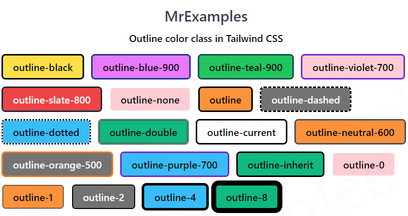
The following example focuses on the implementation of some outline color utility classes in Tailwind:
Example:
Example:
Tailwind Outline Width
Tailwind Outline Width class enables you to set the width of an outline around an element on a web page.
The outline is a line drawn around the outside of an element, outside the border, to make it stand out visually.
Tailwind offers various outline width options that can be applied using its classes.
Tailwind Outline Width Classes
Tailwind offers a variety of classes for defining the width of an outline in a web page.
These classes utilize the CSS outline-width property and are compatible with any HTML element.
The following are some of the outline width classes that Tailwind provides:
| Width Classes | Overview |
| outline-0 | This class sets the width of the outline to 0px, effectively removing the outline from an element. |
| outline-1 | This class is used to define the outline of an element as 1px. |
| outline-2 | This class applies an outline of 2px to an element. |
| outline-4 | Using this class, the outline of an element is specified as 4px. |
| outline-8 | In this case, the outline of an element is defined as 8px |
Syntax
<element class="outline-1">...</element>
To apply an outline width class, simply add the class to the element.
In the below example, our target is to understand the working of the outline width utility classes in Tailwind:
Example:
Tailwind Outline Style
Tailwind outline style classes enables you to apply diverse styles to the outline of an element using the CSS outline-style property.
This property specifies the outline style of an element, such as solid, dashed, dotted and double.
Tailwind offers various outline style options that can be applied using its classes.
Tailwind Outline Style Classes
Here are list of Tailwind outline style property classes:
| Style Classes | Overview |
| outline-none | This class is used to remove the default outline that appears on focused elements in a web page. |
| outline | The outline style is set to a solid line. |
| outline-dashed | Using this class, the outline style is defined as a dashed line. |
| outline-dotted | In this case, the outline style is specified as a dotted line. |
| outline-double | By using this class, the outline style is set to a double line. |
Syntax
<element class="outline-dashed">...</element>
Below example provides a practical overview of the outline style classes in Tailwind:
Example:
Tailwind Outline Offset
In Tailwind CSS, the outline-offset utility class allows you to adjust the distance between element’s outline and its border using the CSS outline-offset property.
This property adds space between the element’s outline and its border, which can be useful for creating a visual effect or separating the outline from the content.
Tailwind Outline Offset Classes
Here are some of the outline offset classes provided by Tailwind:
| Offset Classes | Overview |
| outline-offset-0 | By default, the outline-offset value is 0, which means the outline is drawn directly on top of the border. |
| outline-offset-1 | The outline-offset value is set to 1px. |
| outline-offset-2 | This class sets the outline offset to 2px. |
| outline-offset-4 | This class is used to apply an outline offset of 4px. |
| outline-offset-8 | The outline offset is defined as 8px using this class. |
Syntax
<element class="outline-offset-1">...</element>
We can refer to the example below for a better visualization of the outline offset class in Tailwind:
