Tailwind Placeholder Opacity
This article will explore how to use Tailwind Placeholder Opacity to enhance the user experience on your website.
The placeholder attribute in an input field provides a hint to the user on what type of data should be entered. However, it can be distracting if the placeholder text is too prominent.
Tailwind Placeholder Opacity provides a solution to this problem by allowing you to adjust the opacity of the placeholder text, making it less obtrusive and more visually appealing.
Tailwind Placeholder Opacity Classes
| Classes | Overview |
| placeholder-opacity-0 | This class is used to set the opacity of placeholder text to 0. |
| placeholder-opacity-5 | The opacity of placeholder text is set to 5% using this class. |
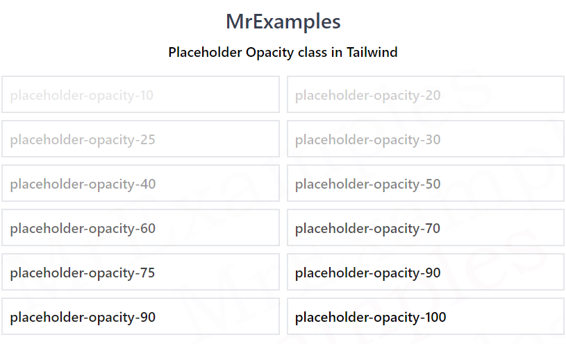
| placeholder-opacity-10 | In this case, the placeholder opacity is set as 10%. |
| placeholder-opacity-20 | Using this class, the placeholder opacity is defined as 20%. |
| placeholder-opacity-25 | This class ensures that the placeholder opacity is set as 25%. |
| placeholder-opacity-30 | Using this class, a 30% opacity is applied to the placeholder text. |
| placeholder-opacity-40 | Applies 40% opacity to the placeholder text. |
| placeholder-opacity-50 | The opacity of placeholder text is specified as 50%. |
| placeholder-opacity-60 | This class is used to set the opacity of placeholder text to 60%. |
| placeholder-opacity-70 | This class applies 70% opacity to the placeholder text. |
| placeholder-opacity-75 | Using this class, 75% opacity is applied to the placeholder text. |
| placeholder-opacity-80 | This class ensures that the placeholder opacity is set as 80%. |
| placeholder-opacity-90 | The opacity of placeholder text is specified as 90%. |
| placeholder-opacity-95 | Applies 95% opacity to the placeholder text. |
| placeholder-opacity-100 | In this case, the placeholder opacity is set as 100%. |
Syntax
<element class="placeholder-{opacity}">...</element>Tailwind Placeholder Opacity can be added to an input field using the placeholder-opacity class.
This class can be added to any input field in your HTML code.
The following example discusses the implementation of some placeholder opacity classes:
Example:
Example:
Tailwind Placeholder Opacity Benefits
Tailwind Placeholder Opacity can provide several benefits to the user experience on your website.
Here are a few reasons why you might want to consider using this feature:
- By reducing the opacity of the placeholder text, it becomes less distracting and easier to read. This can be especially useful for longer placeholder text that might otherwise be overwhelming to the user.
- Lowering the opacity of the placeholder text can also make the input field look more visually appealing. It can provide a subtle, yet noticeable effect that adds to the overall design of the website.
- By making the placeholder text less prominent, the user is better able to focus on entering their information into the input field. This can lead to increased usability and a better user experience overall.
Conclusion
Tailwind Placeholder Opacity is a useful feature for web developers who want to enhance the user experience on their website.
By adjusting the opacity of the placeholder text, you can improve readability, aesthetics, and usability. It’s easy to use and customizable, making it a valuable tool for any web development project.
