Quick Guide To Tailwind Transitions
In this article, we’ll take a closer look at how the Tailwind Transition Property works and how it can be used to enhance the user experience on your website.
In web development, animations and transitions can be used to enhance the user experience and make web pages more dynamic and engaging.
Transitions are powerful CSS features that allow smooth animations between different states of an element.
The transition-property class is used to specify the name of the CSS property on which the transition effect will occur.
Tailwind Transition Property Classes
The transition property classes have been examined below:
| Classes | Overview |
| transition-none | This class is used to specify that transition effects will not be applied to any CSS property. |
| transition-all | All the CSS properties will get a transition effect using this class. This is also the default value for this class. |
| transition | It is possible to specify which CSS properties will be affected by the transition effect. Multiple properties can be specified by separating them with commas. |
| transition-colors | Using this class, the color properties such as background-color, border-color, color, fill and stroke will get a transition effect. |
| transition-opacity | In this case, the opacity property will acquire a transition effect. |
| transition-shadow | This class is used to specify that a transition effect should be applied on the box shadow property. |
| transition-transform | This class specifies that transitions should only be applied to the transform properties of an element. |
Syntax
<element class="transition-shadow">...</element>
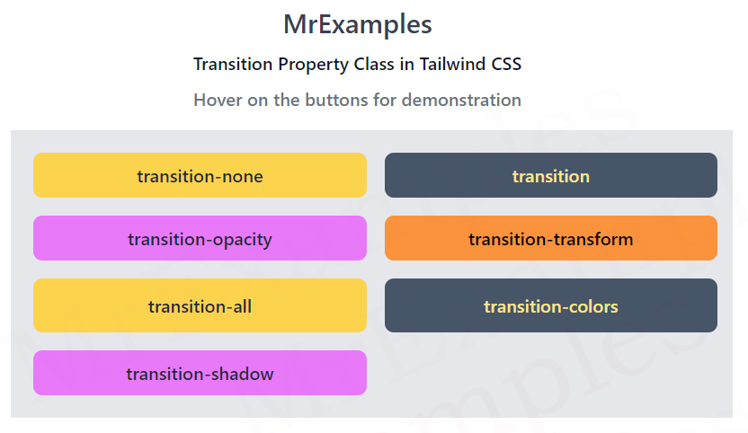
The following example illustrates some of the transition property classes:
Example:
<!DOCTYPE html>
<html><head>
<script src="https://cdn.tailwindcss.com"></script>
</head>
<body class="m-3 text-center">
<h1 class="text-gray-700 text-2xl font-semibold">
MrExamples
</h1>
<p class="font-semibold my-2 text-slate-900">Transition Property Class in Tailwind CSS</p>
<p class="text-gray-500 font-semibold my-2">Hover on the buttons for demonstration</p>
<div class="bg-gray-200 w-full m-4 grid grid-cols-2 gap-4 p-5 font-medium">
<button class="transition-none duration-500 ease-in-out text-slate-800
bg-amber-300 hover:bg-amber-400 hover:scale-110
rounded-lg px-3 py-2">
transition-none
</button>
<button class="transition duration-500 ease-in-out text-amber-200
bg-slate-600 hover:bg-slate-700 hover:scale-110
rounded-lg px-3 py-2">
transition
</button>
<button class="transition-opacity duration-500 ease-in-out text-slate-800
bg-fuchsia-400 hover:bg-fuchsia-500 hover:scale-110
rounded-lg px-3 py-2 hover:opacity-70">
transition-opacity
</button>
<button class="transition-transform duration-500 ease-in-out
bg-orange-400 hover:bg-orange-500 hover:scale-110
rounded-lg px-3 py-2">
transition-transform
</button>
</div>
</body>
</html>
Some of the transition property classes were not covered in the previous example, they have been implemented below:
Example:
<!DOCTYPE html>
<html><head>
<script src="https://cdn.tailwindcss.com"></script>
</head>
<body class="m-3 text-center">
<h1 class="text-gray-700 text-2xl font-semibold">
MrExamples
</h1>
<p class="font-semibold my-2 text-slate-900">Transition Property Class in Tailwind CSS</p>
<p class="text-gray-500 font-semibold my-2">Hover on the buttons for demonstration</p>
<div class="bg-gray-200 w-full m-4 grid grid-cols-2 gap-4 p-5 font-medium">
<button class="transition-all duration-500 ease-in-out text-slate-800
bg-amber-300 hover:bg-amber-400 hover:scale-110
rounded-lg px-3 py-2">
transition-all
</button>
<button class="transition-colors duration-500 ease-in-out text-amber-200
bg-slate-600 hover:bg-slate-700 hover:scale-110 border-4
rounded-lg px-3 py-2 border-transparent hover:border-amber-200">
transition-colors
</button>
<button class="transition-shadow duration-500 ease-in-out text-slate-800
bg-fuchsia-400 hover:bg-fuchsia-500 hover:scale-110
rounded-lg px-3 py-2 hover:shadow-xl">
transition-shadow
</button>
</div>
</body>
</html>
We value your feedback.
+1
+1
+1
+1
+1
+1
+1
