Tailwind Visibility: How to Control Element Visibility?
Let’s take a closer look at Tailwind visibility class and learn how to use it to create more flexible and responsive layouts.
Sometimes you want to show or hide elements depending on certain conditions, such as user interactions or device size.
Tailwind CSS provides a range of visibility utilities to help you control the visibility of HTML elements with ease.

Tailwind CSS uses the visibility class to control an element’s visibility. The visibility class in Tailwind CSS is a powerful utility class that enables us to control the visibility of an element.
Tailwind Visibility Classes
Let’s take a closer look at Tailwind’s visibility classes below:
| Classes | Overview |
| visible | This is the default value for the visibility class. In this case, the element is visible and will be displayed on the screen. |
| invisible | It hides the element but does not remove it from the layout. |
| collapse | By using collapse, you can hide table rows, row groups, columns, and column groups as if they were displayed none, but without affecting the size of other rows and columns. |
Syntax
<element class="invisible">...</element>
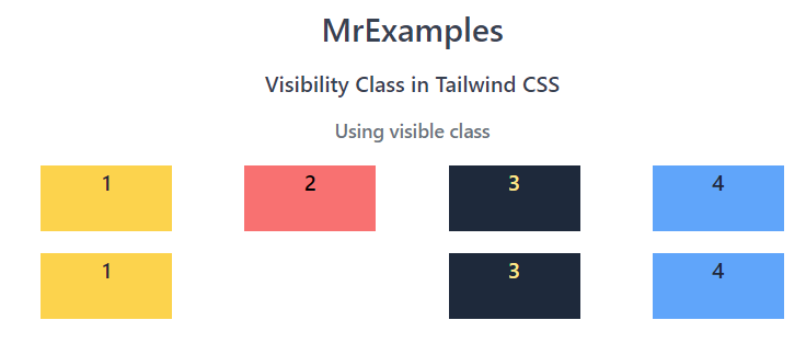
In this example we are going to focus on the visible class in Tailwind:
<!DOCTYPE html>
<html><head>
<script src="https://cdn.tailwindcss.com"></script>
</head>
<body class="m-3 text-center">
<h1 class="text-gray-700 text-2xl font-semibold">
MrExamples
</h1>
<p class="font-semibold text-gray-700 my-3">Visibility Class in Tailwind CSS</p>
<p class="font-medium text-gray-500 my-3 text-sm">Using visible class</p>
<div class="flex flex-row justify-evenly text-center font-medium mt-4">
<div class="bg-amber-300 text-slate-800 w-24 h-12">1</div>
<div class="visible bg-red-400 w-24 h-12">2</div>
<div class="bg-slate-800 text-amber-200 w-24 h-12">3</div>
<div class="bg-blue-400 text-slate-800 w-24 h-12">4</div>
</div>
</body>
</html>
The usage of Tailwind’s invisible class is illustrated in the example below:
<!DOCTYPE html>
<html><head>
<script src="https://cdn.tailwindcss.com"></script>
</head>
<body class="m-3 text-center">
<h1 class="text-gray-700 text-2xl font-semibold">
MrExamples
</h1>
<p class="font-semibold text-gray-700 my-3">Visibility Class in Tailwind CSS</p>
<p class="font-medium text-gray-500 my-3 text-sm">Using invisible class</p>
<div class="flex flex-row justify-evenly text-center font-medium mt-4">
<div class="bg-amber-300 text-slate-800 w-24 h-12">1</div>
<div class="invisible bg-red-500 w-24 h-12">2</div>
<div class="bg-slate-800 text-amber-200 w-24 h-12">3</div>
<div class="bg-blue-400 text-slate-800 w-24 h-12">4</div>
</div>
</body>
</html>
Below example is used for the demonstration of the collapse class in Tailwind:
<!DOCTYPE html>
<html><head>
<script src="https://cdn.tailwindcss.com"></script>
</head>
<body class="m-3 text-center">
<h1 class="text-gray-700 text-2xl font-semibold">
MrExamples
</h1>
<p class="font-semibold text-gray-700 my-3">Visibility Class in Tailwind CSS</p>
<p class="font-medium text-gray-500 my-3 text-sm">Using collapse class</p>
<div class="relative overflow-x-auto mt-4">
<table class="w-full text-sm text-left text-gray-500">
<thead class="text-xs text-gray-600 uppercase bg-gray-100">
<tr>
<th scope="col" class="px-6 py-3">
Product name
</th>
<th scope="col" class="px-6 py-3">
Color
</th>
<th scope="col" class="px-6 py-3">
Category
</th>
<th scope="col" class="px-6 py-3">
Price
</th>
</tr>
</thead>
<tbody>
<tr class="bg-white border-b collapse">
<th scope="row" class="px-6 py-4 font-medium text-gray-900 whitespace-nowrap">
Apple MacBook Pro
</th>
<td class="px-6 py-4">
Silver
</td>
<td class="px-6 py-4">
Laptop
</td>
<td class="px-6 py-4">
$2999
</td>
</tr>
<tr class="bg-white border-b">
<th scope="row" class="px-6 py-4 font-medium text-gray-900 whitespace-nowrap">
Dell Latitude
</th>
<td class="px-6 py-4">
Black
</td>
<td class="px-6 py-4">
Laptop PC
</td>
<td class="px-6 py-4">
$1999
</td>
</tr>
</tbody>
</table>
</div>
</body>
</html>
Tailwind Visibility Benefits
The benefits of using Tailwind Visibility utilities are numerous.
By using these utilities, you can easily control the visibility of HTML elements on your website without having to write custom CSS. This can save you a lot of time and effort in the web design process.
Additionally, you can use Tailwind Visibility classes to create responsive layouts, as you can show or hide elements based on screen size or device.
This means that your website can provide a consistent user experience across different devices and screen sizes. Moreover, using Tailwind Visibility classes can make your website more accessible to users with disabilities, as you can provide alternative content that is accessible to screen readers.