Tailwind Placeholder Color
This article discusses how to use Tailwind placeholder color feature and how to create effective placeholder colors with examples.
Placeholder colors are the colors that are used in input fields before the user types anything in.
It allows you to change the default color of the placeholder text to a custom color.
They are a subtle but important element of web design that can enhance the user experience and make your website more visually appealing.
Tailwind Placeholder Colors?
Tailwind Placeholder colors are the colors that are used to represent text in input fields before the user types anything in.
It often used in forms to indicate what type of information should be entered in each field.
Placeholder colors are typically light grey or a similar neutral color, which helps to differentiate them from the text that the user enters.
Tailwind Placeholder Color Classes
Tailwind makes it easy to set placeholder colors using its built-in classes.
| Classes | Overview |
| placeholder-transparent | This class is used to set the color of the placeholder text of an input element to be transparent. |
| placeholder-current | Used to set the color of placeholder text to the current color of text. |
| placeholder-black | In this case, the placeholder text color is black. |
| placeholder-white | The placeholder text color is set to white. |
| placeholder-gray-50 | The placeholder text color is defined as a shade of gray. |
| placeholder-red-50 | Using this class, the placeholder text color is specified as a shade of red. |
| placeholder-blue-50 | A shade of blue color is used as the placeholder text. |
| placeholder-indigo-50 | The color of placeholder text is a shade of indigo. |
| placeholder-purple-50 | Using this class, the color of placeholder text is set to a shade of purple. |
| placeholder-green-50 | In this case, the placeholder text color is set to a shade of green. |
| placeholder-yellow-50 | The placeholder text color is defined as a shade of yellow. |
| placeholder-pink-50 | A shade of pink color is used as the placeholder text color. |
| placeholder-slate-50 | This class sets the placeholder text’s color to a shade of slate. |
| placeholder-gray-50 | By using this class, placeholder text color will be a shade of gray. |
| placeholder-neutral-50 | In this case, the placeholder text color is set to a shade of neutral. |
| placeholder-zinc-50 | Using this class, the color of placeholder text is set to a shade of zinc. |
| placeholder-stone-50 | Used to set the color of placeholder text to a shade of stone. |
| placeholder-orange-50 | A shade of orange is used as the color of placeholder text. |
| placeholder-amber-50 | This class applies a placeholder text color of amber. |
| placeholder-lime-50 | A shade of lime is used as the placeholder text color. |
| placeholder-emerald-50 | Applies a shade of emerald as the placeholder text color. |
| placeholder-teal-50 | Placeholder text color is set to a shade of teal. |
| placeholder-cyan-50 | The placeholder text color is defined as a shade of cyan. |
| placeholder-sky-50 | Using this class, the placeholder text color is specified as a shade of sky. |
| placeholder-violet-50 | By using this class, the placeholder text color is set to a shade of violet. |
| placeholder-fuchsia-50 | This class ensures the placeholder text color is set to a shade of fuchsia. |
| placeholder-rose-50 | A shade of rose is defined as the placeholder text color. |
Why Use Tailwind Placeholder Colors?
Tailwind Placeholder colors serve several purposes.
- It provides visual cues to users about what information they should enter in each field. This can help to reduce errors and make it easier for visitors to complete forms quickly and accurately.
- Tailwind placeholder colors can enhance the visual appeal of your website. By choosing a color that complements your website’s color scheme, you can create a more cohesive and attractive design.
- It can be used to indicate required fields. By making the placeholder color red, for example, you can let users know that they must fill in that field before they can submit the form.
Syntax
<element class="placeholder-{color}">...</element>The following example illustrates the use of some placeholder color classes in Tailwind:
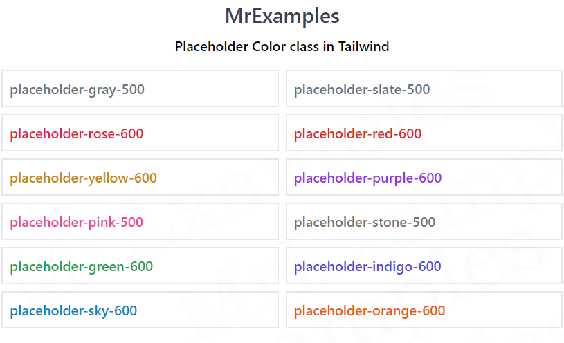
Example:
Example:
Tips for Tailwind Placeholder Colors
When choosing Tailwind placeholder color, there are several factors to consider.
Here are some tips to help you create effective placeholder colors:
- Choose a color that complements your website’s color scheme. This will help to create a cohesive design.
- Consider the readability of the text. Avoid colors that are too light or too dark, as this can make the text difficult to read.
- Use color to indicate required fields. By making the placeholder color red or another attention-grabbing color, you can let users know which fields they must fill in.
- Experiment with opacity. Adjusting the opacity of the placeholder color can create a subtle but visually appealing effect.
- Test your colors on different devices and screen sizes. Make sure your colors are legible and visually appealing on all types of devices.
