Tailwind Resize
In this article, we gain a deeper understanding of the Tailwind resize and its classes with examples.
The resize property in Tailwind CSS provides a simple and flexible way to control the resizing behavior of elements on your web page.

What is Tailwind Resize?
Tailwind Resize is a feature that allows you to specify how an element should behave when the user resizes the browser window or changes the device orientation.
It provides a set of responsive classes that you can use to control the size, position, and other properties of an element based on the viewport width.
It does not apply to inline elements or specific block elements where overflow is visible.
In traditional CSS, we achieve this by using the CSS resize property.
Resize classes:
| Classes | Overview |
| resize-none | By setting this value, users will not be able to resize an element. |
| resize-y | Using this class, the vertical resizing is enabled but horizontal resizing is disabled. |
| resize-x | This class enables horizontal resizing but disables vertical resizing for the element. |
| resize | It is possible to resize an element both horizontally and vertically using this class. |
Syntax
<element class="resize-none">...</element>
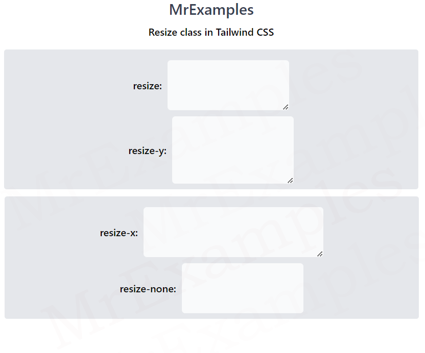
Below example showcases the implementation of the resize and resize-y classes in Tailwind:
<!DOCTYPE html>
<html><head>
<script src="https://cdn.tailwindcss.com"></script>
</head>
<body class="m-3 text-center">
<h1 class="text-gray-700 text-2xl font-semibold">
MrExamples
</h1>
<p class="my-2 font-semibold">Resize class in Tailwind CSS</p>
<div class="mt-4 bg-gray-200 w-full font-medium p-2 rounded">
<div class="flex justify-center items-center gap-2 font-medium mt-2">
<p>resize:</p>
<textarea class="resize border rounded-md
w-48 h-20 p-1 bg-gray-50"></textarea>
</div>
<div class="flex justify-center items-center gap-2 font-medium mt-2">
<p>resize-y:</p>
<textarea class="resize-y border rounded-md
w-48 h-20 p-1 bg-gray-50"></textarea>
</div>
</div>
</body>
</html>
The following example covers the resize-x and resize-none classes in Tailwind:
<!DOCTYPE html>
<html><head>
<script src="https://cdn.tailwindcss.com"></script>
</head>
<body class="m-3 text-center">
<h1 class="text-gray-700 text-2xl font-semibold">
MrExamples
</h1>
<p class="my-2 font-semibold">Resize class in Tailwind CSS</p>
<div class="mt-4 bg-gray-200 w-full font-medium p-2 rounded">
<div class="flex justify-center items-center gap-2 font-medium mt-2">
<p>resize-x:</p>
<textarea class="resize-x border rounded-md
w-48 h-20 p-1 bg-gray-50"></textarea>
</div>
<div class="flex justify-center items-center gap-2 font-medium mt-2">
<p>resize-none:</p>
<textarea class="resize-none border rounded-md
w-48 h-20 p-1 bg-gray-50"></textarea>
</div>
</div>
</body>
</html>