Tailwind Justify Items

In this article, we’ll examine the different ways you can use Tailwind justify items classes to achieve different layouts for your web page.

The justify-items property is used to align items along the horizontal axis within a grid container.

This property affects all grid items within the container, and it can be applied to the container itself or individual items within the container.

Tailwind justify items property specifies the default horizontal alignment of grid and flex items when they are not explicitly set.

Tailwind Justify Items


Justify Items Classes

ClassesOverview
justify-items-startThis class aligns the items within a grid container along the start edge of the grid’s column axis.
justify-items-endThis class aligns the items within a grid container along the end edge of the grid’s column axis.
justify-items-centerUsing this class, the items within a grid container are aligned along the center of the grid’s column axis.
justify-items-stretchThis class stretches the grid items within a grid container to fill the entire width of the column.

Justify Items Start

The justify-items-start class in a grid container aligns the items along the start edge of the grid’s column axis, positioning them towards the left side of the container and leaving any remaining space towards the right side.

Syntax

<element class="justify-items-start">...</element>

This is an example of the justify-items-start class in action:

Example: 

<!DOCTYPE html> <html> <head> <script src="https://cdn.tailwindcss.com"></script> </head> <body class="text-center"> <h1 class="text-gray-600 text-2xl font-semibold"> MrExamples </h1> <p class="font-medium text-slate-800 my-3">Justify Items in Tailwind</p> <p class="font-medium text-gray-500 text-sm my-3">Using justify-items-start class</p> <div class="grid justify-items-start grid-cols-2 font-medium border-2"> <div class="bg-rose-400 rounded m-4 p-2">1st</div> <div class="bg-rose-400 rounded m-4 p-2">2nd</div> <div class="bg-rose-400 rounded m-4 p-2">3rd</div> <div class="bg-rose-400 rounded m-4 p-2">4th</div> </div> </body> </html>

Justify Items End

The Tailwind utility class justify-items-end positions the items inside a grid container along the end edge of the grid’s column axis, meaning the items will be aligned towards the right side of the container, and any remaining space will be on the left side.

Syntax

<element class="justify-items-end">...</element>

For a better understanding let’s go through an example of the justify-items-end class in Tailwind:

Example: 

<!DOCTYPE html> <html> <head> <script src="https://cdn.tailwindcss.com"></script> </head> <body class="text-center"> <h1 class="text-gray-600 text-2xl font-semibold"> MrExamples </h1> <p class="font-medium text-slate-800 my-3">Justify Items in Tailwind</p> <p class="font-medium text-gray-500 text-sm my-3">Using justify-items-end class</p> <div class="grid justify-items-end grid-cols-2 font-medium border-2"> <div class="bg-rose-400 rounded m-4 p-2">1st</div> <div class="bg-rose-400 rounded m-4 p-2">2nd</div> <div class="bg-rose-400 rounded m-4 p-2">3rd</div> <div class="bg-rose-400 rounded m-4 p-2">4th</div> </div> </body> </html>

Justify Items Center

The justify-items-center utility class in Tailwind centers the items within a grid container along the center of the grid’s column axis. This results in the grid items being horizontally centered within the container, with an even amount of space on both sides.

Syntax

<element class="justify-items-center">...</element>

This example makes use of the justify-items-center class for demonstration:

Example: 

<!DOCTYPE html> <html> <head> <script src="https://cdn.tailwindcss.com"></script> </head> <body class="text-center"> <h1 class="text-gray-600 text-2xl font-semibold"> MrExamples </h1> <p class="font-medium text-slate-800 my-3">Justify Items in Tailwind</p> <p class="font-medium text-gray-500 text-sm my-3">Using justify-items-center class</p> <div class="grid justify-items-center grid-cols-2 font-medium border-2"> <div class="bg-rose-400 rounded m-4 p-2">1st</div> <div class="bg-rose-400 rounded m-4 p-2">2nd</div> <div class="bg-rose-400 rounded m-4 p-2">3rd</div> <div class="bg-rose-400 rounded m-4 p-2">4th</div> </div> </body> </html>

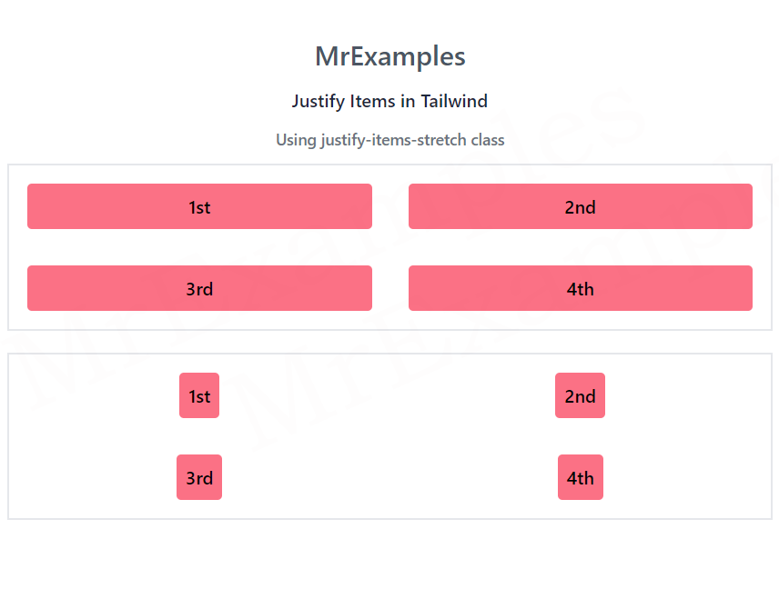
Justify Items Stretch

The grid items within a grid container are stretched to occupy the entire width of the column.

This means that the grid items will expand horizontally to fill the available space within the container, creating a uniform layout where all items have the same width.

Syntax

<element class="justify-items-stretch">...</element>

This example sheds some light on the justify-items-stretch class in Tailwind:

Example: 

<!DOCTYPE html> <html> <head> <script src="https://cdn.tailwindcss.com"></script> </head> <body class="text-center"> <h1 class="text-gray-600 text-2xl font-semibold"> MrExamples </h1> <p class="font-medium text-slate-800 my-3">Justify Items in Tailwind</p> <p class="font-medium text-gray-500 text-sm my-3">Using justify-items-stretch class</p> <div class="grid justify-items-stretch grid-cols-2 font-medium border-2"> <div class="bg-rose-400 rounded m-4 p-2">1st</div> <div class="bg-rose-400 rounded m-4 p-2">2nd</div> <div class="bg-rose-400 rounded m-4 p-2">3rd</div> <div class="bg-rose-400 rounded m-4 p-2">4th</div> </div> </body> </html>
We value your feedback.
+1
0
+1
0
+1
0
+1
0
+1
0
+1
0
+1
0

Subscribe To Our Newsletter
Enter your email to receive a weekly round-up of our best posts. Learn more!
icon

Leave a Reply

Your email address will not be published. Required fields are marked *