Tailwind Cursor: A Comprehensive Guide
Let’s take a deep dive into Tailwind cursor class in this article that extensively covers all related concepts.
In Tailwind CSS, Cursor class used to specify the mouse cursor to be displayed while pointing at an element.
In traditional CSS we achieve this by using the CSS cursor property.
In Tailwind CSS, this class accepts various values, and all the properties are covered in class form.
Syntax
<element class="cursor-{behaviour}">....</element>Tailwind Cursor Classes
As part of Tailwind CSS stylesheets, you can style cursors using a range of different classes as shown below in the following table.
| Classes | Overview |
| cursor-auto | This is the default class. Using this class, the browser sets a cursor automatically. |
| cursor-default | This class sets the cursor present in normal operation. Typically an arrow. |
| cursor-pointer | Essentially, a cursor is a pointer that indicates a link in this class. |
| cursor-wait | The cursor indicates that the program is busy in this class. |
| cursor-text | In the case of this class, we can see a cursor indicating text that can be selected when it is used. |
| cursor-move | The cursor in this class indicates something that needs to be moved when it is clicked. |
| cursor-help | The cursor indicates that help regarding the content being hovered over is available. |
| cursor-not-allowed | It is evident from the cursor of this class that the requested action will not take place. |
| cursor-none | Cursor is hidden using this class. |
| cursor-context-menu | It specifies that a context menu is available. |
| cursor-progress | Program is busy in execution but it’s still interactive. |
| cursor-cell | Select a table cell or set of cells. |
| cursor-crosshair | Cross cursor is shown which is often used to indicate selection in bitmaps. |
| cursor-vertical-text | Cursor indicates there is an option to select vertical text. |
| cursor-alias | The purpose of this class is to highlight that a shortcut must be created. |
| cursor-copy | The cursor implies that something has to be copied. |
| cursor-no-drop | The resulting cursor indicates that the item cannot be dropped on the current location. |
| cursor-grab | The cursor indicates that something can be grabbed and dragged to move to another place. |
| cursor-grabbing | Something is currently grabbed by the cursor and is to be moved to a new location. |
| cursor-all-scroll | There is an indication by the cursor that something can be scrolled in any direction. |
| cursor-col-resize | Column can be resized according to our needs. By dragging horizontally. |
| cursor-row-resize | Row can be resized by dragging upwards or downwards. |
| cursor-n-resize | This cursor is used for adjusting the size of an element in the upward direction. |
| cursor-e-resize | This cursor is used for adjusting the size of an element in the right hand direction. |
| cursor-s-resize | This cursor is used for adjusting the size of an element in the downward direction. |
| cursor-w-resize | This cursor is used for adjusting the size of an element in the left hand direction. |
| cursor-ne-resize | Cursor for resizing the element towards the north-east direction. |
| cursor-nw-resize | Cursor for resizing the element towards the north-west direction. |
| cursor-se-resize | Cursor for resizing the element towards the south-east direction. |
| cursor-sw-resize | Cursor for resizing the element towards the south-west direction. |
| cursor-ew-resize | This cursor allows you to resize an element horizontally in both directions. |
| cursor-ns-resize | This cursor allows you to resize an element vertically in both directions. |
| cursor-nesw-resize | Cursor for resizing an element towards top-right or bottom-left direction. |
| cursor-nwse-resize | Cursor for resizing an element towards top-left or bottom-right direction. |
| cursor-zoom-in | The resulting cursor indicates that an element being hovered can be zoomed in on click. |
| cursor-zoom-out | The resulting cursor indicates that an element being hovered can be zoomed out on click. |
This example showcases the application of some of the cursor classes in Tailwind:
Tailwind Cursor Example: 1
<!DOCTYPE html>
<html>
<head>
<script src="https://cdn.tailwindcss.com"></script>
</head>
<body class="text-center">
<h1 class="text-gray-600 text-2xl font-semibold">
MrExamples
</h1>
<p class="font-semibold my-2">Tailwind CSS Cursor Class</p>
<div id="main" class="p-2 justify-around mx-auto w-3/4 flex
items-center border-solid gap-4 flex-wrap my-2 font-medium">
<div class="cursor-auto bg-gray-300
p-2 rounded-md">
Hover over cursor-auto
</div>
<div class="cursor-default bg-gray-300
p-2 rounded-md">
Hover over cursor-default
</div>
<div class="cursor-pointer bg-gray-300
p-2 rounded-md">
Hover over cursor-pointer
</div>
<div class="cursor-wait bg-gray-300
p-2 rounded-md">
Hover over cursor-wait
</div>
<div class="cursor-text bg-gray-300
p-2 rounded-md">
Hover over cursor-text
</div>
<div class="cursor-move bg-gray-300
p-2 rounded-md">
Hover over cursor-move
</div>
<div class="cursor-help bg-gray-300
p-2 rounded-md">
Hover over cursor-help
</div>
<div class="cursor-not-allowed bg-gray-300
p-2 rounded-md">
Hover over cursor-not-allowed
</div>
</div>
</body>
</html>
Another example related to cursor class in Tailwind is illustrated below:
Tailwind Cursor Example: 2
<!DOCTYPE html>
<html>
<head>
<script src="https://cdn.tailwindcss.com"></script>
</head>
<body class="text-center">
<h1 class="text-gray-600 text-2xl font-semibold">
MrExamples
</h1>
<p class="font-semibold my-2">Tailwind CSS Cursor Class</p>
<div id="main" class="p-2 justify-around mx-auto w-3/4 flex
items-center border-solid gap-4 flex-wrap my-2 font-medium">
<div class="cursor-none bg-gray-300
p-2 rounded-md">
Hover over cursor-none
</div>
<div class="cursor-context-menu bg-gray-300
p-2 rounded-md">
Hover over cursor-context-menu
</div>
<div class="cursor-progress bg-gray-300
p-2 rounded-md">
Hover over cursor-progress
</div>
<div class="cursor-cell bg-gray-300
p-2 rounded-md">
Hover over cursor-cell
</div>
<div class="cursor-crosshair bg-gray-300
p-2 rounded-md">
Hover over cursor-crosshair
</div>
<div class="cursor-vertical-text bg-gray-300
p-2 rounded-md">
Hover over cursor-vertical-text
</div>
<div class="cursor-alias bg-gray-300
p-2 rounded-md">
Hover over cursor-alias
</div>
<div class="cursor-copy bg-gray-300
p-2 rounded-md">
Hover over cursor-copy
</div>
</div>
</body>
</html>
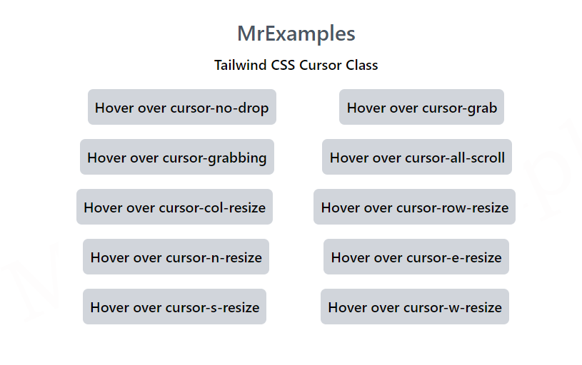
Further classes of cursor in Tailwind are examined below:
Tailwind Cursor Example: 3
<!DOCTYPE html>
<html>
<head>
<script src="https://cdn.tailwindcss.com"></script>
</head>
<body class="text-center">
<h1 class="text-gray-600 text-2xl font-semibold">
MrExamples
</h1>
<p class="font-semibold my-2">Tailwind CSS Cursor Class</p>
<div id="main" class="p-2 justify-around mx-auto w-4/5 flex
items-center border-solid gap-4 flex-wrap my-2 font-medium">
<div class="cursor-no-drop bg-gray-300
p-2 rounded-md">
Hover over cursor-no-drop
</div>
<div class="cursor-grab bg-gray-300
p-2 rounded-md">
Hover over cursor-grab
</div>
<div class="cursor-grabbing bg-gray-300
p-2 rounded-md">
Hover over cursor-grabbing
</div>
<div class="cursor-all-scroll bg-gray-300
p-2 rounded-md">
Hover over cursor-all-scroll
</div>
<div class="cursor-col-resize bg-gray-300
p-2 rounded-md">
Hover over cursor-col-resize
</div>
<div class="cursor-row-resize bg-gray-300
p-2 rounded-md">
Hover over cursor-row-resize
</div>
<div class="cursor-n-resize bg-gray-300
p-2 rounded-md">
Hover over cursor-n-resize
</div>
<div class="cursor-e-resize bg-gray-300
p-2 rounded-md">
Hover over cursor-e-resize
</div>
<div class="cursor-s-resize bg-gray-300
p-2 rounded-md">
Hover over cursor-s-resize
</div>
<div class="cursor-w-resize bg-gray-300
p-2 rounded-md">
Hover over cursor-w-resize
</div>
</div>
</body>
</html>
This example explains the use of remaining cursor classes in Tailwind:
Tailwind Cursor Example: 4
<!DOCTYPE html>
<html>
<head>
<script src="https://cdn.tailwindcss.com"></script>
</head>
<body class="text-center">
<h1 class="text-gray-600 text-2xl font-semibold">
MrExamples
</h1>
<p class="font-semibold my-2">Tailwind CSS Cursor Class</p>
<div id="main" class="p-2 justify-around mx-auto w-4/5 flex
items-center border-solid gap-4 flex-wrap my-2 font-medium">
<div class="cursor-ne-resize bg-gray-300
p-2 rounded-md">
Hover over cursor-ne-resize
</div>
<div class="cursor-nw-resize bg-gray-300
p-2 rounded-md">
Hover over cursor-nw-resize
</div>
<div class="cursor-se-resize bg-gray-300
p-2 rounded-md">
Hover over cursor-se-resize
</div>
<div class="cursor-sw-resize bg-gray-300
p-2 rounded-md">
Hover over cursor-sw-resize
</div>
<div class="cursor-ew-resize bg-gray-300
p-2 rounded-md">
Hover over cursor-ew-resize
</div>
<div class="cursor-ns-resize bg-gray-300
p-2 rounded-md">
Hover over cursor-ns-resize
</div>
<div class="cursor-nesw-resize bg-gray-300
p-2 rounded-md">
Hover over cursor-nesw-resize
</div>
<div class="cursor-nwse-resize bg-gray-300
p-2 rounded-md">
Hover over cursor-nwse-resize
</div>
<div class="cursor-zoom-in bg-gray-300
p-2 rounded-md">
Hover over cursor-zoom-in
</div>
<div class="cursor-zoom-out bg-gray-300
p-2 rounded-md">
Hover over cursor-zoom-out
</div>
</div>
</body>
</html>
We value your feedback.
+1
+1
+1
+1
+1
+1
+1
