Tailwind Place Items: An Ultimate Guide to Positioning HTML Elements
In this article we will focus on Tailwind place items property and classes with examples.
When it comes to designing responsive websites, positioning HTML elements can be a daunting task.
The traditional way of using float, position, and margin properties may not always work as expected.
Fortunately, Tailwind CSS has an intuitive and efficient way of positioning HTML elements using the Place Items classes.
Tailwind Place Items
Tailwind place items property is used to align both the grid or flex items and the container along the horizontal and vertical axes.
It is a shorthand property that combines the align-items and justify-items properties.
The align-items property is used to align the items along the vertical axis, while the justify-items property is used to align the items along the horizontal axis.
By setting the place-items property, you can align both axes at once.
Tailwind Place Items Classes
Tailwind Place Items offers several alignment options that you can use to position HTML elements.
Some of the most commonly used options include:
| Classes | Overview |
| place-items-start | Using this class, the items will be positioned towards the top left corner of the container and the grid or flex tracks will also start from that point. |
| place-items-end | In this case, the items will be positioned towards the bottom right corner of the container. |
| place-items-center | This class ensures that the items are positioned at the center of the container and the tracks will also start from that point. |
| place-items-baseline | In this case, the items will be positioned in a way that the text baseline of each item is aligned with the text baseline of the other items, and the tracks will also start from that point. |
| place-items-stretch | Items and their tracks are expanded to take up all available space in the container, regardless of their original size. |
Tailwind Place items start
This class aligns the grid or flex items and tracks to the start of the container along both the horizontal and vertical axes.
This results in the items and tracks being positioned towards the top left corner of the container.
Any extra space in either axis will not be utilized by the items and tracks, as they will not be stretched or spaced out to fill that space.
Syntax
<element class="place-items-start">...</element>
The following example revolves around the place-items-start class in Tailwind:
Example:
Tailwind Place Items End
This is the class used for aligning grid or flex items to the end of the container along both the horizontal and vertical axes is called place-items-end.
This will position the items towards the bottom right corner of the container, without any extra spacing or alignment being applied.
Syntax
<element class="place-items-end">...</element>
Below example highlights the usage of place-items-end class in Tailwind:
Example:
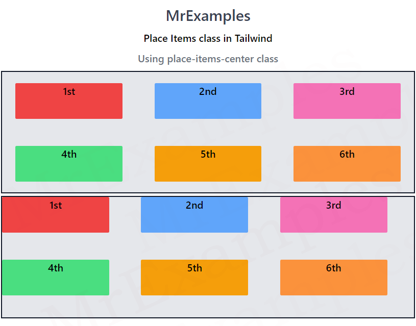
Tailwind Place Items Center
This class aligns the flex or grid items and the container path to the center along both the horizontal and vertical axes.
This means that the items will be positioned at the center of the container and the tracks will also start from that point.
If the container has extra space in either axis, the items will not be stretched or spaced out to fill that space.
Syntax
<element class="place-items-center">...</element>
The following example demonstrates the working of place-items-center class in Tailwind:
Example:
Tailwind Place Items Baseline
The function of this class is to align both the grid items and the grid tracks to the baseline of the grid container along both the horizontal and vertical axes.
This means that the items will be positioned in a way that the text baseline of each item is aligned with the text baseline of the other items, and the tracks will also start from that point.
If the container has extra space in either axis, the items will not be stretched or spaced out to fill that space.
Syntax
<element class="place-items-baseline">...</element>
Below example implements the place-items-baseline class in Tailwind:
Example:
Tailwind Place Items Stretch
Both grid or flex items and their tracks are stretched with this class to fill the entire grid container along both horizontal and vertical axes.
Regardless of their original size, the items and tracks will be expanded to cover all the available space in the container.
Items with a set height or width will be stretched to fit the space. If not, they will be given equal amounts of space to fill.
Syntax
<element class="place-items-stretch">...</element>
Using this example, we can better understand the place-items-stretch class in Tailwind:
Example:
Conclusion
Tailwind Place Items simplifies the process of positioning HTML elements in responsive designs.
It offers an intuitive and efficient way of aligning elements within a container using flexbox properties.
By using the Place Items , you can achieve complex layouts and responsive designs with minimal code.
So next time you’re struggling to position HTML elements, give Tailwind Place Items a try and see how easy it can be.
