Tailwind Height: Everything You Need to Know
In this article, we will explore Tailwind height classes and how to use them in your projects with examples.
The height property is used to set the height of an element, such as a <div> or an <img> tag.
The height of an element can be specified using absolute or relative units.
These classes are based on a simple naming convention that starts with the prefix h- followed by a number that represents the height in pixels.
Syntax
<element class="h-40">...</element>
Tailwind provides various classes that you can use to set the height of an element without having to write custom CSS.
Tailwind Height classes
The following are some of the most commonly used Tailwind height classes:
| Classes | Overview |
| h-0 | The height is set to zero. |
| h-px | Equivalent to custom CSS height 1px. |
| h-0.5 | This class defines the height of an element as 0.125rem or 2px. |
| h-1 | A height of 0.25rem or 4px is defined by this class. |
| h-1.5 | Using this class, an element’s height is defined as 0.375rem or 6px. |
| h-2 | Height of an element in this class is 0.5rem or 8 pixels. |
| h-2.5 | Elements using this class have a height of 0.625rem (10px). |
| h-3 | The height of an element is specified as 0.75rem or 12px. |
| h-3.5 | This class defines an element’s height as 0.875rem or 14 px. |
| h-4 | Using this class, you can set an element’s height to 1rem or 16px. |
| h-5 | Using this class, an element will have a height of 1.25rem or 20 pixels. |
| h-6 | In this case, the element will have a height of 1.5rem or 24px. |
| h-7 | This class sets the height of an element to 1.75rem or 28px. |
| h-8 | An element’s height is set to 2rem or 32px with this class. |
| h-9 | A height of 2.25rem or 36px is applied to an element using this class. |
| h-10 | This class sets an element’s height to 2.5rem (40px). |
| h-11 | When this class is used, an element’s height is set to 44px or 2.75rem. |
| h-12 | A class with this name sets the height of an element to 3rem or 48px. |
| h-14 | It sets the height of an element to 3.5rem or 56px. |
| h-16 | An element’s height is set to 4rem or 64px by using this class. |
| h-20 | Using this class, an element’s height is defined as 5rem or 80px. |
| h-24 | This class defines the height of an element as 6rem or 96px. |
| h-28 | An element using this class has a height of 7rem or 112px. |
| h-32 | The height of an element is 8rem, or 128px, when this class is applied. |
| h-36 | This class applies a height of 9rem or 144px to an element. |
| h-40 | Using this class, an element will have a height of 10rem or 160px. |
| h-44 | This class specifies the height of an element as 11rem or 176px. |
| h-48 | A height of 12rem or 192px is specified by this class. |
| h-52 | An element with this class has a height of 13rem or 208px. |
| h-56 | Elements in this class are defined to have a height of 14rem or 224px. |
| h-60 | Using this class, an element has a height of 15rem or 240px. |
| h-64 | Elements using this class have a height of 16rem or 256px. |
| h-72 | Using this class, elements are specified as 18rem or 288px tall. |
| h-80 | The height of an element is specified as 20rem or 320px. |
| h-96 | A height of 24rem or 384px is defined by this class. |
| h-auto | This class sets the height of an element to its default, automatic size based on its content. |
| h-1/2 | This class sets the height of an element to 50% of its parent container’s height. |
| h-1/3 | In this class, an element’s height is set to 33.33% of its parent container’s height. |
| h-2/3 | An element with this class has a height of 66.67% of its parent container. |
| h-1/4 | Elements of this class have a height of 25% of their parent containers. |
| h-2/4 | This class sets the height of an element to 50% of its parent container’s height. |
| h-3/4 | The height of an element in this class is set to 75% of that of its parent container. |
| h-1/5 | An element of this class has a height that is 20% of that of its parent container. |
| h-2/5 | Element height is set to 40% of its parent container height. |
| h-3/5 | Element height will be set to 60% of its parent container’s height. |
| h-4/5 | Using this class, elements are set to 80% of their parent container’s height. |
| h-1/6 | This class sets an element’s height to 16.67% of its parent container’s height. |
| h-2/6 | In this class, the height of an element is set to 33.33% of its parent container’s height. |
| h-3/6 | This class sets the height of an element to 50% of its parent container’s height. |
| h-4/6 | An element’s height is set to 66.67% of the height of its parent container according to this class. |
| h-5/6 | This class sets an element’s height to 83.33% of its parent container’s height. |
| h-full | This class sets the height of an element to 100% of its parent container’s height. |
| h-screen | This class specifies the height of an element to be equal to the height of the screen. |
| h-min | This will set the height of an element to the minimum height required to contain its content. |
| h-max | This will set the height of the element to the maximum height required to contain its content. |
| h-fit | The height of an element will adjust based on the height of the element’s content. |
Absolute units
Absolute units are units of measurement in CSS that are not based on the relative size of other elements.
They have fixed values and remain constant regardless of the size or dimensions of the viewport or other elements on the page.
The most common absolute units are pixels (px), points (pt), inches (in), centimeters (cm), and millimeters (mm).
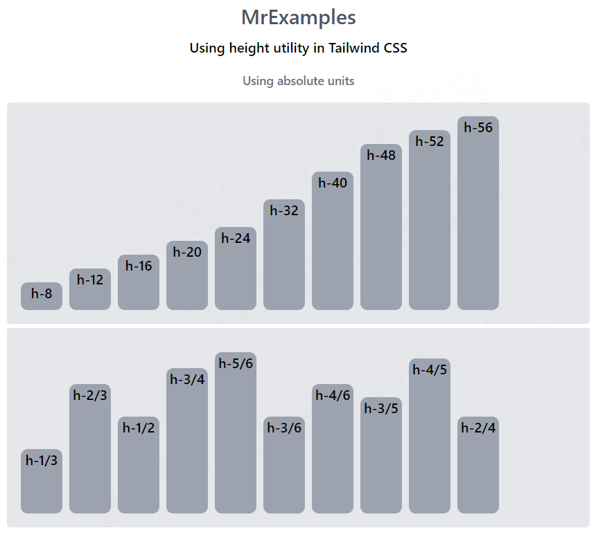
Below example demonstrates the usage of Tailwind height utility using absolute units:
Example:
Relative units
Relative units are CSS units that are relative to another property or value, typically the font size of the element or the width of its parent container.
They are particularly useful for creating flexible, responsive designs that adapt to different screen sizes and devices.
Syntax
<element class="h-2/3">...</element>
This example illustrates the use case of Tailwind height property using relative units:
