Display In Tailwind CSS
The focus of this article is to provide a comprehensive overview of Tailwind display class, complete with examples to illustrate its practical usage.
Tailwind display class specifies how HTML elements (divs, headings, paragraphs, images, etc) are arranged on a web page. As the name implies, this property specifies how various parts of a web page will appear.

Tailwind CSS supports more than one value for this class.
Each property is covered by a class.
This is an alternative to the CSS display property.
Tailwind Display Classes
| Classes | Overview |
| block | An element can be displayed as a block element using this attribute. |
| inline-block | This class displays an element as an inline-level block container. |
| inline | Inline elements are displayed as a result of this class. |
| flex | This class displays elements as block-level flex container. |
| inline-flex | This class creates an inline-level flex container for elements. |
| table | In this case, all elements are treated as a table. |
| table-caption | It sets all elements to have the caption behavior. |
| table-cell | It sets an element to display as a table cell. |
| table-column | A table column element can be styled with this class. |
| table-column-group | This class applies styles to a group of table columns. |
| table-footer-group | Styles are applied to a table footer group element using this class. |
| table-header-group | The purpose of this class is to apply styling to the header section of a table. |
| table-row-group | This class is used with the intention of styling a group of rows in a table. |
| table-row | Table rows are styled with the table-row class in Tailwind. |
| flow-root | In order for its contents to be formatted properly, it establishes a new block formatting context. |
| grid | The display of an element is set as a block-level grid container. |
| inline-grid | The display of an element is set as an inline-level grid container. |
| contents | Using this class removes the element from the document flow, and its children become siblings of the element’s parent. |
| hidden | The class removes the element from the document. It’s still present in the HTML but not rendered on the document. |
Tailwind Display Use Cases & Examples
Now that we have explored the different types of display class values supported by Tailwind CSS, let’s take a look at some examples of how they can be used practically.
Tailwind Display block
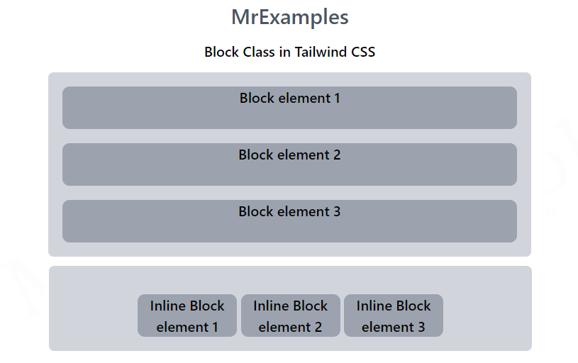
This class sets the display of an element as a block-level element. By default, it is applied to div elements, and it stacks them vertically.
The height and width of the div can be modified using the block class.
If the width is not specified, the div under the block class will take up the full width of the container.
Syntax
<element display="block">....</element>
This example provides a practical demonstration of block class in Tailwind:
<!DOCTYPE html>
<html><head>
<script src="https://cdn.tailwindcss.com"></script>
</head>
<body class="text-center">
<center>
<h1 class="text-gray-600 text-2xl font-semibold">
MrExamples
</h1>
<p class="font-semibold my-3">Block Class in Tailwind CSS</p>
<div class="bg-gray-300 p-4 mx-16 space-y-4 rounded-md font-semibold">
<span class="block h-12 bg-gray-400 rounded-lg">Block element 1</span>
<span class="block h-12 bg-gray-400 rounded-lg">Block element 2</span>
<span class="block h-12 bg-gray-400 rounded-lg">Block element 3</span>
</div>
</center>
</body>
</html>
In this example we have considered inline-block class in Tailwind:
<!DOCTYPE html>
<html><head>
<script src="https://cdn.tailwindcss.com"></script>
</head>
<body class="text-center">
<center>
<h1 class="text-gray-600 text-2xl font-semibold">
MrExamples
</h1>
<p class="font-semibold my-3">Inline Block Class in Tailwind CSS</p>
<div class="bg-gray-300 p-4 mx-16 space-y-4 rounded-md font-semibold">
<span class="inline-block w-28 h-12 bg-gray-400 rounded-lg">Inline Block element 1</span>
<span class="inline-block w-28 h-12 bg-gray-400 rounded-lg">Inline Block element 2</span>
<span class="inline-block w-28 h-12 bg-gray-400 rounded-lg">Inline Block element 3</span>
</div>
</center>
</body>
</html>
Tailwind Display Inline
An inline-level element is displayed using the inline class.
Anchor tags use this class by default. It aligns the div horizontally in an inline fashion.
Unlike the block class, the inline display property ignores any height and width set by the user.
Syntax
<element class="inline">...</element>
In this example, our focus is on implementing inline class in Tailwind:
<!DOCTYPE html>
<html><head>
<script src="https://cdn.tailwindcss.com"></script>
</head>
<body class="text-center">
<center>
<h1 class="text-gray-600 text-2xl font-semibold">
MrExamples
</h1>
<p class="font-semibold my-3">Inline Class in Tailwind CSS</p>
<div class="bg-gray-300 p-4 mx-16 space-y-4 rounded-md font-semibold">
<span class="inline bg-gray-400 rounded-lg p-1">Inline element 1</span>
<span class="inline bg-gray-400 rounded-lg p-1">Inline element 2</span>
<span class="inline bg-gray-400 rounded-lg p-1">Inline element 3</span>
</div>
</center>
</body>
</html>
Tailwind Display Flex
This class is highly responsive, allowing for easy positioning of both child elements and the main container.
Margins do not collapse with the content margins, and element’s order can be changed easily without modifying the HTML section.
Syntax
<element class="flex">...</element>
This example implements flex class in Tailwind:
<!DOCTYPE html>
<html><head>
<script src="https://cdn.tailwindcss.com"></script>
</head>
<body class="text-center">
<center>
<h1 class="text-gray-600 text-2xl font-semibold">
MrExamples
</h1>
<p class="font-semibold my-3">Flex Class in Tailwind CSS</p>
<div class="flex bg-gray-300 p-4 mx-16 space-x-2 rounded-md font-semibold">
<span class="bg-gray-400 rounded-lg p-2">Flex element 1</span>
<span class="bg-gray-400 rounded-lg p-2">Flex element 2</span>
<span class="bg-gray-400 rounded-lg p-2">Flex element 3</span>
</div>
</center>
</body>
</html>
Tailwind Display inline-flex
Flexbox layout properties can be applied to the children of an inline flex container using this class. In this way, elements can be arranged horizontally, while still being able to flex and wrap as required.
Syntax
<element class="inline-flex">....</element>
For this example, let’s look at the inline-flex class:
<!DOCTYPE html>
<html><head>
<script src="https://cdn.tailwindcss.com"></script>
</head>
<body class="text-center">
<center>
<h1 class="text-gray-600 text-2xl font-semibold">
MrExamples
</h1>
<p class="font-semibold my-3">Inline Flex Class in Tailwind CSS</p>
<div class="bg-gray-100 mx-auto rounded-md font-semibold">
Pellentesque tellus libero, lobortis quis volutpat sit amet,
congue in lectus. Fusce quam sem, porttitor at mauris nec,
vulputate laoreet tellus. Quisque consequat bibendum nunc,
bibendum facilisis velit ultrices ac. Vestibulum sed viverra
tortor, in hendrerit tortor.
<div class="inline-flex">
<div class="bg-gray-300 rounded-lg p-2 text-sm mx-1">Inline flex element 1</div>
<div class="bg-gray-300 rounded-lg p-2 text-sm mx-1">Inline flex element 2</div>
</div>
Nunc mollis, nunc ac volutpat
tempus, eros mauris tempus felis, sed ultrices lectus ex quis
libero. Aliquam lobortis ante augue, sit amet commodo turpis
eleifend quis. Sed ornare est odio, ac convallis nibh auctor
eu. Nulla facilisi. Donec quam sem, gravida ac ullamcorper
aliquet, interdum in massa. Suspendisse at mattis risus.
</div>
</center>
</body>
</html>
Tailwind Display Grid
A CSS grid container is created with this class. In addition, it allows grid-related properties to be defined conveniently.
Syntax
<element class="grid">...</element>
In this example let’s dig into grid class in Tailwind:
<!DOCTYPE html>
<html><head>
<script src="https://cdn.tailwindcss.com"></script>
</head>
<body class="text-center">
<center>
<h1 class="text-gray-600 text-2xl font-semibold">
MrExamples
</h1>
<p class="font-semibold my-3">Grid Class in Tailwind CSS</p>
<div class="grid grid-cols-2 grid-rows-2 gap-2 bg-gray-300 p-4 mx-auto rounded-md font-semibold">
<span class="bg-gray-400 rounded-lg p-2">Grid element 1</span>
<span class="bg-gray-400 rounded-lg p-2">Grid element 2</span>
<span class="bg-gray-400 rounded-lg p-2">Grid element 3</span>
<span class="bg-gray-400 rounded-lg p-2">Grid element 4</span>
<span class="bg-gray-400 rounded-lg p-2">Grid element 5</span>
<span class="bg-gray-400 rounded-lg p-2">Grid element 6</span>
</div>
</center>
</body>
</html>
Tailwind Display Inline-grid
Inline Grid container class used to display inline CSS grids.
Syntax
<element class="inline-grid">...</element>
This example demonstrates the working of inline-grid class in Tailwind:
<!DOCTYPE html>
<html><head>
<script src="https://cdn.tailwindcss.com"></script>
</head>
<body class="text-center">
<center>
<h1 class="text-gray-600 text-2xl font-semibold">
MrExamples
</h1>
<p class="font-semibold my-3">Inline Grid Class in Tailwind CSS</p>
<div class="inline-grid grid-cols-2 grid-rows-2 gap-2 bg-gray-300 p-4 mx-auto rounded-md font-semibold">
<span class="bg-gray-400 rounded-lg p-2">Grid element 1</span>
<span class="bg-gray-400 rounded-lg p-2">Grid element 2</span>
<span class="bg-gray-400 rounded-lg p-2">Grid element 3</span>
</div>
<div class="inline-grid grid-cols-2 grid-rows-2 gap-2 bg-gray-300 p-4 mx-auto rounded-md font-semibold">
<span class="bg-gray-400 rounded-lg p-2">Grid element 4</span>
<span class="bg-gray-400 rounded-lg p-2">Grid element 5</span>
<span class="bg-gray-400 rounded-lg p-2">Grid element 6</span>
</div>
</center>
</body>
</html>
Tailwind Display Table
An HTML table element is styled using this class. In this way, you can easily set various table-related properties.
Syntax
<element class="table">...</element>
In this example let’s explore application of table and its related classes in Tailwind:
<!DOCTYPE html>
<html><head>
<script src="https://cdn.tailwindcss.com"></script>
</head>
<body class="text-center">
<center>
<h1 class="text-gray-600 text-2xl font-semibold">
MrExamples
</h1>
<p class="font-semibold my-3">Table Class in Tailwind CSS</p>
<div class="table w-full bg-gray-100 mx-auto rounded-md font-semibold">
<div class="table-header-group bg-gray-200">
<div class="table-row">
<div class="table-cell w-1/3 p-1">Language</div>
<div class="table-cell w-1/3 p-1">Inventor</div>
<div class="table-cell w-1/3 p-1">Year</div>
</div>
</div>
<div class="table-row-group font-normal">
<div class="table-row">
<div class="table-cell w-1/3 p-1">Java</div>
<div class="table-cell w-1/3 p-1">James Gosling</div>
<div class="table-cell w-1/3 p-1">1995</div>
</div>
<div class="table-row">
<div class="table-cell w-1/3 p-1">Python</div>
<div class="table-cell w-1/3 p-1">Guido van Rossum</div>
<div class="table-cell w-1/3 p-1">1991</div>
</div>
<div class="table-row">
<div class="table-cell w-1/3 p-1">JavaScript</div>
<div class="table-cell w-1/3 p-1">Brendan Eich</div>
<div class="table-cell w-1/3 p-1">1995</div>
</div>
<div class="table-row">
<div class="table-cell w-1/3 p-1">PHP</div>
<div class="table-cell w-1/3 p-1">Rasmus Lerdorf</div>
<div class="table-cell w-1/3 p-1">1995</div>
</div>
</div>
</div>
</center>
</body>
</html>
Tailwind Display Contents
Renders only the contents of an element without its container box.
Syntax
<element class="contents">...</element>
This example focuses on contents class in Tailwind:
<!DOCTYPE html>
<html><head>
<script src="https://cdn.tailwindcss.com"></script>
</head>
<body class="text-center">
<center>
<h1 class="text-gray-600 text-2xl font-semibold">
MrExamples
</h1>
<p class="font-semibold my-3">Contents Class in Tailwind CSS</p>
<div class="flex bg-gray-100 mx-auto rounded-md font-semibold">
<div class="bg-gray-300 rounded-lg p-2 text-sm mx-1">Flex element</div>
<div class="contents">
<div class="bg-gray-300 rounded-lg p-2 text-sm mx-1">Element 1 inside content class</div>
<div class="bg-gray-300 rounded-lg p-2 text-sm mx-1">Element 2 inside content class</div>
</div>
<div class="bg-gray-300 rounded-lg p-2 text-sm mx-1">Flex element</div>
</div>
</center>
</body>
</html>
Tailwind Display Hidden
A class used to visually hide an element on a web page.
Syntax
<element class="hidden">...</element>
This examples covers the hidden class in Tailwind:
<!DOCTYPE html>
<html><head>
<script src="https://cdn.tailwindcss.com"></script>
</head>
<body class="text-center">
<center>
<h1 class="text-gray-600 text-2xl font-semibold">
MrExamples
</h1>
<p class="font-semibold my-3">Hidden Class in Tailwind CSS</p>
<div class="flex bg-gray-100 mx-auto rounded-md font-semibold p-2">
<div class="bg-gray-300 rounded-lg p-2 text-sm mx-1">Flex element</div>
<div class="hidden bg-gray-300 rounded-lg p-2 text-sm mx-1">Flex element</div>
</div>
</center>
</body>
</html>
Tailwind Display flow-root
This class creates a new block formatting context for an element.
Syntax
<element class="flow-root">...</element>
This example provides an understanding of flow-root class in Tailwind:
<!DOCTYPE html>
<html><head>
<script src="https://cdn.tailwindcss.com"></script>
</head>
<body class="text-center">
<center>
<h1 class="text-gray-600 text-2xl font-semibold">
MrExamples
</h1>
<p class="font-semibold my-3">Flow-root Class in Tailwind CSS</p>
<div class="space-y-4 font-medium">
<div class="flow-root">
<div class="my-4 bg-gray-100 p-2 rounded">Element 1</div>
</div>
<div class="flow-root">
<div class="my-4 bg-gray-100 p-2 rounded">Element 2</div>
</div>
</div>
</center>
</body>
</html>