Tailwind Ring Color
This article will cover the process of creating Tailwind ring colors and provide insights into best practices for effectively using ring colors in your web design with examples.
Tailwind ring colors are used to add a border around an element, similar to the border property in traditional CSS.
However, ring colors are designed to be more flexible and customizable than traditional borders.
You can create borders that are partially transparent or that have varying levels of thickness.

Tailwind Ring Color Classes
There are several utility classes available for customizing the color of rings in Tailwind CSS.
| Classes | Overview |
| ring-inherit | The color of the parent element is used as the color of the ring. |
| ring-transparent | This class is used to set the color of the ring around an element as transparent. |
| ring-current | Used to set the color of the ring around an element to the current text color. |
| ring-black | In this case, the color of the ring around an element is black. |
| ring-white | The color of the ring is set to white. |
| ring-gray-50 | The color of ring is specified as a shade of gray. |
| ring-red-50 | Using this class, the ring color is set as a shade of red. |
| ring-blue-50 | A shade of blue is used as the color of the ring. |
| ring-indigo-50 | This class is used to set the color of the ring as a shade of indigo. |
| ring-purple-50 | This class applies a ring color as a shade of purple. |
| ring-green-50 | Applies a ring color that is a shade of green color. |
| ring-yellow-50 | A shade of yellow is used as the color of the ring. |
| ring-pink-50 | By using this class, the color of the ring is specified as a shade of pink. |
| ring-slate-50 | The color of the ring is defined as a shade of slate. |
| ring-neutral-50 | Used to set the color of the ring as a shade of neutral. |
| ring-fuchsia-50 | This class is used to define the ring color as a shade of fuchsia. |
| ring-amber-50 | Ring color is specified as a shade of amber. |
| ring-orange-50 | A shade of orange is set as the color of the ring. |
| ring-stone-50 | Using this class, the color of the ring is specified as a shade of stone. |
| ring-rose-50 | The color of the ring is defined as a shade of rose. |
| ring-violet-50 | By using this class, the color of the ring is specified as a shade of violet. |
| ring-zinc-50 | The ring color is specified as a shade of zinc using this class. |
| ring-lime-50 | By using this class, the color of the ring is defined as a shade of lime. |
| ring-emerald-50 | Applies a ring color that is a shade of emerald color. |
| ring-teal-50 | Using this class, the color applied to the ring is a shade of teal. |
| ring-cyan-50 | A shade of cyan is used as the color of the ring. |
| ring-sky-50 | The ring color is specified as a shade of sky color. |
Syntax
<element class="ring-blue-500">...</element >
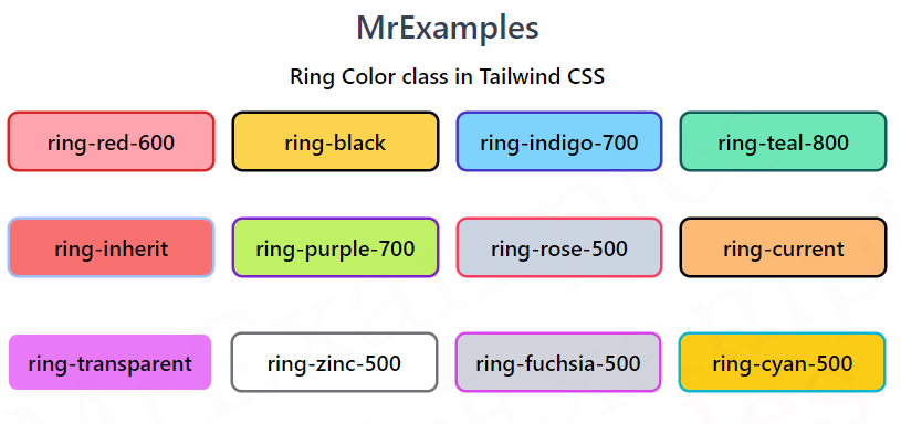
Let’s explore Tailwind ring color property through an example that makes use of some classes:
Example:
Example:
Example:
Tailwind Ring Colors Best Practices
Tailwind ring colors can be a great way to add visual interest to your web design, it’s important to use them judiciously.
Here are a few best practices to keep in mind:
- Ring colors can be a great way to draw the user’s attention to important elements, such as buttons or calls to action.
- While ring colors can be a great way to add visual interest, it’s important not to overdo it. Too many ring colors can make your design feel cluttered and overwhelming.
- When choosing a ring color, it’s important to consider your overall color palette. Choose colors that complement your existing color scheme and that help to reinforce your brand identity.
- To create a cohesive design, it’s important to use ring colors consistently throughout your website. For example, you might use a particular ring color for all of your buttons or calls to action.
